Showing posts with label water. Show all posts

Monday, July 15, 2013

"Red Boat" (watercolor on Yupo; 8" x 8") sold


sold


The scene depicts a small charming marina at Luce Creek in Annapolis, MD.  The red boat sings in this green, blue, and purple landscape, doesn't it?  Its actual color was dark blue!  I had a lot of trouble with this painting.  I wiped out and repainted the sky and water.  Still something bothered me.  But I liked the middle section with the boats so much that I couldn't give up.  So I redid the water one more time.  More disappointment.

I was about to toss it into the waste basket, because one cannot mess with a painting forever.  Suddenly a light bulb went off.  Why not crop it and get rid of the offending bottom portion?  I am raising the attitude of "Never give up, never surrender" to an art form!


Reference photo


Monday, June 17, 2013

"After Independence Day" (oil on stretched canvas; 12" x 16") sold


sold


The day after the Independence Day in 2002, I visited a marina along the Potomac River and saw the scene.  The contrast between the brilliant sun-lit boats and those in the shadow made an indelible impression.  Full of enthusiasm, I painted a full-sheet watercolor painting, also titled "After Independence Day."

The painting won the Potomac Valley Watercolorists Award (something like the second-place award) in the prestigious American Landscape Show at the Art League Gallery in August 2002!  It was before the age of the digital camera; I wasn't much of a photographer either.  Unfortunately, I didn't have the chance to get the painting photographed properly in slides before the show.

When the painting got sold on the last day of the show, I didn't know whether I should be happy or sad.  Dang!  All I have left of the entire exhilarating experience is a snapshot.  I took a picture of the picture to prove that I didn't make up the story!


"After Independence Day" (watercolor, 22" x 30"; sold)

I cropped the scene for the new, much smaller, oil painting.  Unlike the original watercolor version, for which I did a lot of careful pencil drawing, the new version was done with a minimal pre-drawing.  The background is barely suggested in the watercolor painting; in the new painting the background is treated more boldly.  The result is that the sun-lit boats are highlighted between the darker values of the background landscape and the foreground boats.  So, which painting do you prefer?

Friday, June 14, 2013

"Robin Bath" (oil on linen; 8" x 10") sold


sold


I was taking a walk when I saw a scruffy-looking robin at a shallow brook the day after a heavy rain.  Charming!

Thursday, January 17, 2013

"Tidal Basin in Cherry Blossom Season" (oil on linen; 8" x 10") sold


sold


The Tidal Basin during the National Cherry Blossom Festival in early spring is the mecca for tourists.  In this painting, I nestled the famous Jefferson Memorial in a circle of cherry branches.

Thursday, June 14, 2012

"Sunrise by the Lake" (oil on linen; 7" x 5") sold


sold


It is summertime.  Time to go to the lakes.  Like Boundary Waters, if you live in Minnesota.  Make sure to get up early to witness a spectacular sunrise or two.  A duck glides on the mirror-like water that reflects what is unfolding in the sky.  

Tuesday, January 24, 2012

"Mountain Waterfalls" (oil on linen; 12" x 10") sold


"Mountain Waterfalls"
sold

"Great Falls Roaring" (oil, 14" x 11")
click here to buy

Waterfalls are magnificent to look at and difficult to paint.  I have seen quite a few waterfalls, both in this country and mine (South Korea).  The biggest was the Niagara Falls, although my favorites are those in Oregon.  I shouldn't have tried to paint them on location until I had gained more experience in oil painting.  Who knew that rocks, trees, and everything else seemingly kept moving when I first set out to paint Great Falls last summer?  The noise, heat, and crowd got to me! 

I went back and "Great Falls Roaring" was the second attempt at this popular tourist attraction, close to the nation's capital.  The painting used to be a little bigger (16 x 12"), but I decided that I didn't really need that much foreground rocks and cropped it to the current size.  It's not the best painting of Great Falls ever painted; it was, however, a great leap forward for me.  So I am keeping it in my private collection.

It appears that the hardest part of painting waterfalls is keeping the balance between the hard and soft edges for the water.  It has to have hard edges here and there to maintain form.  On the other hand, if the water is hard-edged everywhere, the waterfall looks like icicles.  Since waterfalls usually occur in a rocky environment, one also has to paint rocks convincingly as hard, three-dimensional, bulky objects.  Surprisingly, neither tasks--painting water and rocks--are easy.

Does it sound like another mini-series coming up?  Yes!  How does one learn to paint something well unless one keeps at it many times?  So I painted "Mountain Waterfalls" today.  I don't know the name of this fall in Shenandoah National Park in Virginia.  But isn't it pretty?  The upper falls looks like lady fingers!  I thought that it would be a little easier to paint waterfalls from a photo.  It wasn't.  After lots of wiping out, I got this far.  What do you think of the result?

Thursday, December 22, 2011

"Kids at Sunset Beach" (oil on linen; 11" x 14") sold


"Kids at Sunset Beach"
sold
"Moonrise" (oil, 8" x 10")
sold
"Central Park Reflections" (oil, 12" x 9")
sold

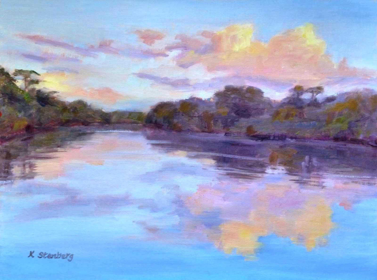
I am fascinated by water's ability for reflecting things above and around it.  Especially when there is no strong breeze, water acts as a lovely mirror.  At sunrise and sunset, when the sky takes on those ineffable hues of pale yellows, oranges, pinks, mauves, subtle blues and violets, water becomes the enchanting bridesmaid who accompanies the beautiful bride--the sky.  Throw in some magnificent clouds to the mix, we are in heaven on earth!

Thursday, December 15, 2011

"Walk along Autumn Canal" (oil on linen; 9" x 12") sold


"Walk along Autumn Canal"
sold
"Autumn Bliss" (oil, 9" x 12")
sold
"Autumn Canal" (oil, 12" x 12")

"Autumn Day along the Canal" (oil, 9" x 12")
sold

Canal is not really one of my series, although it surely looks that way.  The reason has to do with the beauty of Wide Water on the C & O Canal along the Potomac. Some places are like a painter's heaven, a gold mine, a jackpot. You can go there over and over and still find things to paint.  The C & O Canal is one of them. I had a good fortune to discover the place, thanks to the Art League Plein Air Painters, who went there several times this fall. It's always a good idea to paint with friends for safety and conviviality. I joined them twice. Each time, the weather obliged. I still have more pictures to work from. Yippee!

"Autumn Bliss" was the third painting from my "mini" series.  Can you tell whether it was done on location or in studio?  Surprisingly, "Autumn Canal," with all those details, was painted en plein air, whereas "Autumn Bliss," with a bolder design, was painted at home.  You can tell, however, that both have the similar feel in terms of the time of the season.

"Walk along Autumn Canal" (I am running out of titles!) is the latest canal painting.  The vantage point is just a short distance from the one in "Autumn Bliss."  It feels more painterly than "Autumn Bliss."  Perhaps I have finally gotten in touch with the painterly arist's zen.

Sunday, December 11, 2011

"Sunset Clouds" (oil on linen; 9" x 12") sold


"Sunset Clouds"
sold
"Lighthouse at Sunset" (oil; 9" x 12")
sold

It is a great idea to work in a series.  To get to the bottom of things, so to speak.  Sunset sky is one of my such on-going series.  I am perhaps inspired by my mentor, Sara Linda Poly.  She is my first oil painting teacher, whose luminous skyscapes never fail to take my breath away.  As a veteran plein air painter, she paints on location these "golden moments," which don't last very long.  Half an hour, tops, if you are lucky. 

Sara draws the landscape parts--trees and so on--on a toned ground first and waits for the sunset to work its glorious, spectacular magic.  It is, of course, hard to paint looking at the sun in rapidly fading light, and I don't know how she does it so well.  As a newbie to plein air painting, I prefer to paint these sunset scenes in my studio.  "Sunset Clouds" and "Lighthouse at Sunset" are my two latest attempts at sunset sky.  I am pleased with them, for now.

Tuesday, August 9, 2011

"Lone Lotus" (oil on linen; 12" x 9") sold


sold

Reference photo


Back to the water lily pond at Green Spring Gardens Park in Alexandria, VA.  I have a collector who loves my water lily/lotus paintings and asked me to paint several for his family.  It's always nice to be wanted, so I said yes!  His original request was to paint additional versions (i.e. copies) of "By the Lily Pond".  I did it once, and decided twice was enough.  How can I copy myself on and on, really!  I had a friend who sold a painting at a gallery but ended up doing two more copies of the painting because it was so popular.  I regret that I teased her at that time, because I was now doing exactly the same thing.

Instead, I decided to do a series of new paintings of these majestic flowers; I never get tired of them.  I have faith that either my collector or some other persons will like them enough to buy my creations.  Art is my job, but I want to enjoy the art-making process as long as I live.  It shouldn't become a drudgery, something I have to do pay the bills and send my child to college, and so on. 

By the way, I am going to take a break from blogging for a short while.  I have been working non-stop since last July when I launched my website.  Time to have some fun with my family.  See you in a couple of weeks!

Monday, August 1, 2011

"Sea Caves of California" (oil on linen; 9" x 12") sold


sold

Reference photo


Some vacations are more memorable than others.  The trip to California three years ago was one such happy memory maker.  There was a family wedding, which was held at a beautiful vineyard in Napa!  Visits with family were special enough, since we don't get to see them often as we live so away.  But one additional week spent just with my own family in the glorious light of California keeps generating a painting after another.  I must go back to California!

As I am focusing on water in Bobbi Pratte's landscape class this summer, I decided to paint from the above photo taken somewhere in northern California.  (You know how it is--after a while, you don't remember exactly where you took the pictures.)  The picture doesn't show much color in the sea caves because they are in the shadow; but I can see many different color changes in the water itself.  In the distance, it is cobalt blue.  As the waves approach the sandy beach, it changes from cerulean blue to a blue tinged with ocher.  The wet sand looks lavender.

I like the design too.  Three concentric waves all point to the sea caves, which I painted with warm, dark paints.  Sometimes I don't have to do anything other than just paint as Nature took care of the design for me!

Friday, July 8, 2011

"By the Lily Pond" (oil on linen; 12" x 9") sold


sold


Despite the threat of a heavy thunderstorm, five die-hard plein-air painting friends including myself went out to paint the water lily pond at Green Spring Gardens Park in Alexandria, VA.  The thing is that we are not going to have a nice, balmy weather until September in the mid-Atlantic region.  We might as well brave the elements so that we can show off to our soft friends what we are made of.

Having said that, it was hot and very, very humid.  It would cloud up, making us all nervous, then the sun would return to cast gorgeous shadows on lily pads.  The fluctuating light and generally intolerable weather conditions somehow led me to paint decisively so that I could go home as quickly as possible.  If I may say so, I like "By the Lily Pond" very much.  Unfortunately, I lost the photo file, so I cannot Photoshop it to show you the true colors of the painting.

Thursday, May 26, 2011

"Turquoise Time" (oil on linen, 12" x 9") sold


sold


On Sunday morning, Bobbi Pratte had her plein-air workshop students do a black-and-white value study prior to a full-fledged color painting.  I thought I would take it easy and paint just one boat after Saturday's challenge.  I sat down on my stool to do a study of the boat with a turquoise cover.  If you click the photo above, you can see my attempt better.  It didn't take a whole lot of time and actually looked nice, although I later ruined it by accidentally putting a plastic bag for soiled paper towels on top.

By the time I got to colors, the boat on the far right had left.  Bobbie thought I would be better off without it anyway.  She asked me what I was going to do with the top portion of the painting, which was not like what you see in my painting (there was a lot going on in that area).  I said I was going to simplify and treat it as one big shape of dark-toned reflections; she was fine with that.

One very important thing I learned from Bobbi is this: a boat sits in water, not on water.  The line created where it meets water is crucial.  Painting a simple boat was a good idea.  What I like about "Turquoise Time" is that it has a clear, strong message.  I often try to put too many things into a painting and end up with a fussy picture.  As the popular saying goes, less is often more.

"Peaceful Marina" (oil on linen, 9" x 12") sold


sold


On Saturday afternoon, Bobbi Pratte's plein-air workshop students painted a marina at Solomons Island, MD.  Water is hard to paint; boats are even harder to paint.  Two of them combined make a fabulous, but challenging subject for a plein-air painter. 

The reason why water is difficult to paint is that it's hard to tell what colors a body of water happens to be at a particular moment because it reflects sky and many other things all around.  Added to that are the currents, breeze, and the ripples caused by boats going by, which keep shifting the shapes of reflections.  Boats come in so many different shapes and sizes that drawing them in perspective is always a big headache.  I tried them last year en plein air and was not happy with what I produced.  So I challenged myself again this year.

As you can see from the photo above, I moved the boat on the right so that it would be within my picture to balance what's going on on the left side of the painting.  You cannot see in the photo the colors inside the boat shed.  There was a lot of reflected light bouncing into the wall, poles, and the boat.  That's why we paint outside, to really see.  It was chilly in the shade; the ducks in their mating season made quite a bit of noise; and sea gulls hovered in the air as the fishing boats returned.  Whenever I look at the painting, I will always remember these things.

Friday, March 25, 2011

"Orange Sail" (oil on stretched linen, 14" x 11") sold


sold


It is chilly today; the weather forecast is threatening snow tonight.  Time to look at a summery painting to cheer up.  A photo I took years ago became a reference for this studio painting.  It must have been a perfect day for the couple who sailed on the Potomac that day.  The river never looks this blue; its colors are a range of grays, to put it politely.  The sails were really those bright oranges--one of my favorite colors.  Orange and blue are complementary colors, so together they vibrate.

Sunday, March 6, 2011

"Fall Patterns" (acrylic on paper; 15" x 11") sold


sold

Do you like Wolf Kahn, a great colorist?  His calendar hanging in my office claims on the back that he is "probably the foremost American colorist."  Whether you agree with it or not, I surely love his semi-abstract art.  But I don't have the courage to paint with his bright yellows, mauves, aquamarines, pinks, and scarlets.  If I dare, my teachers would probably admonish me to tone them down to more "natural" colors.  Perhaps only masters, such as Kahn, can truly follow their aesthetic choices.

In "Fall Patterns", however, I hear the echos of Wolf Kahn.  Have you ever seen the violet fall foliage?  Why is the ground under the tall trees burgundy, or the sky so chalky Naples yellow?  But the painting works, and one feels that it is fall and the leaves are changing colors.  I don't know what got into me to paint like that, but surely like to do it again.

Tuesday, February 15, 2011

"Cherry Blossom" (watercolor on paper; 18" x 14") sold


sold


Cherry Blossom is the name of a tour boat that goes up and down the Potomac River.  On the day when I took the reference photo, it was glowing with the sunlight.  A perfect subject to try out the  watercolor technique that I learned in Jean Grastorf 's workshop!  She uses only three colors--a red, blue, and yellow--in large tubes, which she dilutes to a creamy consistency in small separate cups.  On a stretched paper, the whites on the drawing have to be protected with masking fluid. 

Then the messy and fun part begins--you pour the colors, letting them mix and mingle.  As the paper dries, you have to do this in several stages for darker values, at each stage protecting the areas of lighter tones with more masking fluid.  Tedious, yes.  But you just cannot get the same glowing effect with brushes.  The painting was juried into the Art League show in Alexandria, VA in 2005.

Thursday, December 30, 2010

"Tidal Basin in Bloom" (oil on linen, 7" x 7") sold


sold


The Tidal Basin during the Cherry Blossom Festival is an irresistible subject for a painter.  But it is impossible to paint en plein air with all those people milling around.  The reference photo was taken on a misty, overcast day, which created a romantic mood.  When parts of the country are under snow, it's perhaps good to remember that the spring will come in about three or four months.

Wednesday, October 20, 2010

"Day at the Dock" (oil on linen; 8" x 10") sold


sold


Water is hard to paint.  Winds, currents, and clouds keep changing the shapes of reflections.  As I have been watching my self-confidence erode lately--no sales in the two group shows in which I participated and rejections in the Art League shows month after month although I have worked so hard all summer--it was perhaps unwise to paint water.  But I did anyway because I am always drawn to the fluidity of water.  Besides, I am an Aquarius.

I struggled through the first attempt.  My mentor and teacher, Sara Linda Poly, who was there busily helping other students during a workshop in Easton, MD, basically left me alone to figure things out on my own.  I tried the second time--the same scene zoomed in on a slightly larger canvas.  Colors got more intense, shapes were simplified, and water reflections less belabored.  There is something to be said for persistence and painting the same subject twice.  I am going to keep painting water.