 |
| sold |
The famous view of the Bixby Bridge at Big Sur, California. Completed in 1932, the concrete span, one of the highest bridges of its kind in the world, soars 260 feet above the bottom of a steep canyon carved by Bixby Creek. I love Big Sur!

|
| sold |
The famous view of the Bixby Bridge at Big Sur, California. Completed in 1932, the concrete span, one of the highest bridges of its kind in the world, soars 260 feet above the bottom of a steep canyon carved by Bixby Creek. I love Big Sur!
 |
| "Donut Fest" |
The
following is the description of what we did in the eighth week of the
spring term, 2022 for my "Watercolor from Start to Finish" class (my online Zoom class with the Art League School
in Alexandria, VA).
 |
| "Sabrina at Hanauma Bay" |
The following is what we did in the seventh and eighth weeks of the spring term, 2022 in my "Watercolor Portraits" class (my online Zoom classes with the Art League School in Alexandria, VA).
 |
| "Figure Proportions I" |
 |
| "Figure Proportions II" |
 |
| "Shadow Patterns" |
 |
| "Sabrina in Hanauma Bay in Progress" |
 |
| "Two Women in Black" |
 |
| "Artist at 28" |
 |
| "Red Giraffe" |
The following is the description of what we did in the seventh week of the spring term, 2022 for my "Watercolor from Start to Finish" class (my online Zoom class with the Art League School in Alexandria, VA).
Finally, paint markings on the giraffe in cadmium red and restore the lost white with white gouache. Have fun!
 |
| "Mimosa Time" |
The following is what we did in the sixth week of the spring term, 2022 in my "Watercolor Portraits" class (my online Zoom classes with the Art League School in Alexandria, VA).
 |
| "Mimosa Time in Progress" |
The end game here is modeling the hand (with five fingers!) successfully so that it looks three-dimensional. When I realized that I had lost the light shapes, I reintroduced them with white gouache, and there you go, the
hand holding the champagne flute appeared in full glory.
 | |
| "National Cathedral" |
The painting is a commission for Catherine and her husband Andrew. Andrew went to St. Albans School, right next to the cathedral and practically grew up in and around the magnificent Gothic cathedral. He got married there and had planted a tree in front of the north side (entry area) with his father. It was an important sentimental project for Andrew and he chose this image personally so that his tree would be a part of the finished painting.
It was the largest oil painting project ever for me. It took about two months to draw, block in, paint and add finishing touches. I needed a little stool to reach the highest areas of the big canvas! Thank you for the opportunity, Andrew and Catherine, who were the most gracious clients.
I must say that my patience and drawing skills have improved much because of this project. The only drawback is that I couldn't take a proper photography of the huge canvas, so I had to make do with a quick shoot with my phone. What a shame!
 |
| Work in Progress I |
 |
| Work in Progress II |
 |
| Work in Progress III |
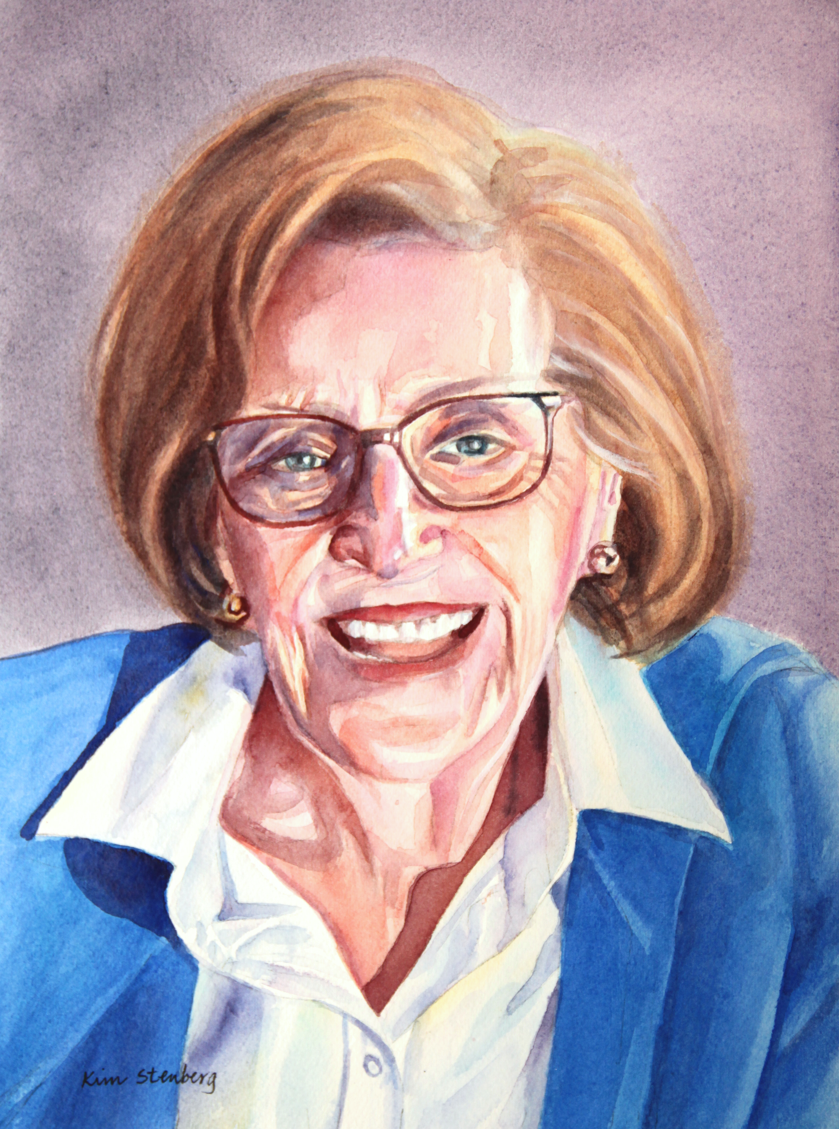 |
| "Margaret" |
This is a commission portrait for Christa. Her beautiful mother passed away last year at the age of 86 and the portrait is meant for her father. I have known Christa for over 20 years and it was an honor to paint her mother, whom I have never met but heard about when our daughters went to preschool together. It is time like this when I feel particularly good about being a portrait painter, helping my friends and other clients to remember the happy memories of their beloveds.