Tuesday, January 31, 2012

"Cardinal on Maple" (oil on linen; 10" x 12") sold


"Cardinal on Maple"
sold
"Robin in the Evergreen Bough" (oil, 8" x 10")
sold
"Blue Jay at Bird Bath" (oil, 8" x 10")
sold
"Early Spring Robin" (oil, 8" x 10")
sold
"Cardinal in the Snow" (oil, 8" x 10")
sold
"Winter Bird" (oil, 8" x 12")
sold
"Duck Pond" (oil, 8" x 10")
sold

Last fall I decided to do some bird paintings.  To date, I have seven under my belt.  "Cardinal on Maple" is my latest attempt at bird paintings.  As you know, I am an impressionist painter, not a super realistic animal painter.  So if you are an avid bird watcher and I got some avian anatomies wrong, please bear with my errors. 

I am more of an opportunistic bird watcher, if there is such a thing. The other day I spotted a male cardinal perched on green shrubs outside of my laundry room. I grabbed a camera and began to click away. This bird made a terrific model, turning its head to show profile, then facing forward for the front view, and so on. This went on for a while until it decided to retire from a modeling career.  I didn't dare to open the window for better shots (one knows better than that when dealing with a wildlife).  After photoshopping the best shot, I came up with the picture below.  Passable, yes, but the environment in which the bird was sitting left much to be desired.  I did some Internet research and found a picture of a scrawny-looking cardinal on a lush maple tree.


My photo

Reference photo for the maple tree

I got to work and painted "Cardinal on Maple" with joyous rapidity.  My gratitude goes to the anonymous photographer and the cardinal who lives in and is fiercely protective of my property.

Monday, January 30, 2012

"Spring Bouquet" (oil on linen; 10" x 8") sold


"Spring Bouquet"
sold
"From Spring Garden" (oil, 12" x 12")
sold

I painted "From Spring Garden" last spring after having taken Robert A. Johnson's still life workshop, excited at the realization that I could paint floral still lifes in oil.  I picked out three favorite spring flowers from my garden, challenging myself with some with florets--lilac and hyacinth.  I did a few more still lifes, always tormented by the conflicted desire--shall I go outside to paint flowers on such a beautiful day or stay put in my studio to learn to set up and paint still lifes?  The pleasure of companionship of fellow plein-air painters usually won out.  By late fall, the pickings from my garden were slim. Japanese anemones were the best I could do; "White Japanese Anemone" was the result.


"White Japanese Anemone" (oil, 12" x 10")
click here to buy

I love flowers with multiple tiny florets. Think lilac, cherry, hyacinth, hydrangea, etc. They are hard and intimidating to paint though.  It is funny that I used the word "intimidating."  How can anybody be intimidated by such small and lovely things?  But I do.  That is why I had printed out the reference photo for "Spring Bouquet" last spring, but never got around to paint from it.  The familiar delay tactics, if you know what I mean.

Spring is just around the corner in northern Virginia, with the temperature in the 50's day after day in late January!  I finally got inspired to paint "Spring Bouquet."  The setup on the kitchen table in front of a large window was backlit by the natural light from outside.  I got rid of the window panes and trees clearly visible in the picture, and painted the daffodil first.  After taking a deep breath, I began to paint gesturally the floret of hyacinth one by one.  It went surprisingly fast!  Many initial rough-edged brushstrokes were left alone to suggest movement.  After all, the hyacinths were alive and would have moved follwing light if I had painted them from life.  I let the painting dry a little, then refined the flowers and wobbly stems in the vase. How about that!  No reason to get stymied by flowers anymore.

I took a picture of snowdrops blooming in my garden yesterday.  Do you think I will paint them soon, or sit on the picture for a year?

Sunday, January 29, 2012

"Cherry Blossom Season" (oil on linen; 8" x 12") sold


"Cherry Blossom Season"
sold
"Spring Song" (oil, 12" x 10")
sold
"Weeping Cherry Blooming" (oil, 12" x 9")
sold

Cherry trees got to be the most seductive trees in the world.  Look at "Cherry Blossom Season," my most recent painting of cherry trees in full bloom.  Trunks and branches twist in all directions.  Not all cherry trees behave this way, of course.  Some have straight limbs, like those featured in "Spring Song."  The weeping variety in "Weeping Cherry Blooming" looks like cascading pink waterfalls. 

In all varieties, the fluffy clusters of pale pink flowers drape the trees top to bottom in early spring.  They all look like ballerinas in pink gossamer tutus.  Innocent and intoxicating at the same time.  Stand under their pink umbrellas.  You are transported to a pink heaven.  When they are spent, petals drift down like pink snow.  If there is a breeze, you get caught in the midst of a pink blizzard.  No slow, ugly death for cherry blossoms.  From beginning to end, there is nothing uncool about cherry trees in season.

I am utterly seduced by the magic of cherry blossoms.  I keep painting them, trying to capture their exuberant, yet delicate, essence.  Someday I will succeed to my heart's content.

Thursday, January 26, 2012

"Glorious Poppies" (oil on linen; 8" x 12") sold


"Glorious Poppies"
sold

"Red Poppies" (oil, 8" x 12")
sold

Last summer I spotted gorgeous red poppies at Green Spring Gardens Park in Alexandria, VA.  As I was leaving after a plein-air painting session, I didn't have the time or energy to do another painting.  I took a picture, thinking that I would come back soon.  I did a few days later, but the flowers were all gone!  As the Roman poet Horace said, it's carpe diem or dead flowers.  I had to console myself with the photo, which served as the reference for "Glorious Poppies."

Compare the new painting with "Red Poppies."  The old painting has a merit--soft, dreamy, etc.  But I absolutely prefer "Glorious Poppies"!  I don't know what's happening to me.  I seem to have become bolder, more confident, not afraid of strong contrasts, and so on.  The new one has more depth and interesting "details" too.  When one thinks of red poppies, one does not dream of a  romantic, pastel image, unless he is Claude Monet.  Aren't these papery, blood red flowers all about hot-headed passion?  "Glorious Poppies" fits the bill much better than my earlier attempt, I dare say.

Tuesday, January 24, 2012

"Mountain Waterfalls" (oil on linen; 12" x 10") sold


"Mountain Waterfalls"
sold

"Great Falls Roaring" (oil, 14" x 11")
click here to buy

Waterfalls are magnificent to look at and difficult to paint.  I have seen quite a few waterfalls, both in this country and mine (South Korea).  The biggest was the Niagara Falls, although my favorites are those in Oregon.  I shouldn't have tried to paint them on location until I had gained more experience in oil painting.  Who knew that rocks, trees, and everything else seemingly kept moving when I first set out to paint Great Falls last summer?  The noise, heat, and crowd got to me! 

I went back and "Great Falls Roaring" was the second attempt at this popular tourist attraction, close to the nation's capital.  The painting used to be a little bigger (16 x 12"), but I decided that I didn't really need that much foreground rocks and cropped it to the current size.  It's not the best painting of Great Falls ever painted; it was, however, a great leap forward for me.  So I am keeping it in my private collection.

It appears that the hardest part of painting waterfalls is keeping the balance between the hard and soft edges for the water.  It has to have hard edges here and there to maintain form.  On the other hand, if the water is hard-edged everywhere, the waterfall looks like icicles.  Since waterfalls usually occur in a rocky environment, one also has to paint rocks convincingly as hard, three-dimensional, bulky objects.  Surprisingly, neither tasks--painting water and rocks--are easy.

Does it sound like another mini-series coming up?  Yes!  How does one learn to paint something well unless one keeps at it many times?  So I painted "Mountain Waterfalls" today.  I don't know the name of this fall in Shenandoah National Park in Virginia.  But isn't it pretty?  The upper falls looks like lady fingers!  I thought that it would be a little easier to paint waterfalls from a photo.  It wasn't.  After lots of wiping out, I got this far.  What do you think of the result?

Friday, January 20, 2012

"Two Red Peppers" (oil on linen; 11" x 14") sold


sold

The still life setup

We don't often give ourselves and others enough time.  Enough time for sleeping; for eating (by doing other things like reading at the same time); for others to finish talking; or for painting.  We beat ourselves up, rush about, and get all stressed out as a result.  For instance, my still life class with John Murray on Wednesdays is always hectic.  Out of three hours, more than an hour is dedicated for the teacher's putting together three setups in a crowded studio, a quick demo, and a group critique. 

Instead of being disgusted with my painting as was by the end of the class, I decided to continue working on it at home with a photo of the setup.  I don't know whether it is cheating or not, but there was no reason whatsoever to get stressed out by the pressure of the limited time.  Painting is neither a race, nor a performance art.  It is a kind of meditation.  One is supposed to be truly present, mindful of the task at hand.  Unfortunately, I tend to paint fast and dash off one painting after another, quite a few of which turn out to be duds.  I am aware of my shortcomings and intend to work on them.

Anyhow, I am glad of my decision to take the above picture.  The drawing wasn't bad.  It was my initial treatment of the green and dark blue violet draperies that was problematic.  I had ignored all the folds and creases and had also made a straight "horizon" line where the fabrics met.  Dead boring!  The color of the green cloth was too warm; the brushstrokes were too grassy-looking.  I fixed the problems, as you can see.  I also worked some more on the peppers and bowl as well.  I am rather pleased with the final painting. 

The more I look at it, however, the more I see green and dark blue landscapes in the background.  The peppers and bowl look like huge objects lying on green fields, like Gulliver in the island country of Lilliput.  Perhaps I should stop meditating while painting by staring at my painting too long!

Thursday, January 19, 2012

"Fresh Snow" (oil on linen; 9" x 12") sold


"Fresh Snow"
sold
"Winter Morning" (oil, 9" x 12")
sold

As you know, I have painted quite a few snowscapes since last fall.  I am pretty much out of the snow reference material in this exceptionally mild, snowless winter.  Out of desperation, I dug out a photo I had used for "Winter Morning," and came up with a new painting, titled "Fresh Snow."  Cheeky!

I remember how pleased I was with the first version.  Now I look at it, I am not impressed at all.  Look at the reflections of the trees.  Don't you think they look anemic?  And what about the treatment of the distant woods?  Half-hearted, I say.  I admit that there is that ineffable softness in the old painting.  Nonetheless, I vote for the new one.  What do you think?

Wednesday, January 18, 2012

"Poppy Field" (oil on linen; 16" x 12") sold


After
sold
"Poppy Field" before revision

"Evening Island" (oil, 14" x 11")
sold

I have a tendency of quitting a painting too soon.  It's not because I am lazy.  It's because of the fear factor--if I continue working on this pretty darn good painting, I am going to ruin it!  Last week, in his first class of the winter term, John Murray told the students to be brave: "No one is going to die here.  We are not performing a brain surgery.  So go ahead, use big brushes and lots of paint, and knock yourself out."  Or something like that.

We got a good laugh at his encouraging comments, but they got me thinking.  I have a few paintings that are supposedly finished and framed.  Whenever I look at them, however, I am bothered.  Yesterday I decided to do something about this nagging sensation and unframed a couple of the guilty paintings.  There was nothing to lose, you see?  Just as when a painting is a knock-out, it is a knock-out; when a painting doesn't work, it doesn't work.  No judges will like them; nobody will buy them either.

"Poppy Field" was too wispy.  It looked good only when I turned on a lamp next to it.  So I turned up the chroma (color intensity) of the poppies and greens in the foreground.  For "Evening Island," I increased the value scale.  The sky along the horizon was lightened and the grassy foreground was deepened.  I also added texture with a rough bristle brush, dipping it into pure paints and mixing colors directly on the painting.

I am happy to report that no one died in the process and I just rescued two paintings from the ignominy of mediocrity.  Not a bad reward for courage!

Thursday, January 12, 2012

"Late Roses" (oil on linen; 10" x 8") sold


sold

I have been avoiding the reference photo for "Late Roses" since I took it last November.  I was into painting fall colors and snow scenes.  But there was another reason for my dillydallying.  It seemed like a lot of drawing to get the flowers right.  After the figure painting workshop last week, however, I suddenly felt like painting them. 

And I was right about my gut feeling.  Everything is relative.  Compared with the drawing and color mixing involved in a figure painting, it was nothing.  Of course, one has to get the gesture and color temperature of each flower just so.  But there is a lot more room for error in flower painting, to my relief.

I consider "Late Roses" a still life, although it wasn't set up on a table top, but in a natural setting.  An arrangement of a limited number of objects and a close look at them.  Isn't that a still life?  I suppose one could also call it an intimate landscape.


"Red and Green Apples" (oil, 11" x 14")
sold

Speaking of still lifes, I started taking a still life class with John Murray at the Art League School.  The first class met yesterday, during which I painted "Red and Green Apples."  Doesn't it look quite different from my usual stuff?  I loved the way John did the quick demo with a big brush, dipping into the huge piles of paints on his palette.  Bold colors and brushstrokes!  A great departure from what I experienced last week during the workshop with Stephen Early.  Check out his website to see his paintings, then you will know what I am wowing about.

John said, however, the same thing about the way I handled the shadows, as Stephen did, despite their different styles.  I see too many colors and end up fragmenting a dark value shape.  Interesting, isn't it?   Styles may vary, but the fundamentals in painting remain true.  I hope to learn much from my new teacher.  How exciting!

Wednesday, January 11, 2012

"Snowman and Barn" (oil on linen; 9" x 12") sold


sold


As I was painting "Snowman and Barn" on Monday, it started snowing!  There had been no forecast for snow, but it kept falling.  The first snow of this winter made all of us giddy with joy like the kids on the Christmas morning.  Alas, by yesterday, with the balmy spring-like temperature, there was no more white stuff to be seen. 

Another reason for my happiness was that I was painting a landscape, not a figure!  Boy, I was glad to be back to what I normally do--paint loose and suggestively.  No more uptight measuring and hours of staring a nude person to figure out the subtle color changes in the skin tone.  The moral of my experience last week is this: get out of your comfort zone once in a while; do something wild and get back to your life.  You will be wiser for the adventure.

The painting was based on a black and white photo.  The advantage of a challenge like this is that one gets to make up colors.  Ha!  it wasn't that hard to come up with lovely violets for distant woods; brownish wood colors for the barn; and the red scarf for the snowman.  I made the big tree on the right not clearly defined, although it was in the middle ground and a lot closer to the viewer than the barn, because I made the latter the secondary interest.  Of course, the snowman is the star.  I boldly put it in the middle of the picture.  Why not?  Relax and have fun.

Monday, January 9, 2012

"Lise" (oil on stretched linen; 20" x 16") sold


"Lise"
sold

Stephen's demo grisaiiles

"Sarah" (grisaille)

"Wayne" (grisaille 1 with lights blocked in)

The second grisaille with lights blocked in

One-hour grisaille with lights blocked in

Stephen's paintings under two different lighting conditions

"Wayne" (the first color study)

The second color study

Stephen with his long-pose demo painting

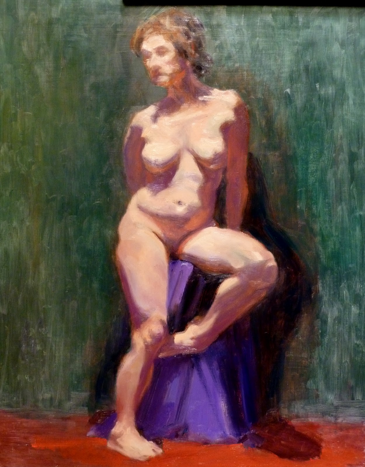
"Lise" (at the end of the first day)

"Lise" (at the end of the second day)

Last week I took a five-day figure painting workshop with Stephen Early at the Art League School in Alexandria, VA.  What an amazing and exhausting experience it was!  Stephen teaches at Studio Incamminati in Philadelphia, PA and has trained with Nelson Shanks, who is one of the foremost portrait painters today.  It was with much nervousness that I signed up for this workshop.  As you know, I am not a figure painter, but a landscape artist.  If I paint in a figure in a landscape, it is usually small and only gesturally.  But I have set a goal to become a better painter, and a good painter is supposed to be able to paint anything.  Right?

What I learned after five days of intense looking and trying to paint a figure is this: I am glad that I am not a figure painter!  Painting figures is too hard.  I noticed a different attitude among the workshop students from my watercolor and oil landscape friends.  There were twelve of us (like twelve disciples of Christ; Stephen has a beard to do the part, too!).  One was a beginner; I, of course, was a stray person in the wrong place. 

My friends generally participate in lots of shows and endeavor to sell their artwork.  Several of the workshop students I talked to were shocked when I asked them where they show and sell their paintings.  They were like monks who were in training to go deeper and deeper in their spiritual quest, and no more.  Their modest demeanor, I believe, has much to do with the fact that it takes a prodigious amount of work to reach the level in figure painting to be able to exhibit and sell with confidence and public esteem.

Think about it.  Drawing a figure convincingly itself is difficult enough.  Even a complete stranger to art can tell if something is wrong with the posture or proportion of a figure.  Add to that difficulty the dangerous issue of color.  You are pretty much walking in a mine field.  Let's say that I am painting a flower garden on a sunny day in late spring.  The sky is some sort of blue; there is a variety of greens (a horror for landscape painters!); and, of course, the color explosions in the flowers.  In other words, there are many colors one has to deal with, but you can see them clearly unless you are color blind.

But with a nude figure, there isn't going to be a splash of strong colors.  They are there, but they are so subtle that one has to be trained to look really hard.  At first, I couldn't see greens in mid-tones.  Purples in the shadows?  What purple?  As I continued to look as I was forced by the teacher, who would make an excellent drill sergeant, I began to see more colors, not just obvious reflected colors in the shadows.  Wow!  My eyes hurt, along with my feet, at the end of the day (the workshop ran from 9:30 am to 4:30 pm with a 45-minute lunch break, unlike most workshops that last from 10:00 am to 4:00 pm with a one-hour break).  It was, however, definitely worth the trouble.

The workshop went like this.  On the first day, we did many gesture drawings with burnt sienna and ultramarine blue--one minute, two minutes, five minutes, ten minutes, and twenty minutes--for hours until our arms ached.  Toward the end of the day, we were allowed to add lights (with cadmium scarlet, cadmium green pale, and titanium white) to the grisailles.  We did several of those.  Stephen's demos were short.

On the second day, we started right where we left off--the same exercises, without any demo by the teacher.  Why waste time with a demo?  In the afternoon, Stephen told us to forget all about careful drawing and do color studies, which turned out to be very similar to what I did in Rick Weaver's opaque watercolor workshop in December.  The purpose of these one-hour exercises was to learn to mix colors.  In the workshop, we had a warm, artificial lighting.  If we had had the natural, cool northern light, things would have been quite different, as you can see in the above photo of Stephen's two paintings done under different lighting conditions.  The teacher threw in some wild colors in draperies to make it "easy" for us to see.  Yes, we could see those colors; but mixing them right was not so easy!

For the last three days of the workshop, we worked on a long pose, with longer demos by Stephen in the mornings.  On the first day of the long pose, we did a careful drawing in grisaille, then blocked in the lights.  On the second day, we worked on the darks (I also painted in the background and floor).  I asked him whether this was how he worked.  His reply was no.  He doesn't operate that rigidly; but he thought that this methodical approach would simplify the matter for the workshop students. 

On the final day of the long pose and workshop, we went back to the lights to modify and adjust them.  Most students had gotten their midtones and darks too light, so there was much recalibrating of the values going on in the class.  Stephen went around, working on each student's work directly, which was a huge help, I must say.  He could have told us to do this and do that.  But the question is always "how"?  He would make color "notes" for us to see what he was talking about.  Stephen Early is a wonderful teacher--passionate, knowledgeable, gentle, funny, modest, sincere, etc.  I can go on.  I highly recommend him to anybody who is interested in learning to see and paint a figure.  As for me, I am happy to go back to painting landscapes!

Sunday, January 8, 2012

"Central Park Snowed In" (oil on linen; 10" x 12") sold


"Central Park Snowed In"
sold
"Snow Trees" (oil, 8" x 12")
sold
"Snow Creek" (oil, 9" x 12")
sold

As you can see, I have a mini series going on here--snowscape with trees and creek/pond.  If I paint the same scene over and over again, I will die of boredom and atrophy.  But as I continue to explore the same theme with variations, I gain a deeper understanding of the theme.  In "Snow Creek," I learned how the smaller area of the sun-lit snow seems to glow next to the much larger one of the snow in shadow. 

In "Snow Trees," I grouped the sun-lit and shadowed areas and assigned them the two separate sections in the picture plane.  I played around by intensifying the blues of the creek, to contrast them with the warm colors of the trees.  But my main concern and fun was to figure out how to paint wet snow clinging to trees.

In the first painting of the new year, painted on the New Year's Day--"Central Park Snowed In--" I am back to the meandering stream and snow-coated trees.  I am also contrasting a small sun-lit area with the rest of the snow-covered pond at Central Park, which is in shadow.  I have become more ambitious, introducing the background, which is very different from the rest of the painting and works as the foil for it: the blurred skyline of Manhattan.  I was also trying to vary the tones in the foreground to indicate different states of moisture from snow to ice (darker) to water (darkest).

Painting these small "daily" paintings has been a great tool for self-education and growth for an amateur-turned professional artist, which is who I am.  Last year I retired from teaching history at a college, something I had been doing over twenty years, and began with much trepidation the adventure of a self-employed , starving artist.  One doesn't get younger.  It was now or never to do something I truly wanted.  Wish me luck!

Monday, January 2, 2012

"Winter Bird" (oil on linen; 8" x 12") sold


sold


Red berries are heavily laden with snow.  One can feel that it is a cold gray day.  No matter.  The small black bird is intently and happily feeding.  I don't know why this painting induces a happy feeling in me.

HAPPY NEW YEAR!