|
| "Oregon Coast Sunset" |
The following is the description of what we did in the nineth week of the winter term, 2022 for my "Watercolor from Start to Finish" class (my online Zoom class with the Art League School in Alexandria, VA).
The
spring registration has begun. Please come back in the next term to
continue your watercolor journey with me. You guys, so many of whom are
beginners, are doing an amazing job! Here is the link for the "Watercolor from Start to Finish" class; here is the link for the "Watercolor Portraits" class, in case you want to move up a notch and challenge yourself even further!
The image you see above is the class demo of "Oregon Coast Sunset" from yesterday. The theme was "Inspired by Tonalism". Tonalism was an American art movement from the late 19th century.
Its most prominent practitioners were George Inness and James Whistler
(his nocturnes). They used a narrow value range in low chroma colors to
create their serene, romantic landscapes.
Admittedly
I am not a tonalist; I am more of an impressionist. It doesn't prevent
me from exploring this intriguing movement; perhaps there are things for
us to glean from their approach to painting landscapes and cityscapes.
We
first wetted the paper and brushed in very pale winsor lemon and
permanent rose while not touching the blue/white bands along the
horiozon. In the next wet-on-wet layer, we did the same thing, this time, with cobalt blue where you see blues.
We decided to deepen the colors slightly by doing the third wet-on-wet
layer, repeating the same color patterns.
Then we painted the headland on dry paper with the dark mixture of French ultramarine blue and burnt sienna, pushing it more brown and slightly lighter along the horizon to suggest sea fog. While the wash was drying, we continued to establish the rugged terrain of the headland with diagonal strokes.
Try not to lose the initial mid-dark wash. Remember this is a tonalist
painting! Don't turn the whole headland shape into a black mess; think 3
and 4 in the value scale, not 1 (black) or 2 (near black).
When the headland was dry, I
decided to experiment by laying down a horizontal stroke of white
gouache over the horizon and headland to suggest sea fog shrouding the
view. I put down the white and quickly softened the top and
bottom edges of the long stroke. Some headland serrated edges got
smeared, but I like the result. This is an optional step; don't do it if
you are unsure of your ability. You can easily ruin the painting that
is going well so far.
Let's finish the painting by adding a series of horizontal strokes to suggest the incoming waves.
The colors are the same as the headland mixture, except lighter.
Sometimes we used it bluer; sometimes added a little alizarin crimson.
Some lines are darker. There are two
bands of blues; the second band is where the dark reflection of the
headland begins. The bottom third of the painting has the big
reflections.
The colors are the same as the headland's, except it's bluer than the headland color. Remember that
if you don't overmix two colors, you can push it either way depending
on your need. Let it me one of the biggest gains from my class.
Make sure the reflections are not too dark (you destroy the serene mood) or too light (you lose the impact). The edges should be uneven and a not solid, straight vertical line. Make curvy strokes toward the bird.
The bird may be tiny, but it's very important in the design.
If it had not been there in the reference, I would have invented it to
balance the massive mirror-image shapes of the headland and reflections
on the right side. It's a some kind of a coastal bird (sandpiper?).
Don't forget to paint the shadow. The color is the same as the
reflections and headland.
That's it! Once again, I want to thank you for your awesomeness! Here
is the past nine weeks in a nutshell. Most of you have come a long way,
blossoming from absolute beginners to intermediate watercolorists. I am
proud of all of you for your progress!
 |
| "Waikiki Sunrise" |
 |
| "Zippy Zebra" |
 |
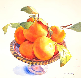
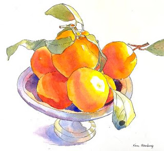
| "Mandarin Oranges in Silver Bowl" |
 | |
| "Red Amaryllis" |
 |
| Winter Shadows" |
 |
| "Crocuses in Snow" |
 |
| "Snowman and Red Barn" |
 |
| "Starry Sky" |