Showing posts with label Holmes Run. Show all posts

Sunday, October 31, 2021

"Storm Moving In" (watercolor on paper; 9" x 12")

"Storm Moving In" (watercolor, 9" x 12)
 

I decided to blog about my online Zoom classes with the Art League School in Alexandria, VA. This is what we did in the sixth week of the fall term, 2021 for my "Watercolor from Start to Finish" class.

The first business this week was finish "Holmes Run Rocks". First, we painted the first layer of the rocks and pebbles with the mixture of quinacridone gold and a little bit of purple (cobalt blue and crimson). Make sure you paint around the sun-struck highlights (if you lose the white of the paper, you lose the game!). If necessary, draw the pebble shapes first, then paint around them.

We started the second stage with the big tree shape using the dotty pointillist method of applying paints. I used three tones: the light tone green (Winsor lemon and cobalt blue), the mid-tone green (cadmium yellow pale and ultramarine blue), and the dark tone (ultramarine blue and permanent alizarine crimson). The tree trunks and branches were painted with the mixture of ultramarine blue and burnt sienna (this is called Jane's Gray).

Then, we moved on to the rocks and pebbles with the dark shadow tone of cobalt blue/ultramarine blue and crimson. We have already established the mid-tone in the first stage. You will see the rocks and pebbles suddenly emerging before your eyes!

The final touch that brought the painting together was the glazing of the big water shape. We wetted the shape first, then dropped the mid-tone mixture of gold and burnt sienna. Quickly we painted in the reflected shadows of the trees and the submerged pebbles with the purple mixture of ultramarine blue and crimson. If your paper is too wet, whatever you put down will fuzz into the water!

"Holmes Run Rocks Demo" (watercolor, 12" x 9")

As you can see my demo painting above looks a little different from my sample painting below. Which one do you like better?

"Holmes Run Rocks" (watercolor, 12" x 9")

The main business of this week was painting a triptych, "Storm Moving In". The first image below is the reference photo I took on Assateague Island. Instead of painting from it as is, I cut it up into three unequal pieces, moved them around until I found a pleasing design, which is the second image. Basically, I placed the tall left panel in the right side and put the two divided right panel pieces in the left for the heck of it!

Anything that moves (in this case, a seagull in flight) becomes the center of interest, which happens to fall in the sweet spot of the picture (one quarter way down from the top and one quarter way in from the left edge; there are four potential sweet spots in a picture, by the way). The tall right panel is now the anchor; the two smaller panels on the left are not of the equal size.

"Storm Moving In Original Reference"

"Storm Moving In Reference Reimagined"

Making sure the horizons are straight and at the same level, and at right angle to the side edges of the paper, we drew them with the help of a ruler/straight edge. Then, we divided the picture with a 1/2"-wide washi tape (not so tacky tape) into three small paintings that cohere.

We started the painting with the right long panel. First we wetted the paper and painted the glowing sky shape and the glowing wet sand shape with the pale mixture of Winsor lemon and cadmium red pale. When the paper was dry, we wetted the paper again and dropped the blues in the clouds and the ocean waves with the blue mixture of cobalt blue and burnt sienna. The dark sand shape was painted in the mid-dark tone of ultramarine blue and burnt sienna.

When the first layer (which took two separate steps to avoid contaminating the alternating shapes) was dry, we glazed each shape with a little darker mixtures to create edges and drama. We will pick up from here next week!

"Storm Moving In Demo in Progress" (watercolor, 9" x 12")


Sunday, October 24, 2021

"Holmes Run Creeks" (watercolor on paper; 12" x 9")


"Holmes Run Rocks" 

 
I decided to blog about my online Zoom classes with the Art League School in Alexandria, VA. This is what we did in the fifth week of the fall term, 2021 for my "Watercolor from Start to Finish" class.

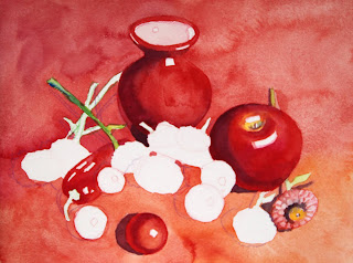
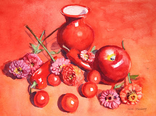
We spent about two hours trying to finish up "Red on Red", but didn't manage. Lol. First, I drew a cherry tomato in graphite to explain the local color, highlight, form shadow, reflected light, and cast shadow. It's easy enough, but once we start painting in color, things can go haywire. I painted around the highlight shape with cadmium red; for the form shadow, I switched to permanent alizarin crimson, but switched back to red for the reflected light. If you use enough paint, you won't need to glaze. When the tomato was dry, we painted the cast shadow with the purple mixture of cobalt blue and crimson.

All the cherry tomatoes and red peppers were painted the same way. As a matter of fact, the vase and apple were painted the same way too, although they may have required a glaze or two; the apple has the belly button and stem area that require some fiddling.

As you put down a wet stroke of one color next to the still wet stroke of another color, make sure you remove the excess water from the brush to avoid runbacks. Don't try to be thrifty by using only one or two sheets of paper towel for the entire painting session. The difficulty of watercolor has everything to do with the control of the ratio between water and paint and the sensitivity to the moisture level in the brush and on the paper. (The other difficulty is the one-way-ticket painting process unique to watercolor, meaning we proceed only in one direction: from light to dark. That's why we have to organize and plan ahead.)

Then we painted the green stems and leaves with the green mixture of Winsor lemon and cobalt blue. Let the first layer dry and do the second layer with a darker green on the shadows along the stem and on the leaves to create form. When the second layer is dry, paint the cast shadows with the purple mixture of crimson and cobalt blue.

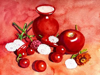
For the zinnias, we first drew the overlapping layers of tiny petals with appropriate colors of watercolor pencils and started the first layer of wash in orange (the mixture of red and cadmium yellow pale), permanent rose, red purple (the mixture of rose and a little cobalt blue), etc. When it was dry, we had to redraw the petals because watercolor pencil lines disappeared, giving us one more opportunity to redraw. For the dark crevices, I used the red purple mixture (crimson and cobalt blue).
 
If you wish, you can have fun with the tiny yellow star-like shapes in the center of some zinnias by painting them with the mixture of yellow and white gouache with a rigger brush. Finish the zinnias by painting dark purple cast shadows. Below are the two demo process images and finished painting. 
 

"Red on Red in Progress I"

"Red on Red in Progress II"

"Red on Red" (watercolor, 9" x 12")

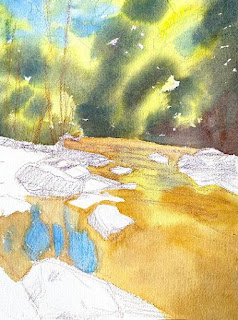
This week's main lesson was painting rocks. I first drew the design with watercolor pencils (green, brown, blue, and violet). The shading in the rocks is demonstration only; don't do it yourself. Landscapes can be overwhelming to many students. Think the big shapes first. In this exercise there are five big shapes: the sky and trees, the middle ground cluster of rocks and pebbles on the left, the foreground big rock and pebbles, the big water shape, and the small group of rocks in the middle ground on the right. Group the shapes and cluster them in a meaningful manner that allows the viewer's eye to enter the painting and travel and linger.

I started painting from the top (that's how we generally paint landscapes) on dry paper, with cobalt blue for the sky holes, yellow green (lemon and a bit of cobalt blue) for the tree foliage in the sun, dark green (quinacridone gold and ultramarine blue) for the dark foliage in the shadow, and dark brown (burnt sienna and ultramarine blue) for the shadowy area in the right bottom of the big tree shape.

For the water, I used gold, yellow green (lemon and a little bit of cobalt blue), and warmer gold/burnt sienna as it gets closer to the bottom of the paper. Please develop "Holmes Run Rocks" up to this point. We will finish the painting together next week and move on to the triptych exercise!


"Holmes Run Rocks in Progress"


Sunday, September 14, 2014

"Snow Creek" (oil on linen; 8" x 10")


click here to buy


Down the street on which I live, there is a park along a small creek, called Holmes Run. When my daughter was little, we spent many hours there, launching paper boats, throwing rocks, and hopping on stepping stones across the creek and back.

These days, I usually go down to the creek by myself after a snowfall to admire the crisp winter beauty.  "Snow Creek" was based on a photo I took last year on a bitingly-cold morning.

Tuesday, November 27, 2012

"Morning After Snowfall" (oil on linen; 8" x 10") sold


sold


I have painted the same scene twice before.  Yes, I like it that much.  It is a creek down the street where I live.  I took the reference photo many years ago before the age of digital cameras.  Because of the severe erosion caused by heavy rainfalls over the years, this stretch of Holmes Run doesn't look quite the same anymore.  As it hasn't snowed much last winter, I keep painting the same enchanting winter wonderland from my old print. 

I have been rereading Kevin Macpherson's Landscape Painting Inside and Out for the umpteenth time. I think I finally get it.  He talks about the light and shadow families and keeping them separate throughout the painting session.  He also emphasizes using MORE PAINT.  I tried my darned best to paint as if I meant it, with as fewest strokes as possible. 


"Fresh Snow" (oil, 8" x 10")
sold

You probably cannot tell much difference between the new painting and the old one ("Fresh Snow") other than the temperature difference (caused by the quirks of photography), but I assure you that I had a lot more fun with the new one and painted it faster.  Of course, painting fast is not the  goal, but the speed implies decisiveness and enthusiasm.  The way I painted "Morning after Snowfall" is the direction I am pursuing--bolder, fresher, and more lively.

Monday, November 7, 2011

"Winter Creek" (oil on linen; 8" x 10") sold


"Winter Creek"
sold

"Winter Morning" (oil, 9" x 12")
sold

Both paintings above are based on the pictures I took many winters ago down the street along Holmes Run in Alexandria, VA.  We don't usually get much snow in northern Virginia.  So whenever there is a bit of snowfall, it is a snow day and everybody is happy.  I am from a country (South Korea) that gets lots of snow every year.  I've got to see snow in winter; otherwise, I feel deprived.

And I love to paint snowscapes.  Although it gives local residents much pleasure, Holmes Run is a small creek, not a particularly scenic one at that.  But look at my paintings!  It's the snow that transformed an ordinary creek into a winter wonderland.  No omnipresent, oppressive greens as leaves had fallen.  White snow, which has hints of the sun's warmth, makes big bold shapes or sparkling, lacy tendrils.  The creek with wonderfully fuzzy reflections of bare trees on the opposite bank is a bonus, which provides a nice dark shape in the middle ground.  I hope we get some nice snow this winter, not just dustings.

Thursday, January 27, 2011

"Winter Walk" (acrylic on illustration board, 20" x 30") sold


sold


Nature is not famous for moderation, and has hit the Northeast with another huge snowstorm.  This time, Washington, DC got caught in her furor as well.  Hundreds of thousands of homes are without power; some drivers got stranded on George Washington Parkway for up to 13 hours!  Oh, well.  At least children are home having fun playing in the snow.  

The sun is out. I am going to take a walk in the neighborhood park and take some pictures.  The park has provided many inspirations for my artwork over the years, and maybe I will get lucky today.  The painting won the Second Place in the Potomac Valley Watercolorists show in 2004, and was juried into the Art League show in Alexandria, VA in 2006.