Friday, March 18, 2022

"Raven" (watercolor on paper; 12" x 9")


"Raven"


The following is what we did in the eighth weeks of the winter term, 2022 in my "Watercolor Portraits" class (my online Zoom classes with the Art League School in Alexandria, VA). 

Lots of things were on my mind (in addition to being dead tired), so I may have talked too lengthily. My apologies. All the things I covered, I stand by them. I talked about the importance of accurate measuring and showed you my work-in-progress (a 40" x 40" oil commission painting of the National Cathedral from the north side) to prove that, if you know how to measure with the aid of a proportional divider, you can draw anything.

If your drawing of the subject is wobbly, no matter how hard you work on the project, it will never turn out satisfactory. I once worked on a watercolor portrait commission, which required five drawings and three paintings to satisfy the client and her three teen-age/college age daughters. Why? Watercolor is a relatively unforgiving medium and you can't really correct once you start painting. Please trace if you know your drawing is weak. There is absolutely no dishonor or shame in that! Arches paper is not where you practice drawing; you do that in sketchbooks, if possible, daily.

I also talked about the importance of the variegated background wash that goes down first to set the tone. Wrong color choices and poor executions often lead to poor paintings.

I introduced you to my contemporary watercolor hero, Shirley Trevena and her book, "Artist's Studio: Vibrant Watercolours". (My dead watercolor hero would be John Singer Sargent, LOL.) Her style is not everybody's cup of tea, but her colors and design sense are absolutely divine. My palette is a modified version of hers. She doesn't do portraits per se, but one must get inspirations from all manners of artists, past and present, if you are really serious about your art.

For the hair of "Raven", I used almost exclusively Moonglow and Piemontite genuine (both by Daniel Smith). They both granulate and are effective in achieving that soft Afro look without much ado. Your black subject will, of course, have different colors and require different paints. Always paint the overall lightest color first (in my case, the mixture of French ultramarine blue and burnt sienna), then start carving out dark shapes.

For the skin tones, I started out by toning the highlight shapes (including the whites of the eyes and teeth) with a very pale cobalt turquoise light (Winsor Newton). Then I pondered about the general color palette of the young woman and decided she has a lot of orange and mahogany (reddish brown). I hardly used any burnt sienna.

I do feel strongly about, when painting black subjects, avoiding the earth colors which tend to mud up everything they touch. The only exception may be mixing, let say, an earth color like burnt umber with a transparent color such as Winsor violet, but what does that dark mixture have to do with the human skin tones?

So went in cadmium orange (yes, I have it; I also have cadmium red orange; it beats having to mix them all the time!), cadmium red, and my favorite cool red, Sennelier Helios purple. For darks, I used perylene maroon, perylene violet and ultramarine violet (my favorite is by Schmincke, but it's very expensive!).

The rest is always the same. Make the dental arch and eyes appear rounded by darkening the corners. Don't stain the teeth yellow even if they appear so in the reference; you may have to model each tooth carefully (observation is the key as anywhere else).

The brows are not caterpillars; they have volume and they should arch at the right places. They are not of the same tone or hue as they travel, hugging along the brow ridge.

Be careful with the the nasolabial fold shapes. If you want to ruin the expression of a portrait, this is where you concentrate first, LOL!

Darks should be dark enough. The black skin tones are generally dark in the first place, so you will need more layering to achieve the rich luminousity.


Sunday, March 13, 2022

"Zippy Zebra" (watercolor on paper; 9" x 12")


"Zippy Zebra"


The following is the description of what we did in the seventh week of the winter term, 2022 for my "Watercolor from Start to Finish" class (my online Zoom class with the Art League School in Alexandria, VA).

At the beginning of the class, I shared my sample paintings for the spring workshop ("Painting Sunsets in Watercolor") and for the summer workshop ("Painting Beach Figures in Watercolor). Please join me on April 2 and 3 for the sunset workshop, which is filling up fast!

The spring registration has begun. Please come back in the next term to continue your watercolor journey with me. You guys, so many of whom are beginners, are doing an amazing job! Here is the link for the "Watercolor from Start to Finish" class; here is the link for the "Watercolor Portraits" class, in case you want to move up a notch and challenge yourself even further!

Next we painted "Zippy Zebra". First, we wetted the paper thoroughly and dropped cobalt blue, quinacridone gold and burnt sienna. This variegated wash should go down, not thoroughly mixed (then it's no longer variegated!), but randomly to suggest green growths outdoors. Keep the wash mid-tone, not light; use enough paints. If the wash turns out too pale, you have to wet the entire negative space again and do the second layer. The fortune never favors the wishy-washy wimps!

Then we gave a very pale gold wash in parts of the back to start "modeling" the form. We talked a great deal about the meaning of "form (a three-dimensional thing) on a two-dimensional surface of the paper. We painted long, narrow form shadow along the neck with the mixture of cobalt blue and a little cadmium red. We also painted small form and cast shadows in various parts with the same mixture.

Understanding how to make a form look round through the correct rendering of soft-edged form shadows (shadow, core shadow and reflected light) and cast shadows (sometimes soft-edged, but usually hard-edged) takes a great deal of practice and years of experience! So take it easy, if you having trouble controlling soft/hard edges. This is an advanced stuff!

Last, but not least, we painted the stripes in the dark mixture of French ultramarine blue and burnt sienna (this mixture is called Jane's Gray and it's an optical black). Make sure the stripes are dark, not mid-tone. Whenever in doubt, take a picture of your work in progress, turn it into a black-and-white image by desaturating it with your phone photo editor app (if you only scan your images, you will have to figure it out somehow), and compare it with the reference. This is the fool-proof way of self-critiquing, which is a very important skill to develop.

Be careful not to make the stripes to smooth-edged in the body of the zebra. Be also super careful to render the awesome mohawk hair along the spine to appear soft. The top edge is more burnt sienna than just dark. Apply some strokes along the edge to suggest the hair texture (most textures should occur at the edges and not inside; this kind of texture is a lot more effective!)

Carry on painting the dark stripes in the head, paying extra attention to render eyes and the muzzle, which has quite a bit of burnt sienna at the central top area. Don't obliterate the barely-noticeable nostrils and mouth opening that's catching light. Any portrait, either of a human or an animal, should show the anatomy of the subject. 


Friday, March 11, 2022

"Dame Maggie Smith" (watercolor on paper; 12" x 9")


"Dame Maggie Smith"


 The following is what we did in the sixth and seventh weeks of the winter term, 2022 in my "Watercolor Portraits" class (my online Zoom classes with the Art League School in Alexandria, VA).  

I worked on "Dame Maggie Smith", picking up where I left it off last week. The left side of the face in generally warmer and lighter; the right side, darker and cooler. I showed you how to paint wrinkles, not as lines but as long shapes, softening them as I went along. These wrinkles must go in when all the planes/structures have been painted to satisfaction. Additional details never make a painting.

At the end, I added the white gouache touches whenever I felt I have lost highlights. We use it with a lot less water, but never straight out of the tube. It dries lighter than you expect, so you may have to go over more than once. If you went too far, with white patches all over the place, you will have to glaze over them with very pale tones (yellow or red depending on the situation).

I also emphasized never to underline the lower lid lines. Don't paint nostrils as dark slits! They often connect with surrounding dark or mid-dark shapes. Be careful with the lips; connect the lips (especially lower lip) with the surrounding tones.

The neck is much darker (although there are some highlights) than the face. I used cad red, madder brown, perylene maroon, perylene violet, cobalt blue, and ultramarine violet.

The eyebrows should be part of larger, mid-tone shapes, not isolated caterpillars. They also change values/hues they arc.

Except the blue (cobalt blue) or violet (I used ultramarine violet), the shadows in the face and neck are all warm.The hair cast shadows, which connect with the form shadows of the face.

I talked about the hair last week. Make it appear soft with extensive lifting/softening along the hairlines (both outer and inner) and inside the hair shape. The hair is a series of long light/mid-tone/dark shapes, never individual strands.


For the last hour, I talked about how to paint portraits of dark-skinned subjects. The dark skins are never to be painted with earth colors (burnt sienna, raw umber, burnt umber, sepia, etc.), which will only result in dull, dirty looking complexions. They vary a great deal: you can find ocher, gold, orange, red, brown, mahogany, magenta, green, blues, and various shades of purples.

"Earth Color Swatches"

You can mix your own browns with cad red/cobalt blue or cad red/permanent sap green, pushing the mixture either way. They are preferable to burnt sienna, which, by itself, never takes my breath away. I am sharing with you the swatches of reds, violets, and some additional colors (including Piemontite genuine by Daniel Smith--my only brown, which I use on its own).
"Mixing Your Own Browns"


"Red Swatches"

"Purple Swatches"

"Additional Color Swatches"

At the very end of the class, I showed you how I would paint the black hair. I decided to wet the hair shape and drop the mixture of ultramarine blue and burnt sienna. I also showed you how to soften the hairlines (both inner and outer) by going around with a clean damp brush before the hair shape dried. What you see is the highlights. I will add darker shapes of the hair (while softening edges at the same time; remember the hair is all about softness) and finish the portrait next week.


"Raven in Progress"


Sunday, March 6, 2022

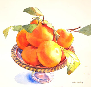
"Mandarin Oranges in Silver Bowl" (watercolor on paper; 11" x 10")


"Mandarin Oranges in Silver Bowl"

The following is the description of what we did in the sixth week of the winter term, 2022 for my "Watercolor from Start to Finish" class (my online Zoom class with the Art League School in Alexandria, VA).

Yesterday I talked a lot to inspire you into doing more art and especially more drawing everyday. Bert Dodson's Keys to Drawing is an invaluable drawing resource any aspiring artist should have in her or his bookshelf and do exercises from daily. The fountain pen with waterproof ink (instead of Micron pens) I use when I am traveling or at home is the Platinum Carbon Ink Desk Fountain Pen. It has an extra fine line; the one I have been using for several years extensively shows no wear; I have two (one with black ink and the other, brown).

The brush pen I showed is the Pentel Arts Pocket Brush Pen. There are many similar brush pens in the market and this one is IT. It has a steep learning curve and not everyone's cup of tea. At the end of the day, all you need for drawing practice is a sketchbook and a pencil!

I am not sharing any links for watercolor sketchbooks. There are too many out there to bother and it's a personal choice. You gotta go through several until you find your favorite. And please finish all your sketchbooks so that you can brag about it (very few people do)!

I also talked about drawing in perspective with the aid of a ruler, which is not necessary but I bet opened your eyes. Some of your drawings were definitely wonky. Although I said a wonky drawing is preferable to a sleek, traced drawing, it doesn't mean you have to live with wonky drawings for the rest of your life. Nobody is born with the gift to draw beautifully. Even the great masters practiced incessantly.

After the light pencil drawing was done (erase the construction lines if you have any), we did the line work over with a dip pen and black India ink. This is when I "redraw" where I see drawing errors. Yes, you can draw without the prior pencil drawing. It's a nerve-wrecking, yet exhilarating experience. You have no idea how risky and dangerous an artist's daily life is! You don't have to be a snowboarder. Lol.

You can apply a slight pressure where you want an emphasis (this is called a varied light weight in art lingo). Be careful with this, otherwise you end up with a sprung pen (permanently ruined!). India ink also has a steep learning curve. Just because you felt awkward using the dip pen and ink first time, don't give upon them. Practice!

In the pen and wash technique, the pen line does at least 60% of the work, so the wash (watercolor part) goes fast with minimum fuss. That's why this technique is so popular among travel-journal artists. It has a bit of illustration feel and perhaps that's why so many illustrators use it (or is it the other way around)?

I am not going to tell you what colors I used for that reason. Keep colors of the mandarin oranges bright and glowing (don't forget the alizarin crimson core shadows though)! This glowing illusion comes from leaving the highlights pure white by painting around! (You can do that with the leaves or silver bowl or anything shiny you feel like painting). The darks were the usual mixture of ultramarine blue and crimson. For the silver bowl, I used cobalt blue as the base color and added different paints as fit.

Try to paint the shadow (luminous and beautiful purple, and not dirty-looking; remember overmixing results in dirty colors and it's the curse to the watercolorist) when the base of the bowl is still wet. Your painting should have a flowing look, not a disjointed and disharmonious one. That's why I often start painting the object B right next when the object A is still wet so that watercolor will bleed (yes, definitely nerve-wrecking).

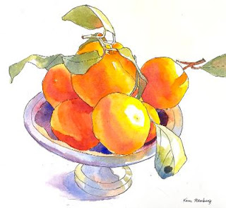
Below is the image of the demo. In the demo, I didn't do any glazing because I ran out of time. It doesn't mean you shouldn't either. When the painting is "finished", assess the situation and do some glazing if deemed necessary. Remember that too many beginners and no-longer-beginners announce their paintings finished too soon! 


"Mandarin Oranges in Silver Bowl Class Demo"


Friday, March 4, 2022

"Baby Angeline" (watercolor on paper; 12" x 9")


"Baby Angeline"

The following is what we did in the fifth and sixth weeks of the winter term, 2022 in my "Watercolor Portraits" class (my online Zoom classes with the Art League School in Alexandria, VA).

First, I showed some pages from Burne Hogarth's Drawing the Human Head to illustrate the developmental stages of the human head.

"Child Head Development I"

"Child Head Development II"

"Child Head Development III"

Next, I talked about my skin tone palette. Cadmium red is the base for all races; I may add a little yellow (it doesn't seem to matter a great deal which yellow); I may shift to a cooler red (usually Sennelier Helios purple); I may add a little cobalt blue or permanent sap green. To suggest the sky reflections on the face, neck and shoulders, I may use very pale cobalt turquoise light (Winsor Newton) at the beginning. I don't use burnt sienna or burnt umber for dark-skinned subjects; they tend to muddy up complexions, which should be luminous no matter what.

Rose dore (Winsor Newton) and Naples yellow reddish (Schimincke) are my cheat colors, which I sometimes use. Some paints are very opaque or highly pigmented; cobalt turquoise light, Naples yellow reddish and, of course, cadmium red are such colors. Use lots of water! Always use lots of water!

Skin Tone Color Swatches.jpg
"Skin Tone Swatches"

Since skin tones are generally reddish, the color red is the most important hue for painting portraits. I have many; you don't have to buy all of them. The chart below shows the warm red and cool reds. The color temperature is a relative thing, so the same color can look cool or warm depending on what's next to it. I also use lower-chroma colors such as perylene maroon and perylene violet. (I have another chart of violets!) I don't have time to mix all these colors (some can be mixed; others cannot) in the middle of washes because watercolor dries fast leaving blotchty patches.

Color Swatches Reds.jpg
"Warm and Cool Red Swatches"

Finally, I did a little demo of an infant portrait (just the most nerve-wrecking first layer). I will finish it in the next class. 

"Baby Angeline in Progress"

This week I finished "Baby Angeline" and showed you what colors I use for the skin tones. What's important in painting an infant is making sure the structure of the head is apparent and highlights are preserved!

For the face and neck, I painted the highlights with very pale cobalt turquoise light, then continued with pale cadmium red (sometimes with a little cad yellow pale). If the area felt cool, I used instead Sennelier Helios purple (I highly recommend this paint; I don't use permanent rose much). I also used cobalt blue and a little permanent sap green whenever I saw blue or green. Caucasian skin tones have a lot of blues and greens! For the neck, I also used perylene maroon and perylene violet, and madder brown. And of course many layers!

For the blue eyes, I used indigo blue (never use bright blue for blue eyes!)

For the dark lines or shapes in the face (such as nostrils, upper lash lines, the inside or corners of the mouth), use warm darks (perylene maroon, perylene violet, moonglow, the mixture of blues and crimson leaning warm, etc.). The upper lash lines may be cool. Never use paynes gray or indigo blue. And layer and instead of going too dark too fast!

For the hair, I used burnt sienna (Daniel Smith) and cad red (you can't tell where the hair begins and the forehead begins, so I painted accordingly).

As you can see in the finished image above, I used a lot of cool red in this portrait and reserved cad red for warm areas only. The name of the game is layering with pure colors and avoiding lines. Infants are all about softness, so avoid getting the skin tones dirty by overmixing (it applies to all ages and races!) and making too many lines.


Sunday, February 27, 2022

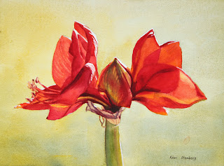
"Red Amaryllis" (watercolor on paper; 9" x 12")


"Red Amaryllis"


The following is the description of what we did in the fifth week of the winter term, 2022 for my "Watercolor from Start to Finish" class (my online Zoom class with the Art League School in Alexandria, VA).

This week we painted "Red Amaryllis" to explore the color red and the complimentary harmony of reds and greens. We have three reds on our required palette, among them cadmium red is warm red and permanent rose and permanent alizarin crimson are cool reds. They are all high-chroma colors, but one can argue that crimson is slightly duller and also darker than the other too. If you want to mix bright oranges, think cad red; if you want to mix beautiful violets, think cool reds (along with warm blues: cobalt blue and French ultramarine blue).

In terms of mixing greens (the complimentary of reds), it depends on how bright, softer, or deeper you want them to be. If you want bright greens, mix Winsor lemon (cool yellow) with Winsor blue (cool blue). If you want a softer green, start with cad yellow pale (neither cool nor warm yellow) and add a soft blue (cobalt blue). If you want a deeper, darker green, start with the darkest yellow we have (quinacridone gold) and the darker and warmer blue (ultramarine blue).

I also showed two tube greens and what you can do with them: permanent sap green and Winsor green (red shade). Neither is necessary, but fun to have.

Color mixing is based on theory and experience. When you know exactly how to mix what colors to create which tones you have in mind, you are an advanced watercolorist. We have completed all the color studies of primaries and mixing secondaries and grays. I hope you have made many color swatches and are comfortable with your ten colors. As you add more paints to your palette (let's say 18 as your palette has as many wells), continue practicing color mixing. Make a book of color swatches as reference. Please remember that you don't mix with white gouache and ivory black/neutral tint.

"Green Swatches"
 
 
In the main portion of the class, we painted "Red Amaryllis". We wetted the big negative space thoroughly and carefully (this takes more time than actually dropping paints onto the wet paper). Then we dropped the gentle green mixture of cad yellow pale and cobalt blue (slightly bluer in the bottom; we are painting a variegated wash). If it dries too light, you didn't use enough paints (think light mid-tone); rewet the paper and do the second layer. If your wash dried too homogenized (all yellow or all blue), rewet the entire paper and drop the missing color in that area only and let the colors fuzz on their own.

We painted the flowers with all three reds, yellow, red orange and purple mixture. As you put down a wet stroke after another wet stroke of a different color, you may lose control and end up with a blob of a homogenized color. It's because your brush has too much water. You can avoid this frustration by layering methodically yellow, orange, red orange, cad red, rose, crimson and purple (as we did in painting yellow crocuses in "Crocuses in Snow"). But the color red has a full value range and we need several more layers than painting yellows.

Paint the flowers section by section. All petals receive at least two layers, some 3-5 layers. For dark purple accents, we mixed crimson with ultramarine blue. This may have to be done two layers as well.

For the central bud, we used yellows, red orange, and crimson first, then in the second layer, we glazed with the green mixture (lemon and cobalt blue). In other words, we have to separate reds and greens by glazing (optical mixing instead of literal mixing); or, we end up with the dull browns.

We painted the papery skins with the pale mixture of quin gold and purple (crimson and ultramarine blue), then glazed with darker purple mixtures.

We painted the green stem in various greens in two layers. Try to create the illusion of the cylindrical form. It's a littler darker along the left side and gets warmer toward the light; I even painted a strip of a little crimson right next to the yellow green on the right to make it slightly darker.

Crop the painting accordingly and don't leave the subject floating in the middle. The harmony of the positive shapes and the negative space is a very important part of design process. I am seeing some paintings with the amaryllis taking up the entire painting and going beyond the edges; I am not sure it's a pleasing design. But it's up to you. Everybody has different aesthetics.

Sunday, February 20, 2022

"Winter Shadows" (watercolor on paper; 12" x 9")


"Winter Shadows"


The following is the description of what we did in the fourth week of the winter term, 2022 for my "Watercolor from Start to Finish" class (my online Zoom class with the Art League School in Alexandria, VA).

The main business of the day was painting "Winter Shadows" to explore the color blue and the complimentary harmony of blues and oranges. By the way, why the next two pictures not so great? My DSLR camera lens causes this distortion whenever I take a picture with images on white paper. I tried with my phone; the distortion was less but the colors were not as good as those taken with the "real" camera. I take a lot of time to get the images to look like the originals (the purpose is not to make the image better than the artwork!)

"Blues and Mixing Dark Browns"

"Mixing Oranges"

As for the painting itself, we wetted the sky shape only and dropped a pale yellow (Winsor lemon) on the sky to mimic the warm late winter afternoon light. Don't make the sky shape too big by placing the horizon too low. Design is the most important stage of the painting process.

We painted the three trees to the left of the center of the sky in yellow orange (cadmium yellow pale and a little cadmium red) to suggest the setting sun right behind them, warming them up. Then I painted the rest of the trees (big and small) in various browns (some warmer and lighter, others cooler and darker) with the brown mixtures made with cadmium red or burnt sienna and cobalt blue. Sometimes a tree may start cool and darker at the base and end warmer and lighter at the top.

Next, we painted the dark fallen trees with the mixtures of burnt sienna, French ultramarine blue, and occasionally permanent alizarin crimson. Don't mix them thoroughly! Take time with your drawing/painting these dark shapes (or any shapes) to make them look organic and interesting. Remember we are shape makers!

Finally, we painted the mid-tone cobalt blue shadows (not too dark or not too light), occasionally dropping very pale lemon or crimson to suggest reflected light. Use lots of water in all your washes. If you are dragging a barely damp brush around, you will not be able to paint the big cobalt blue shadows, with accent colors charged in, without making a mess!

Look at my demo painting and observe how the blue shadows spoke out from the top off-center of the three yellow orange trees where the light source (the sun) is located. This is a one-vanishing-point painting. Keep the blue shadow consistent and don't get too dark or too light. The shapes must maintain its mid-tone value! Don't forget to paint small animal footprints!