Showing posts with label floral still life. Show all posts

Sunday, February 27, 2022

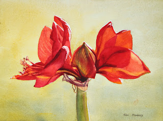
"Red Amaryllis" (watercolor on paper; 9" x 12")


"Red Amaryllis"


The following is the description of what we did in the fifth week of the winter term, 2022 for my "Watercolor from Start to Finish" class (my online Zoom class with the Art League School in Alexandria, VA).

This week we painted "Red Amaryllis" to explore the color red and the complimentary harmony of reds and greens. We have three reds on our required palette, among them cadmium red is warm red and permanent rose and permanent alizarin crimson are cool reds. They are all high-chroma colors, but one can argue that crimson is slightly duller and also darker than the other too. If you want to mix bright oranges, think cad red; if you want to mix beautiful violets, think cool reds (along with warm blues: cobalt blue and French ultramarine blue).

In terms of mixing greens (the complimentary of reds), it depends on how bright, softer, or deeper you want them to be. If you want bright greens, mix Winsor lemon (cool yellow) with Winsor blue (cool blue). If you want a softer green, start with cad yellow pale (neither cool nor warm yellow) and add a soft blue (cobalt blue). If you want a deeper, darker green, start with the darkest yellow we have (quinacridone gold) and the darker and warmer blue (ultramarine blue).

I also showed two tube greens and what you can do with them: permanent sap green and Winsor green (red shade). Neither is necessary, but fun to have.

Color mixing is based on theory and experience. When you know exactly how to mix what colors to create which tones you have in mind, you are an advanced watercolorist. We have completed all the color studies of primaries and mixing secondaries and grays. I hope you have made many color swatches and are comfortable with your ten colors. As you add more paints to your palette (let's say 18 as your palette has as many wells), continue practicing color mixing. Make a book of color swatches as reference. Please remember that you don't mix with white gouache and ivory black/neutral tint.

"Green Swatches"
 
 
In the main portion of the class, we painted "Red Amaryllis". We wetted the big negative space thoroughly and carefully (this takes more time than actually dropping paints onto the wet paper). Then we dropped the gentle green mixture of cad yellow pale and cobalt blue (slightly bluer in the bottom; we are painting a variegated wash). If it dries too light, you didn't use enough paints (think light mid-tone); rewet the paper and do the second layer. If your wash dried too homogenized (all yellow or all blue), rewet the entire paper and drop the missing color in that area only and let the colors fuzz on their own.

We painted the flowers with all three reds, yellow, red orange and purple mixture. As you put down a wet stroke after another wet stroke of a different color, you may lose control and end up with a blob of a homogenized color. It's because your brush has too much water. You can avoid this frustration by layering methodically yellow, orange, red orange, cad red, rose, crimson and purple (as we did in painting yellow crocuses in "Crocuses in Snow"). But the color red has a full value range and we need several more layers than painting yellows.

Paint the flowers section by section. All petals receive at least two layers, some 3-5 layers. For dark purple accents, we mixed crimson with ultramarine blue. This may have to be done two layers as well.

For the central bud, we used yellows, red orange, and crimson first, then in the second layer, we glazed with the green mixture (lemon and cobalt blue). In other words, we have to separate reds and greens by glazing (optical mixing instead of literal mixing); or, we end up with the dull browns.

We painted the papery skins with the pale mixture of quin gold and purple (crimson and ultramarine blue), then glazed with darker purple mixtures.

We painted the green stem in various greens in two layers. Try to create the illusion of the cylindrical form. It's a littler darker along the left side and gets warmer toward the light; I even painted a strip of a little crimson right next to the yellow green on the right to make it slightly darker.

Crop the painting accordingly and don't leave the subject floating in the middle. The harmony of the positive shapes and the negative space is a very important part of design process. I am seeing some paintings with the amaryllis taking up the entire painting and going beyond the edges; I am not sure it's a pleasing design. But it's up to you. Everybody has different aesthetics.

Wednesday, September 26, 2018

"Coral Roses" (oil on stretched linen; 20" x 16") sold


sold


"Rose Posy" (oil, 8" x 10")


Recently I've received a rather odd commission request to repaint "Rose Posy" much larger in a vertical format with a glass vase against soft yellow/green background. The client also wanted the roses to be coral instead of pink. I said it would be very difficult, but she insisted that it should be done. The result several weeks later is "Coral Roses".

Many things have happened since I accepted the commission: the tragic death in the family, the trip to California to attend the memorial service, the recovery from my cataracts surgeries, and the Hurricane Florence with daily rains. I struggled with the commission in the middle of all the above.

I found the image of the "Fairy" rose, which I believe is what I had originally painted during Danni Dawson's workshop at her house a few years ago. They are tiny roses and I had to blow them up, shift colors to coral, and somehow rearrange individual flowers to make a pleasing composition. It was probably the hardest commission ever!

What did I learn from this project? Don't accept an unreasonable commission? Not sure. Because I am about to accept another totally-out-of-the-comfort-zone commission. I decided to turn it into a learning experience. I usually paint what's in front of me, or from a reference photo. But what if I don't have a good reference? I will have to make up, be creative. I am constantly evolving as an artist, embracing challenges, instead of doing same stuff all over again. So, bring it on!


"Fairy"

Sunday, August 5, 2018

"Watercolor from Start to Finish": I Am Teaching Watercolor at The Art League School!


Week 1: Introduction and Painting Donuts!
"Donut Bliss" (watercolor, 7" x 10")
Click here to buy


My dear friend Alice Kale, who teaches watercolor, has been pestering me to do the same for some time, and I finally surrendered to her persuasion. I took over another teacher's slot at The Art League School in Alexandria, VA. It is a six-week-long intensive introduction to watercolor, called "Watercolor from Start to Finish". An enthusiastic class of 18 has been meeting every Saturday from 9:30 to 12:30 for watercolor fun. At this point, we have just one more class to go. And what fun has it been!. This is indeed the beginning of a new chapter in my art career, as I will continue to teach as a regular staff at The Art League School from now on!

The first week I brought donuts to the class, since I thought their simple shapes and fun associations would encourage the beginners (minus two who are experienced watercolorists) to dive into watercolor without fear. And I was right. Some students ate donuts first and painted them from photos!


Week 2: Fruits and Vegetables
"Carrot Bunch" (watercolor, 9" x 12")

Drawing and painting from life is an invaluable training whether the subject is humble everyday things, or a figure. So carrying on the theme of still life of donuts of the first week, the students were asked to bring some fruits and vegetables of their choice for the second class. Several brought a bagful of produce; I love this class! Shapes got a little more complicated, but we are not so worried about drawing for now. (To those who want to improve their drawing skills, I recommend Bert Dodson's Keys to Drawing.) Instead we are focusing on the importance of values, edges and color temperatures in a painting.


Week 3: Landscapes
"Bixby Creek Bridge, Big Sur" (9" x 12")
sold

Week 4: More Landscapes
"Yaquina Head Lighthouse Sunset" (watercolor and gouache, 9" x 12")
Click here to buy

For the next two weeks, we painted landscapes. I did a demo of gradated/varigated washes and the students were let loose to work with the photos they brought, while getting accustomed to the watercolor terms such as washes, glazes, wet on wet/wet on dry, dry brush, etc. Landscape painting can get overwhelming with so many elements to deal with, so I emphasized that the class should look out for big shapes first. If one breaks down a picture into big shapes, there are usually only three to five. That's not so hard, is it? But landscapes often involve leaf/grass textures; boy, many went astray with them. It's been 23 years since I started painting watercolors and the memories of the excitement and frustrations are all coming back!


Week 5: Animals
"Emperor Penguin Love" (watercolor, 8" x 6")
Click here to buy

Changing gears, we painted animals this week. What fun it was! Several painted their dogs; many others painted colorful birds. It all comes down to this: paint what you know well and hold dear. And it showed. I am definitely keeping the subject of animals as part of my curriculum.


Week 6: Flowers
"Red, White and Blue" (watercolor, 7.5" x 10.5")
Click here to buy


One more week to go. Next week we will be painting flowers. We actually took a vote on this; between flowers, portraits, buildings, flowers won. But I let the class know they can paint whatever they choose for the final week. It's going to be fun and challenging no matter which!


Week 6: My awesome class intently painting flowers

Sunday, April 9, 2017

Wednesday, September 14, 2016

"Bouquet with Irises Nigella and Foxglove" (watercolor on paper; 10.5" x 10.5")


click here to buy


Yellow, blue, and purple bearded irises, yellow Dutch iris, Nigella, and foxglove in a white porcelain vase with rose decorations are really the very best my garden can offer.  Yup, I have been holding out the best among my recent watercolors until the last!

Wednesday, June 22, 2016

"Bountiful Peony Bouquet" (watercolor and oil pastel on paper; 10.5" x 15.5")


click here to buy


With this peony painting, I did something unusual and crazy.  After finishing the painting, I decided not to leave the background pure white.  I first tried several vertical stripes of dark colors, which made the background come forward.  Oops.  How about dark squiggly lines in oil pastel over those random stripes?  Then, I spritzed water where the flowers met the background to soften the edges.  It was a complete mess!  Finally, I strengthened the now fuzzy-looking bouquet with white gouache and dark paints.  I think the result looks rather dramatic and contemporary.  What do you think?

Friday, April 22, 2016

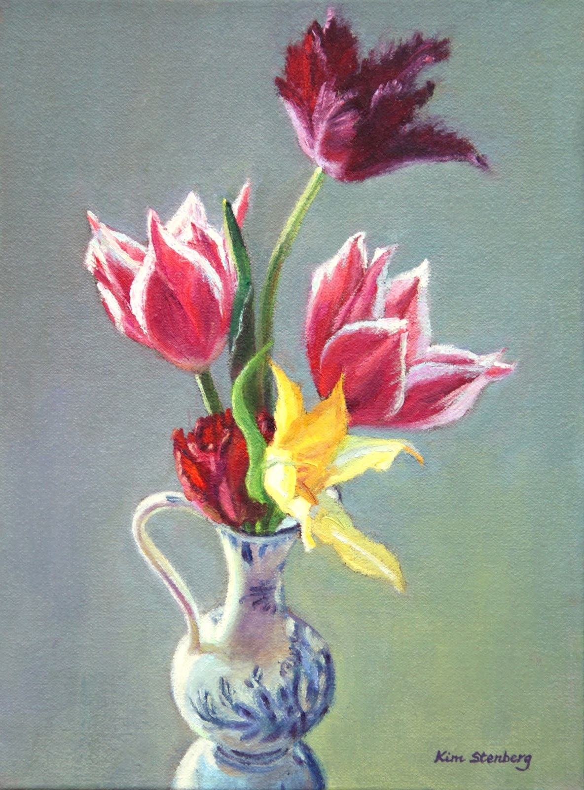
"Tulips in a Dutch Vase" (oil on stretched canvas; 12" x 9")


click here to buy


Danni Dawson gave her portrait painting class a homework last week: paint an interesting tulip still life.  So did we, as she must be obeyed!  This is what I came up with.  I arranged five tulips from my garden in a small Dutch vase on a reflective metal serving platter, then painted them against a muted gray background.  Sadly tulips are pretty much done now.  My husband and I are going to plant lots of specialty tulip bulbs this fall for my painting fun!

Wednesday, April 6, 2016

"Primavera" (oil on stretched canvas; 18" x 24") nfs


nfs


Danni Dawson, my portrait painting teacher, gave the class an assignment for the spring break--either a large still life or a 3-4' full-length portrait in outdoor setting.  The operative word was BIG.  I considered painting a self-portrait, because I have a perfect reference photo.  But where do I hang a 40"-long painting?

Then, I thought of the picture of spring flowers with my darling daughter in the background that I took three years ago.  Get two birds with one stone, as it is both a still life and an outdoor portrait!  How big?  A 24" x 30" or a 22" x 28" canvas would make the girl's face larger than life size; do I want to see it day in day out in the family room, no matter how much I love my baby?

So I settled on a 18" x 24" canvas, with a 6 1/2"-long head of my daughter.  It took many sessions to finish the portrait/still life.  The subject, my husband, and myself are all happy with it.  We'll see what Danni has to say about the painting.

By the way, why did I title the painting "Primavera"?  Because it is about spring--the season and the phase in a life!

Monday, April 4, 2016

"Twelve Inches Squared of Sunshine" (oil on stretched canvas; 12" x 12") sold


sold

I put sunflowers, purple statice, and white Peruvian lilies in a creamy porcelain pitcher by the kitchen window.  One sunny afternoon, I saw the side-lit bouquet; et voila, it was a painting subject.  It has been a few weeks since the magical moment, when I finally got around to paint "Twelve Inches Squared of Sunshine".

Wednesday, February 24, 2016

"Autumn Bouquet" (pen and wash; 8.5" x 8.5")


click here to buy


I have forgotten about this quick painting I have done last year.  My elderly neighbor sent me this gorgeous bouquet as a get-well/Thanksgiving gift.  I was overwhelmed at her kindness.  A bountiful bouquet of yellow and orange flowers--roses, chrysanthemums, and lilies--evokes a perfect autumn day. The orange ribbon is the icing on the cake.

Monday, November 30, 2015

"Delft Blue Love" (pen and wash; 11" x 5")


click here to buy


My irises bloomed again in the fall to my great joy. I put a stem with two flowers and a bud in a Delft blue vase for this minimalist still life in pen and watercolor wash.  I love it so much that I am going to a series of paintings in pen and wash!

Monday, November 16, 2015

"Spring Delights" (watercolor; 10.5" x 15")


click here to buy


A row of small vases filled with bright spring flowers--yellow and white daffodils, yellow woodland poppies, and pink and purple hyacinths.  Have you seen a more cheerful still life?

There was another, smaller version of this painting, which I finished on October 21, on the day of my fainting and big fall.  Unfortunately, the painting got spattered with my blood.  I decided to keep it as a memento mori, as the reminder of how short and precious life is.


Wednesday, November 11, 2015

"Spring Still Life with Bleeding Heart" (watercolor; 8" x 8")


click here to buy


Another watercolor floral pick-me-up!  I am going to let you in on a secret.  The pink camellia was not pink at all in my original arrangement; I only have a white camellia bush in my garden.  When I painted the flower as was in the reference photo, it simply faded away into the white background.  I rescued it by adding a pink blush!

Saturday, November 7, 2015

"Daffodil Dazzle" (watercolor; 9" x 9")


click here to buy


Daffodils are pure sunshine.  If you feel sad and hopeless, get some daffodils.  Every fall, my husband and I plant hundreds of bulbs, most of which are daffodils.  Come spring, we are in a daffodil heaven!

Two springs ago, I made a dazzling bouquet of white and yellow specialty daffodils in a white porcelain vase.  Then I threw in a small sprig of purple hyacinth to match the purple shadows.  Oh, I love daffodils! 

Thursday, November 5, 2015

"White Lilacs and Silver Dollars" (watercolor; 8" x 8")


click here to buy


This spring, whenever the sun shined, I gathered flowers from my garden.  I put them in different vases and took pictures.  When I combined white lilacs with magenta silver dollar flowers in a pink bowl, I was clearly inspired!

Sunday, November 1, 2015

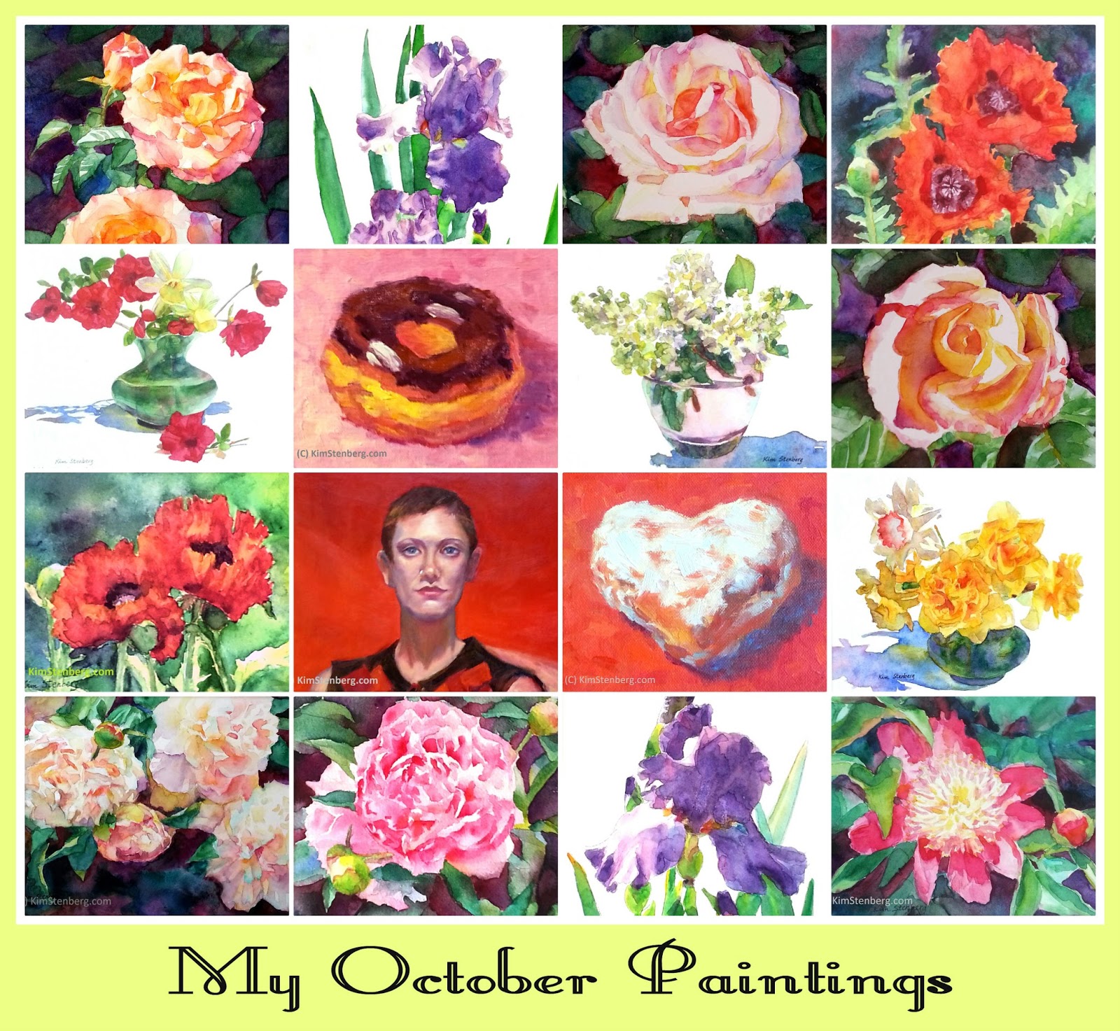
The Collage of My October 2015 Paintings


The collage of my October 2015 paintings


I was super productive last month until my accident!  Which painting is your favorite?  This month I will be probably busy with custom pet portraits for the holidays, but still intend to squeeze in a few watercolor florals.  Wish me luck!

Friday, October 30, 2015

"Azalea Sass" (watercolor; 8" x 8")


click here to buy


Wednesday evening of the last week, I fainted at home and fell forward.  I lost consciousness for a few seconds.  When I came to, I was in excruciating pain in a big puddle of blood. I have several fractures in the nose and right cheek bone, which require surgery.  After hospitalization, several tests and more to come to find out what caused the fainting episode, I am taking it easy.

Even after a full recovery, things won't be the business as usual.  Life is precious.  Everyday is a blessing.

Wednesday, October 21, 2015

"White Lilacs in Rose Vase" (watercolor; 6" x 6") sold


sold


I got excited by the watercolor floral still life on a white background that "Daffodil Sunshine" was all about.  So I looked for old pictures of similar setups that I had taken this spring and in the past years and found a whole bunch.  I am in business for a while!  How do you like this simple, yet, lovely bouquet of white lilacs in a dainty rose vase casting deep purple shadows in the spring sun?