Showing posts with label mixing greens. Show all posts

Sunday, February 27, 2022

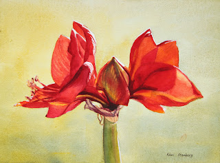
"Red Amaryllis" (watercolor on paper; 9" x 12")


"Red Amaryllis"


The following is the description of what we did in the fifth week of the winter term, 2022 for my "Watercolor from Start to Finish" class (my online Zoom class with the Art League School in Alexandria, VA).

This week we painted "Red Amaryllis" to explore the color red and the complimentary harmony of reds and greens. We have three reds on our required palette, among them cadmium red is warm red and permanent rose and permanent alizarin crimson are cool reds. They are all high-chroma colors, but one can argue that crimson is slightly duller and also darker than the other too. If you want to mix bright oranges, think cad red; if you want to mix beautiful violets, think cool reds (along with warm blues: cobalt blue and French ultramarine blue).

In terms of mixing greens (the complimentary of reds), it depends on how bright, softer, or deeper you want them to be. If you want bright greens, mix Winsor lemon (cool yellow) with Winsor blue (cool blue). If you want a softer green, start with cad yellow pale (neither cool nor warm yellow) and add a soft blue (cobalt blue). If you want a deeper, darker green, start with the darkest yellow we have (quinacridone gold) and the darker and warmer blue (ultramarine blue).

I also showed two tube greens and what you can do with them: permanent sap green and Winsor green (red shade). Neither is necessary, but fun to have.

Color mixing is based on theory and experience. When you know exactly how to mix what colors to create which tones you have in mind, you are an advanced watercolorist. We have completed all the color studies of primaries and mixing secondaries and grays. I hope you have made many color swatches and are comfortable with your ten colors. As you add more paints to your palette (let's say 18 as your palette has as many wells), continue practicing color mixing. Make a book of color swatches as reference. Please remember that you don't mix with white gouache and ivory black/neutral tint.

"Green Swatches"
 
 
In the main portion of the class, we painted "Red Amaryllis". We wetted the big negative space thoroughly and carefully (this takes more time than actually dropping paints onto the wet paper). Then we dropped the gentle green mixture of cad yellow pale and cobalt blue (slightly bluer in the bottom; we are painting a variegated wash). If it dries too light, you didn't use enough paints (think light mid-tone); rewet the paper and do the second layer. If your wash dried too homogenized (all yellow or all blue), rewet the entire paper and drop the missing color in that area only and let the colors fuzz on their own.

We painted the flowers with all three reds, yellow, red orange and purple mixture. As you put down a wet stroke after another wet stroke of a different color, you may lose control and end up with a blob of a homogenized color. It's because your brush has too much water. You can avoid this frustration by layering methodically yellow, orange, red orange, cad red, rose, crimson and purple (as we did in painting yellow crocuses in "Crocuses in Snow"). But the color red has a full value range and we need several more layers than painting yellows.

Paint the flowers section by section. All petals receive at least two layers, some 3-5 layers. For dark purple accents, we mixed crimson with ultramarine blue. This may have to be done two layers as well.

For the central bud, we used yellows, red orange, and crimson first, then in the second layer, we glazed with the green mixture (lemon and cobalt blue). In other words, we have to separate reds and greens by glazing (optical mixing instead of literal mixing); or, we end up with the dull browns.

We painted the papery skins with the pale mixture of quin gold and purple (crimson and ultramarine blue), then glazed with darker purple mixtures.

We painted the green stem in various greens in two layers. Try to create the illusion of the cylindrical form. It's a littler darker along the left side and gets warmer toward the light; I even painted a strip of a little crimson right next to the yellow green on the right to make it slightly darker.

Crop the painting accordingly and don't leave the subject floating in the middle. The harmony of the positive shapes and the negative space is a very important part of design process. I am seeing some paintings with the amaryllis taking up the entire painting and going beyond the edges; I am not sure it's a pleasing design. But it's up to you. Everybody has different aesthetics.

Monday, December 6, 2021

"Parc de La Tete d'Or in Lyon, France" (watercolor on paper; 12" x 9")


"Parc de La Tete d'Or in Lyon, France"


Dappled light is the spotted light which comes through gaps in a tree canopy and produces the feeling of light and the airy, cheerful mood in a landscape and cityscape. In order for dappled light to occur, we need two conditions: bright sunny weather and the presence of deciduous trees with leaves. On a bright sunny winter day, you may have cast shadows of trees, but no dappled light. On overcast days, you don't get dappled light either.


"Autumn Park" Demo Painting


After drawing the design lightly with watercolor pencils, I painted the first layer of wash, starting with the sky holes with the mixture of cobalt blue and cobalt turquoise light (Winsor Newton). I let it dry first before proceeding to paint the light yellows and oranges of the big tree leaf shape. I continued blocking in the yellow green shape of the grass, the two orange shapes along the path, and the path itself with quinacridone gold. Keep everything light (value) and bright (chroma). We are painting light! 

 Before moving on to the second layer, I talked about how to mix greens (leaves), purples (cast shadows and dappled light on the path), and browns tree trunks and branches). Mixing greens are easy enough; add a blue to a yellow. But which blue and yellow? It depends. By mixing them with one blue at a time, I proved both yellow and blue make a difference, but it's actually yellows that seem to have a bigger impact on the results: a spring green (winsor lemon), foresty green (quinacridone gold and cadmium orange), or in-between green (cadmium yellow pale).

 The bottom line is that if you want a lighter, warmer green, add more yellow and if you want a darker, cooler green, add more blue or go for a darker blue (ultramarine blue or winsor blue). When greens get dark enough, you have to switch to purples! My go-to purple mixture is that of ultramarine blue and permanent alizarin crimson.


For browns, think the complementary colors of blues and oranges/red oranges. The classic mixture is Jane's Gray (ultramarine blue and burnt sienna by Daniel Smith). You can also mix cobalt blue with burnt sienna to make a homemade sepia. Cadmium red and cobalt blue make a beautiful purplish brown. Add winsor violet to cadmium orange with enough water, you get a luminous brown (again think complementary colors)!


I layered and layered with an increasingly darker colors on the leaves, grasses, trees, and painted shadows on the path. I splattered and made leaf-like, organic-looking brushstrokes. In order to create a sunny-looking painting, you need a light, mid-tones, and darks. Many darks are purples. Greens can have many values from light yellow green to dark blue green.


As you can see the group critique on Sunday afternoon, everybody did a fabulous job! You learned a great deal about the importance of value above all else! You learned the various qualities of color: value, temperature and chroma (intensity). You learned the basics of how to control edges to create soft edges. In my experience as a watercolor instructor, students have a lot of trouble grasping the concept of color temperature. The control of edges is very hard indeed. But it's the value that stumps the most.

In terms of paint handling, I emphasized the importance of using enough water! Some of you learned to use enough paint to overcome the anemic look that is common among beginners. But in order to achieve the juicy, watery look of the finish painting, one must use enough water.

And let's not forget not overmixing! I looked at some of your palettes and I see completely mixed batches of greens, browns, purples, etc. Your palette should have batches of half mixed colors that show both colors at each ends so that you can use both warm and cool sides of the same mixture.

I hope to see you in the future either in my online classes or in in-person workshops. I will be teaching the "Watercolor Portraits" class on Thursday 1-4 pm and the Watercolor from Start to Finish class on Saturday 9:30 am - 12:30 am. I am planning to teach the "Painting Sunsets in Watercolor" workshop on April 2 & 3.

If you are on Facebook, please join my private Facebook group that is only open to my past and current students. It's safe and friendly place where you can post your art and follow what's going on in my studio and classes.