Showing posts with label watercolor instructor. Show all posts

Sunday, June 12, 2022

"Donut Fest" (watercolor on paper; 9" x 12")


"Donut Fest"


The following is the description of what we did in the eighth week of the spring term, 2022 for my "Watercolor from Start to Finish" class (my online Zoom class with the Art League School in Alexandria, VA).

Yesterday we painted "Donut Fest", inspired by Wayne Thiebaud (1920-2021), who created many delicious-looking pastry paintings. This is a hard-edged, paint-by-the-numbers-without-numbers project, just like what we did in the first week with "Santa Ana Mountain Wildflowers".

What we did was paint a food still life, an important sub-genre within the still life genre. I heartily recommend you should draw and paint many still lifes. Set up whatever objects that interest you and get into the habit of drawing from life. If you have time, paint them too!

We drew the design with a pencil together, including three rectangles to fit in the donuts. We tend to run out of space as we fill in the paper with still life objects, so if you locate the top and bottom and draw in small rectangles like this, you will never have that problem again. Draw as many construction lines as you need; if you use light pressure, you should be able to erase the graphite lines. Use straight lines instead of curves and circles. The finished drawings will look more dynamic and truer to life.

Next we masked the sprinkles in the pink and chocolate donuts with masking fluid. First, wet the rigger brush, lather it in soap, then dip it into the frisket. Use a moderate amount of frisket; if used in excessive amount, the thing will dry very slowly and you will get into all kinds of trouble. It dries quickly if used properly. When finished with the frisket, always rinse it with soap and water immediately. If you leave the brush until the end of the painting session, you have ruined it forever!

Then we started painting with the cake part of all three donuts, from light to mid-tone to darks as always. For the light, I used Winsor lemon; for the mid-tones, the mixture of quinacridone gold and cadmium red; and for the darks, the purple mixture of French ultramarine and alizarin crimson. Get into the habit of developing the painting all over, instead of finishing one section at a time. Even in a landscape, in which we tend to paint from the top to bottom (distant to close-up), block in the entire painting first if possible, then develop each area. Everything is relative (values, chroma, temperature, etc.), so this way you don't have bad surprises.

Next we painted the icings of the three donuts. For the pink donut; I used permanent rose; for the white donut, after painting the shadows (cobalt blue and permanent rose), I used cadmium red (red stripe) and cobalt blue (blue stripe); for the chocolate donut, I used first pale cobalt blue for the blue sheens, let them dry, then painted the dark chocolate color with the mixture of burnt sienna, ultramarine blue and alizarin crimson.

The biggest problem of the entire project was surprisingly the dark wash for the chocolate donut. Most of the class painted this in light to mid-tone. Use more paints! If the wash turns out light, glaze! If one glaze is not enough, glaze again!

When everything looked good, we removed the masking fluid carefully with a clean finger. Then we painted the sprinkles in various colors, making sure a few sprinkles are left untouched. In my case, I used white gouache to create more white sprinkles, because everybody wants more sugar!

Finally, we painted the soft-edge cast shadows in cobalt blue on dry paper. Use enough water so that you have open time to finish the job. Once you have brushed in the cobalt blue, with the clean damp brush go around the edges of the wash to soften them. When satisfied, quickly drop in the dark mixture of ultramarine blue and crimson inside the bulls eye of each donut and around the donuts where they meet the table or whatever. I've noticed that quite a few forgot this last step; if so, paint the dark shadows within the cast shadows on dry paper.


Sunday, June 5, 2022

"Red Giraffe" (watercolor on paper; 12" x 9")


"Red Giraffe"


The following is the description of what we did in the seventh week of the spring term, 2022 for my "Watercolor from Start to Finish" class (my online Zoom class with the Art League School in Alexandria, VA).

This week we explored a stylized portrait of an animal through "Red Giraffe". I don't usually paint like this, so it was a lot of fun and a liberating experience. Art should be about creativity and thinking outside the box. This may not be your cup of tea or it could be just what you were looking for. Finding one's own bliss is the goal, not getting the approval of your instructor or family!
 
You will need white gouache, a dip pen and black india ink, and Pentel Arts Portable Pocket Brush Pen. If you cannot get hold of the Pentel brush pen (make sure you get the right one, there are many different Pentel brush pens!), you can use a small round brush or rigger brush with India ink instead.

First draw the design, then wet the paper thoroughly and drop paints (cobalt blue, Winsor lemon, cadmium yellow pale, and cadmium red) randomly without overmixing. Immediately spritz water and let colors drip and mix. Let it dry.

Do the linework with the dip pen with India ink, then with the Pentel pocket brush pen, using my paintings as reference. There is no right or wrong, so do your thing!

Finally, paint markings on the giraffe in cadmium red and restore the lost white with white gouache. Have fun! 


Sunday, May 29, 2022

"Great Falls Rapids" (watercolor on paper; 9" x 12")


"Great Falls Rapids"


The following is the description of what we did in the sixth week of the spring term, 2022 for my "Watercolor from Start to Finish" class (my online Zoom class with the Art League School in Alexandria, VA).

This week we painted rocks and rapids with "Great Falls Rapids". Painting a landscape can be daunting due to the seemingly endless shapes of trees, leaves, rocks, etc. It is essential to break the scene down into big shapes. In this painting, there are three big shapes of the sky, trees, and rocks/water. As you are familiar by now, we generally paint the landscape from what's farthest to the closest from us (from the top to the bottom of the paper).

So, first we wetted the sky thoroughly and evenly and painted it in cobalt blue in graded wash. We dried the paper for the next step of the tree shape. By the way, the rest of the painting was painted on dry paper with mostly hard edges.

Here I decided to do something different from my sample painting above, which I felt too claustrophobic. Upon analysis, I realized I had painted the trees (two stacks of the farther, blue green and the closer yellow green treelines) too dark and too bright. Instead I decided to paint them slightly lighter, duller, purpler and with less details (and soft edges between the two stacks) so that they will recede to the background instead of coming forward.

For the darker tree stack, I used the purple mixture of French ultramarine blue and permanent alizarin crimson and cut its brightness down a little with the complementary yellow (quinacridone gold). We used the largest round brush we can handle for the tree shape.

While the wash was still damp, we quickly brushed in the dull blue green mixture of ultramarine blue and gold, making sure this front stack was lighter (more water and less paint!). If you are quick enough, you will end up with the soft blurring between the two stacks of trees.

While this front stack was still damp, I decided to brighten the wash by charging (dropping) Winsor lemon into the wash (make sure you don't introduce too much extra water). That was enough and we were done with the tree shape That's how I like to roll with the minimum fuss.

Now the fun and excitement of painting rocks and water began. That rocks are hard and water is not is what you have to remember. Forget the details and focus on the big shapes and gradually break down the big shapes without ending up with tiny pebbles or hard-edged, frozen water.

First, we painted the rocks, then water. For the first wash of the rocks, we painted in a light mixture of gold, burnt sienna and cobalt blue, sometimes pushing the color to yellow, sometimes to brown, and sometimes blue. As long as you don't mix the three colors completely, you can paint the same light-value, first wash in subtly changing colors!

For the mid-tone planes and dark crevices and cracks, I used two different dark mixtures: the first mixture of ultramarine blue, alizarine crimson and gold and the second Jane's Gray mixture of ultramarine blue and burnt sienna. Remember that the rocks are not only hard-edged, but also round objects with volume. Think mass/planes, not lines. Otherwise, you will have a bunch of flat-shaped, busy-looking thingies. Also don't paint over all the light-value, first wash shapes. They are the highlights. Think light, mid-tone, and darks to create the rocks with hard outer edges, but with voluminous mass.

Make sure you don't accidentally paint over the white water shapes. Paint slowly, looking for the rock shapes. Get into the flow and enjoy the process. You are not in a rush to finish the painting. If you get tired because this may take a while, take a break or finish the painting another day.

For the water shapes, we switched to Winsor blue as the base blue; it's a transparent, staining, and cool-temperature/greenish blue. For the turquoise water, we added Winsor lemon; for purple areas, we added a little alizarin crimson. Leave plenty of white shapes to suggest white water. If you accidentally lose white water shapes, it's okay to retrieve them with a white gouache, but it's always best to be mindful and utilize the white of the paper to the maximum.

I  didn't get to finish the demo. But I love the way it's heading; it's so much better than the sample painting, don't you think? I may even finish it someday. I think that's the value of doing the same project twice: learn from the first try and do things better and differently the second time. Be one's own constructive critique without the destructive self-talk. Be kind to oneself, but be objective to oneself as well.


"Great Falls Rapids Class Demo in Progress"

Sunday, May 22, 2022

"Queen Anne's Lace Lake" (watercolor and gouache on paper; 12" x 9")


"Queen Anne's Lace Lake"


The following is the description of what we did in the fifth week of the spring term, 2022 for my "Watercolor from Start to Finish" class (my online Zoom class with the Art League School in Alexandria, VA).

This week we explored the mixed media of watercolor and gouache. Whenever you add a little white gouache to watercolor, the latter turns into an opaque medium of gouache. Please check out James Gurney's YouTube video on "Painting Peonies with Watercolor". In this video, you will learn the nuts and bolts about plein-air painting and how to paint tree peonies in watercolor and gouache. He is a world-famous painter of many mediums; he is one of the most creative artists I know of.

"Queen Anne's Lace Lake" involves the hard/soft edge handling as well. After drawing the design, we wetted the paper thoroughly and evenly and first painted along the horizon (both above and below) with a very pale winsor lemon (if you are heavy-handed with lemon, your sky will turn green!), then painted the rest of the sky and water in cobalt blue.

After drying the paper, we wetted this time the sky shape only and dropped the greens (lemon and cobalt blue) and purples (French ultramarine and permanent alizarin crimson) to suggest the distant trees. If your paper is too wet, you will lose control and the distant trees will be as tall as the middle-ground tree. Drop purples generally along the horizon, but don't be automatic. Refer to my painting. At one go, I created the impression of the soft-edged distant tree line with layers of tall and short trees.

After the paper dried, we wetted this time the water and tall middle-ground tree shape. We dropped purples for the reflections of the distant trees along the horizon and the reflections of the tall tree and middle-ground land shape. We also dropped greens and purples for the tall tree. Make sure the tall tree shape looks like a tree, not a mitten! If you haven't wetted the paper thoroughly, you will have hard edged reflections!

While the paper is still damp, make grass strokes in the foreground with various greens and even some purples for dark shadows in between grasses. 

When the paper dried, we pained the middle ground land shape (now hard edges are happening for definitions).

Time for gouache! Whenever we use gouache, we have to use it with much less water. If you use it in the consistency of watercolor (with lots of water), gouache practically disappears. Whenever we mix watercolor with white gouache, the mixture dries about two value scales darker (the opposite of watercolor).

Keeping these two things in mind, stipple dots with the watercolor/gouache mixture of appropriate colors in the tall tree, middle-ground land shape, and middle-ground reflections in the water. These dots suggest the tree foliage, distant Queen Anne's lace and their reflections in the watercolor.

For the foreground, we are also using the watercolor/gouache mixture, but in a more controlled manner, tiny dots for the Queen Anne's lace flower heads, elongated strokes for the cattails, and long grass-like strokes for the tall grasses
 
Make sure that the flowers or cattails don't have the same heights or are not evenly spread out as if they are a marching band. The grasses should have different heights and some should reach all the way to the middle-ground land shape. Grasses should have a variety of greens; stroke in some ocher-colored grasses and dark blue shapes for a variety as well. 

At the end, as the icing on the cake, I painted the tiny water lilies in the water using permanent rose and gouache.

As you can see, introducing a white gouache to watercolor opens a whole new world to the watercolorist. We can go not only from light to dark as the medium dictates, we can also go dark to light. Freedom it allows us may not be for all watercolorists, but I embrace it whole-heartedly!


Sunday, May 15, 2022

"South Downs Fog" (watercolor on paper; 12" x 9")


"South Downs Fog"


The following is the description of what we did in the fourth week of the spring term, 2022 for my "Watercolor from Start to Finish" class (my online Zoom class with the Art League School in Alexandria, VA).

This week we explored the aerial perspective through "South Downs Fog". The aerial perspective is the phenomenon that occurs in nature in which the farther things (let's say, mountains) are, the lighter (value), duller (chroma), and bluer (hue) they appear. The details also disappear progressively as the distance between the viewer and things increases. The phenomenon is caused by the presence of dust, pollution and moisture. The following images from the internet are good examples of the aerial perspective.


How do we achieve the aerial perspective in watercolor? Watercolor is ideal for painting this sort of landscape situation. We have been exploring the wet-on-wet variegated wash for the last two weeks and that is precisely what we used to create the soft, diffused look of the distant hills in the reference. Since we go light to dark and soft to hard edges, we established the general atmosphere in the first wet-on-wet layer.

We wetted the paper thoroughly and evenly and painted in horizontal strokes, using cobalt blue, permanent alizarin crimson and ultramarine blue (the last two make purple). At the very bottom of the paper, you may want to use a little winsor lemon with cobalt blue to paint the light yellow green field. Dry the paper.

The rest of the painting was painted on dry paper to create crisp top treelines, using stippling method (reminiscent of Seurat's pointillism). A small round brush is better than a large one. You have to use enough water, otherwise the dots will dry by the time you stipple the next brushful of different colored dots, therefore not allowing the paints to mix on their own on paper (as supposed to the artist mixing the paints on palette).

If you look at my painting above, you will observe the bottom of each treelines is darker than the top of the treelines. This occurs in nature as the bottom of a tree or treeline doesn't receive as much light as the top. We created the illusion by starting each treeline with the dark purple mixture of ultramarine blue and alizarin crimson.  Immediately we switched to stippling with the darker green mixture of ultramarine blue and gold and the lighter and brighter green mixture of cobalt blue and cadmium yellow pale (for the top of trees). In the shadow areas, you can stipple with the purple mixture.

Make sure you draw some tree trunks and limbs to suggest these dots are trees. Also connect the dots here and there so that they don't look like a jumble of meaningless dots. Some trees should have more "sky holes" than others for variety.

Before the first dark purple strokes started drying, we stroked cobalt blue shadows to create the soft, fuzzy look. In the case of the first treeline, I stroked the cobalt blue wash diagonally and left some first light yellow green wash intact (to suggest the sun rising and the fog lifting) in this mellow southern English landscape.

For the second treeline, we used slightly less paints to make it lighter; for the third treeline, even less so that the aerial perspective was materialized. The control of values by using less or more paints (or more or less water) isn't easy. In my class demo, I erred on too light a third treeline, which had almost the same value as the fourth treeline. I could have added another layer (glazing), but didn't have time.

The details also were minimized in the third treeline; by the fourth treeline, there was no detail.

At the end I tried the milky white gouache horizontal strokes on the fourth and third treelines to emulate fogs. You can try them too!


Friday, May 13, 2022

"Female Portrait in Full Palette" (watercolor on pape; 12" x 9")


"Female Portrait in Full Palette"


The following is what we did in the third and fourth weeks of the spring term, 2022 in my "Watercolor Portraits" class (my online Zoom classes with the Art League School in Alexandria, VA).

First we talked about the essential skin colors I use. I highly recommend that you should acquire these paints. I usually start a portrait with a very pale wash over the highlights in the face, neck, and shoulders (if applicable) in Winsor Newton cobalt turquoise light. The mother color of all skin tones is cadmium red; for cool red, I switch to Sennelier Helios Purple (this is a primary color and cannot be mixed successfully). For an area that is getting sun, therefore light and warm, I add a little yellow (cadmium yellow pale works well) to cadmium red.

When I see a little green in the skin tone, I use permanent sap green; when I detect a little blue (either caused by blue sky, clothing, facial hair, or blood veins), I introduce cobalt blue (I don't use French ultramarine blue in the face; I never use Winsor/thalo blue in any skin tones).

"Essential Skin Colors"

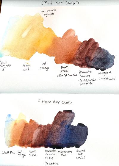
Before I started painting the brunette hair of the subject, I made a couple of color swatches: blonde and brunette. This is only the beginning. There are so many colors of human hair; one must continue to experiment how to render them accurately. Again I stand by the colors I use, but you are welcome to come up with your own concoctions.

"Hair Colors"

We started the full-on Caucasian female portrait in full color and will finish in in the first half of the next week's class. I successfully took the screen shots during and at the end of the demo and photoshopped them for you.

I always start the portrait with the background with the wet-on-wet variegated wash. In this painting, I aimed at the loose, mid-tone, yellow green/blue green background that suggests foliage. You have to wet the paper thoroughly and evenly, otherwise you are risking a hell of a mess!

"Screen Shot I"

Then I started painting the brunette hair with very pale cobalt blue highlight, then washed in cadmium orange, thereby created a damp environment to paint burnt sienna, Daniel Smith Piemontite Genuine, and the mixture of Piemontite and Ultramarine blue. (Paint one half at a time).

Hair is all about softness. I had already softened the outer hairline with a small stiff bright oil painter's brush. The reason why I dampened the hair shape with cadmium orange is to paint basically wet-on-wet, because as you know the wet-on-wet technique is all about softness within the shape. Apply the brushstrokes the way the hair grows. If it is straight as this particular subject's hair, use a long, graceful stroke. Think the hair as a series of long light, mid-tone, and dark strands, not individual hair (the same applies to eye brows or any other facial hair).

Many students struggle with hair. (As a matter of fact, many students struggle with everything: background, hair, skin tones, drawing of features, folds of clothes, you name it!) My aim is to make watercolor portraiture accessible to most students and I hope this step-by-step approach helps.

Next, I softened the inner hairline with the lifting brush (there is hardly any painting within which I don't use this brush). Then I started painting the first layer of the skin tones on dry paper, using the pale, watery versions of the above-mentioned essential skin colors (minus cobalt blue, which I used in the second layer).

I didn't mix any colors, except a little cad yellow to cad red in the forehead, etc. Depending on the moisture level of your brush, you may end up with blooms. Don't worry about them. It's sometimes hard to read whether a certain passage is a cool red or a warm red. You can mix the two reds; you can use either red (they are so pale that it doesn't really matter). As we spend more and more time looking at the subject, it becomes clear which area is warm and which area is cool.

"Screen Shot II"

In a light-skin-toned subject, the painting goes fast. I started the second layer, going bolder. I also started painting the features. There are so many things I covered that I am not going to detail them here. Please rewatch the recording.

"Screen Shot III"

Next, I finished the female portrait in full palette. I showed you how to deepen the hair without losing the feeling of softness that was established in the first wash last week. I emphasize the importance of soft texture of any hair. Avoid the liney hair with many fussy strokes and instead focus on the light/dark shapes.

How to create the soft, fuzzy texture in watercolor? Paint with water, i.e., as soon as you put down a linear stroke, rinse your brush, remove the excess water on clean paper towel, and stroke it down one or both sides of the previous stroke. Keep repeating the process until you are satisfied with the hair.

I painted the white blouse by painting pale shadow shapes. I used a variety of colors although the shapes are not very big. You can't paint colorful paintings with just few colors. Get into the habit of dipping into a different color each time you reach out to reload your brush. A wet stroke of Color A, then another wet stroke of Color B, and so on. As long as you control the moisture level of your brush, you will still see color variations in your shapes.

But more than anything else, the big picture of the left side of the white blouse being in light and the right side being in shadow has to be emphasized! Do you see the difference of the left and right sides in the finished portrait?

The skin tones needed to be strengthened a bit and the dark shadows of the neck introduced, so that what I did next. The subject with a fair skin tones doesn't require too many layers of glazing, but it doesn't mean you don't have to deny her colors!

After the break, I talked about how to approach painting the subject with glasses/shades. Less is more! Suggest the frames instead of accentuating them. Remember the frames, no matter how thin, have volumes; sometimes it's necessary to paint planes (especially if the subject is in three-quarters view. If you can't see the subject's eyes, don't invent them. If you see the reflections of interesting shapes, paint them. If the glasses/shades cast strong shadows, paint them.
 
This is an independent project, so I won't discuss my demo in details. I am painting "Sabrina at Dean Village, Edinburgh". I finished the sky, the background architecture and stream, and her hair before the class and focused on the skin tones for the demo. 

"Sabrina at Dean Village, Edinburgh"

In the image above , you can see the first layer of skin tones. It's very pale, but still gives the impressions of three dimensionality with the adroit use of the highlights (cobalt turquoise light and cadmium yellow pale with a bit of cadmium red) and warm red (cadmium red)/cool red (Helios purple). Something to think about!


Sunday, May 8, 2022

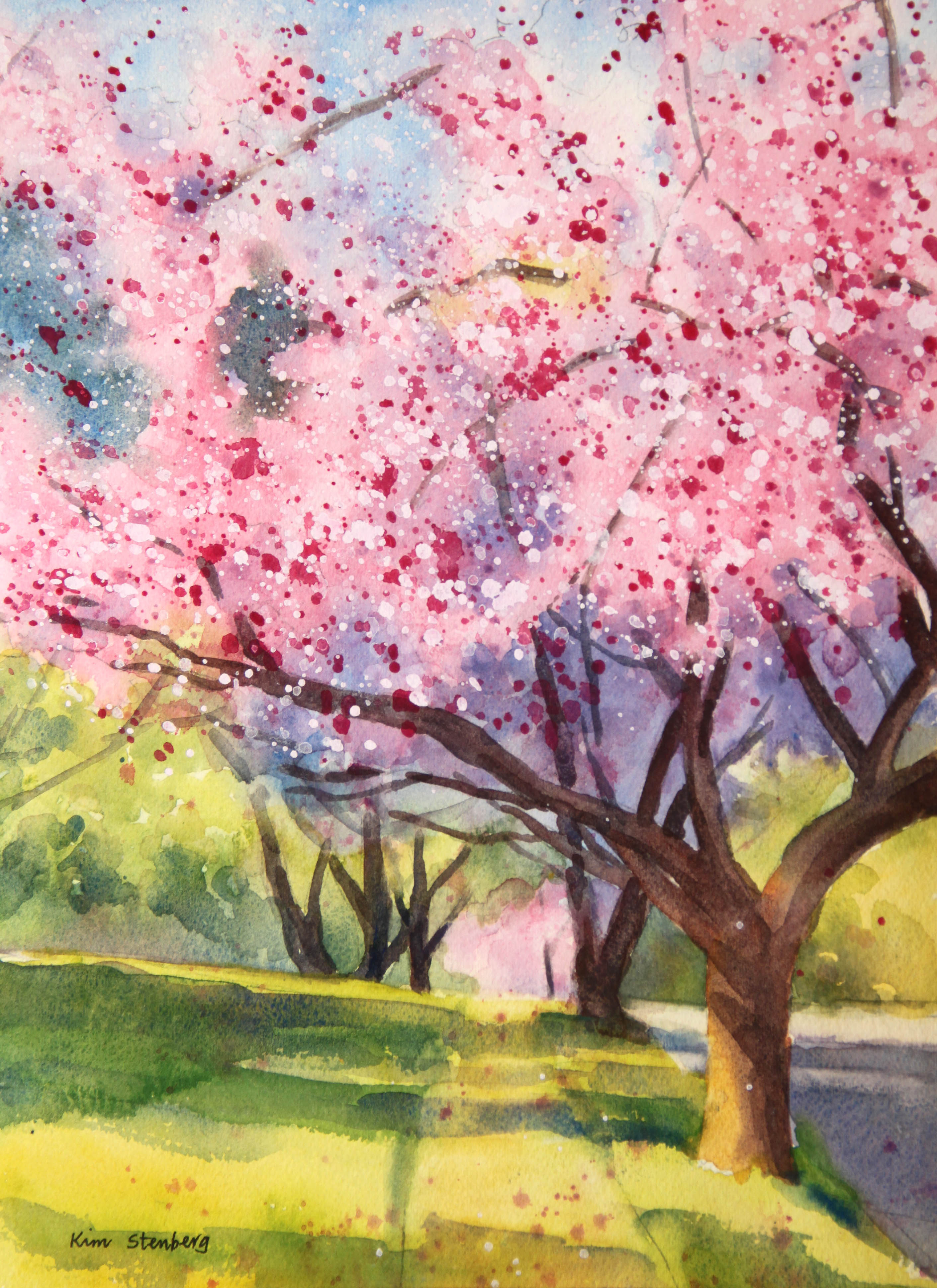
"Double Cherry Blossoms" (watercolor on paper; 12" x 9")


"Double Cherry Blossoms"


The following is the description of what we did in the third week of the spring term, 2022 for my "Watercolor from Start to Finish" class (my online Zoom class with the Art League School in Alexandria, VA).

This week's lesson was about the edges through painting "Double Cherry Blossoms". We drew the design, then we wetted the paper thoroughly and evenly. The success of the variegated wash depends on how you do this step; don't rush it.

We dropped cobalt blue in the sky holes, pale permanent rose in the sun-struck cherry blossoms, yellow green (winsor lemon and a little cobalt blue) in the grass and trees, and quinacridone gold in the trees, side walk and street. We dried paper until it's bone dry. 

The biggest trap in a cherry blossom painting is paint it all pink and saccharine. One must focus on light and dark shapes. Desaturate the picture and print it out black and white as well as a color version to avoid the trap. We wetted a little more than the top half of the paper and dropped the purple mixture (French ultramarine blue and permanent alizarin crimson) to suggest the cherry blsooms in shadow.

We mixed the dark green (ultramarine blue and gold) and dropped it in the two dark green shapes showing through the gaps in the cherry blossoms in the top left.

So far, the painting has no hard edges. We are going to bring the sunshine by introducing the crisp-edged shadows. The shadow colors vary depending on the local colors: the blue greens (cadmium yellow pale and cobalt blue; I glazed the purple mixture over green here and there later) on the grass and the shadow areas in the distant trees and purples (ultramarine blue and crimson; you may add a little gold for the street) on the sidewalk and street.

I've noticed during the critique session, quite a few of you made the edges of these shadows mushy. Don't be afraid of hard edges. What's problematic (at least for me) is that there are only hard edges in a painting. Hard edges come forward and they can also suggest the sunny condition; soft edges tend to recede, create soft textures and can suggest a damp weather condition. The ability to control the hard/soft edges indicates how advanced you are in your watercolor journey and will open the door for you to paint any subject you wish!

By the way, below is your homework. Please practice mixing greens. Many students hate mixing and painting greens, but we cannot avoid greens, especially in landscapes. It's actually not that hard to mix beautiful greens. Again, it's matter of practice and positive attitude!

Mixing Greens

We painted the tree trunks and limbs with the mixture of ultramarine blue and burnt sienna. Make sure the mid-tone branches in the middle of the cherry blossoms tuck behind the clouds of flowers or dark shadows and not stick out out of nowhere.

Finally, it's time to get messy with the splatters. Cover yourself and the working area because these pesty splatters tend to end up everywhere! We first splattered with permanent rose, then white gouache. Use a small round brush, load it up with enough thick paint and splatter carefully in all directions. Avoid big bombs (caused by too much water in the brush). Nothing happening? Use more water. Don't be half-hearted with these splatters. Do enough of them so that they show!

I avoided these splatters (which suggest the highlights on the flowers) in the shadow areas. I splattered a little bit on the sidewalk and grass. At the end, I decided to splatter the mixture of a little permanent rose and white gouache as well.

Below is my class demo. This is only one way of painting cherry blossoms. You may want to try a different approach with more hard-edged flowers. As long as you include the dark shadows of these delicate flowers, you will have success.


"Double Cherry Blossoms Class Demo"


Sunday, May 1, 2022

"Acadia Milky Way Reflections" (watercolor on paper; 12" x 9")


"Acadia Milky Way Reflections"


The following is the description of what we did in the second week of the spring term, 2022 for my "Watercolor from Start to Finish" class (my online Zoom class with the Art League School in Alexandria, VA).

This week''s lesson was the wet-on-wet variegated wash through painting "Acadia Milky Way Reflections". The way we did it was a little unusual, but the sky is the limit as far as the variegated wash is concerned, and I cannot emphasize its importance in watercolors. 

We drew the design with a HB pencil very lightly. Then we wetted the paper thoroughly and evenly except the land shape below the horizon. The success of the variegated wash depends on how you do this step; don't rush it. There are no fixes when the paper is wet unevenly.

We dropped very pale Winsor lemon, then a little permanent rose in the sky and water, where you see the glows caused by the gazillion stars. Make these pale shapes interesting and somewhat mirror-image (the glow shape in the water is the reflection of the same in the sky!)

Dry paper until it's bone dry (feels room temperature, not cool, to touch). If you rush this drying stage, you are likely to disturb the underlying layer(s). As long as you bone-dry and then wet the paper gently but thoroughly for the next layer with a soft flat brush, you can do this theoretically up to hundred times, although only a few fanatical watercolorists do it!

The next layer was cobalt blue to suggest the night sky. The night sky is usually very dark, almost pitch black, but when there is a full moon, aurora, or a galaxy full of stars, it will look quite colorful. Don't cover the glows from the first layer. Bone-dry the paper and wet it again for the third layer.

We darkened the periphery of the paper with the blue purple mixture of French ultramarine blue (darker than cobalt blue) and permanent rose. Quite a few of you ended up covering up the cobalt blue layer entirely. Please don't. If you haven't wetted the paper nice and evenly, you will by now have many hard edges around the glows in the sky and water. It's game over because the sky and water take up 90% of the painting. We cannot even say they are the background or negative space; they are the painting, the story (plus the stars). Again, I cannot emphasize enough the importance of the beautifully executed variegated wash at the beginning of many paintings.

Many beginners feel thwarted by the variegated wash or wet-on-wet technique altogether and decide to stick to the wet-on-dry, paint-by-the numbers-without-numbers technique. If you are one of them, you are limiting your potential. Watercolor is capable of achieving the infinite variety of subtle and not-so-subtle images. You master both the wet-on-wet and wet-on-dry techniques, the world truly becomes your oyster!

If your sky and water are not dark enough, you have to repeat the process. Don't be afraid of using enough paints. Don't paint wishy-washy, anorexic paintings. Nobody swoons over the half-hearted washes.

Now, it's time to paint the small sliver of the land shape. Paint the rocks in three layers: quinacridone gold base, burnt sienna mid-tone cracks, and the dark mixture of ultramarine blue and burnt sienna, plus a little gold (for the dark base, some cracks, and reflections of the dark rocks in the water). Using the same dark mixture (don't mix the paints thoroughly ever!), paint also the coniferous tree shape, making sure the farther trees are smaller to have them recede.

Finally, it's time to get messy with the white gouache splatters. Cover yourself and working area because these pesty splatters tend to end up everywhere! And mask the water and trees with two pieces of paper. Use a small round brush, load it up with enough thick paint and splatter carefully in all directions. Avoid big bombs (caused by too much water in the brush). Nothing happening? Use more water. Don't be half-hearted with these splatters. Do enough of them so that they show!
 
We will be using the splatter technique again. So if you don't like the mess, get over it! It's useful for stars, sands, rocks, or to add some visual noise where nothing of interest is happening.


Sunday, April 24, 2022

"Santa Ana Mountains Wildflowers" (watercolor on paper, 9" x 12")


"Santa Ana Mountains Wildflowers)


The following is the description of what we did in the first week of the spring term, 2022 for my "Watercolor from Start to Finish" class (my online Zoom class with the Art League School in Alexandria, VA).

This week's lesson was about painting by numbers without numbers. This is how the beginners start out; one can do the most amazing things with this approach, so no reason to disdain it.

I discussed the properties of color: hue (yellow, orange, red, purple, blue, green, etc), value (light and dark), intensity/chroma (bright and dull), and temperature (warm and cool). I will keep repeating these important concepts, so if you are a little confused, don't worry about it!

To practice the wet-on-dry, paint-by-numbers-without-numbers method, we painted "Santa Ana Mountains Wildflowers". First, we drew the design with a HB pencil with a light touch. The less you use eraser, the better-off you are. If you must, use a kneaded eraser. The watercolor paper must be handled with kid gloves and with tenderness. I emphasize the importance of using an undamaged, good paper (Arches 140lb cold press paper). It comes through layers of watercolor washes and that's why a good watercolor painting glows.

Then we wetted the sky shape only and did a graded wash in cobalt blue. This is the simplest, yet effective way of painting sky and still gives it a sensation of depth. The sky is usually darker at the top and lighter near the horizon. So use more paint at the top and less near the horizon. Making a smooth transition from deeper to lighter tone is much harder than you think. Hence practice the graded wash!

Tilt the paper pad/board a little to utilize gravity. If you are using a stiff flat brush, your job will be tougher. If the wash turns out too light (watercolor dries a couple of value scales lighter; wet paper requires more paint than dry paper), repeat the process. Dry the paper completely, wet the sky shape (if your flat brush is stiff or your strokes are too vigorous, you will remove a lot of the first layer), then drop the cobalt blue. Theoretically you can repeat the process up to hundred times, but who has the time or patience!

The rest is relatively simple; it's matter of blocking in different color shapes, then glazing (adding layers on dry paper). We started with the orange California poppy shapes (mixture of cadmium yellow pale and a little cadmium red), then painted the purple California bluebell shapes (mixture of cobalt blue and permanent rose), and the green grass shapes (mixture of cadmium yellow and cobalt blue).

I glazed the poppy petals in shadow with the red orange mixture of cadmium red and cadmium yellow.

I glazed the distant hill slopes in shadow with the purple mixture of French ultramarine blue and permanent alizarin crimson. I glazed darker purple flowers and darker grasses with the same purple mixture. Yes, purple is a very useful color as greens and blues turn purple when they become really dark. Even reds become purple when they are dark.
 
In this lesson, you learned to mix paints partially so that two paints can make four colors (for instance, yellow, yellow orange, red orange and red; rose, rose purple, blue purple, blue; yellow, yellow green, blue green, and blue). Never overmix and end up with a homogenized mixture


Monday, April 4, 2022

"Kaena Point Sunset" (watercolor on paper; 9" x 12")


"Kaena Point Sunset"


The following is the wrap-up of the "Painting Sunsets in Watercolor" workshop I taught this weekend at the Art League School in Alexandria, VA.
 
It has been a great pleasure to have you in my sunset workshop. I hope you learned something to help you in your watercolor journey. Some of you were not familiar with the wet-on-wet variegated wash or painting in layers. But it is generally why we take workshops: to broaden the horizon and try something new. You guys were awesome!

Things to take away? Sunsets are all about the yellow and orange glows and we have to preserve that glow to paint a successful sunset.

Blues and purples are present often in sunsets. Since oranges and yellows are complimentary colors of blues and purples, if we paint them at the same time, they will mix on their own on the  wet paper and result in mud. Hence, we must separate them in layers!

Each time when you wet the paper for the wet-on-wet technique, which helps us to apply paint smoothly without leaving hard edges (and sky, water, and many other things are all about softness), you have to wet the paper thoroughly. And you have to use good paper (we used Arches 140 lb cold press paper)!

Each time when we start the next layer, the paper has to be bone dry! Otherwise you risk stirring up the previous layer(s). If you do this right, you can repeat the process until you can't take it anymore. Lol. You can also wet only part of the paper (sky, water, etc.) depending on your purpose.

We don't always repeat the variegated wash in multiple layers. As I have shown some examples, I sometimes get it done in one or two layers.  So don't think what we did is the norm. It depends!

The reason why repeated the yellow, red orange, and blue layers twice is this: it's better to go gentle and layer than go too strong and do oops. In watercolor, removing paints is much much harder than adding more paints in layers. Go easy and go slow! Patience is the most important virtue in watercolor.

So the end result should be vibrant yellow, red orange and blue. Some of you needed to strengthen blues, right?

When you are satisfied, paint the land shape, tree, boats, or whatever. Hard edges are introduced at this stage and we often paint on dry paper. Darks must be dark enough!

Values are the most important thing in a painting in any medium. If you are plagued by the feeling that your project is not going well, take the picture of your work-in-progress and desaturate the picture using your phone picture editor. You will see your problems right away!