 |
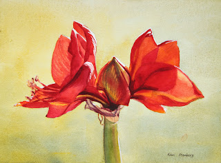
| "Red Amaryllis" |
The following is the description of what we did in the fifth week of the winter term, 2022 for my "Watercolor from Start to Finish" class (my online Zoom class with the Art League School in Alexandria, VA).
This week we painted "Red Amaryllis" to explore the color red and the complimentary harmony of reds and greens. We have three reds on our required palette, among them cadmium red is warm red and permanent rose and permanent alizarin crimson are cool reds.
They are all high-chroma colors, but one can argue that crimson is
slightly duller and also darker than the other too. If you want to mix
bright oranges, think cad red; if you want to mix beautiful violets,
think cool reds (along with warm blues: cobalt blue and French
ultramarine blue).
In terms of mixing greens (the complimentary of reds), it depends on how bright, softer, or deeper you want them to be.
If you want bright greens, mix Winsor lemon (cool yellow) with Winsor
blue (cool blue). If you want a softer green, start with cad yellow pale
(neither cool nor warm yellow) and add a soft blue (cobalt blue).
If you want a deeper, darker green, start with the darkest yellow we
have (quinacridone gold) and the darker and warmer blue (ultramarine
blue).
I also showed two tube greens and what you can do with them: permanent sap green and Winsor green (red shade).
Neither is necessary, but fun to have.
Color mixing is based on theory and experience. When you know exactly how to mix what colors to create which tones you have in mind, you are an advanced watercolorist. We have completed all the color studies of primaries and mixing secondaries and grays.
I hope you have made many color swatches and are comfortable with your
ten colors. As you add more paints to your palette (let's say 18 as your
palette has as many wells), continue practicing color mixing. Make a book of color swatches as reference. Please remember that you don't mix with white gouache and ivory black/neutral tint.
We painted the flowers with all three reds, yellow, red orange and purple mixture. As you put down a wet stroke after another wet
stroke of a different color, you may lose control and end up with a
blob of a homogenized color. It's because your brush has too much water.
You can avoid this frustration by layering methodically yellow, orange, red orange, cad red, rose, crimson and purple
(as we did in painting yellow crocuses in "Crocuses in Snow"). But the
color red has a full value range and we need several more layers than
painting yellows.
Paint the flowers section by section. All petals receive at least two layers, some 3-5 layers. For dark purple accents, we mixed crimson with ultramarine blue. This may have to be done two layers as well.
For
the central bud, we used yellows, red orange, and crimson first, then
in the second layer, we glazed with the green mixture (lemon and cobalt
blue). In other words, we have to separate reds and greens by
glazing (optical mixing instead of literal mixing); or, we end up with
the dull browns.
We painted the papery skins with the pale mixture of quin gold and purple (crimson and ultramarine blue), then glazed with darker purple mixtures.
We painted the green stem in various greens in two layers. Try to create the illusion of the cylindrical form.
It's a littler darker along the left side and gets warmer toward the
light; I even painted a strip of a little crimson right next to the
yellow green on the right to make it slightly darker.
Crop the painting accordingly and don't leave the subject floating in the middle. The harmony of the positive shapes and the negative space is a very important part of design process.
I am seeing some paintings with the amaryllis taking up the entire
painting and going beyond the edges; I am not sure it's a pleasing
design. But it's up to you. Everybody has different aesthetics.


No comments:
Post a Comment