Sunday, October 31, 2021

"Storm Moving In" (watercolor on paper; 9" x 12")

"Storm Moving In" (watercolor, 9" x 12)
 

I decided to blog about my online Zoom classes with the Art League School in Alexandria, VA. This is what we did in the sixth week of the fall term, 2021 for my "Watercolor from Start to Finish" class.

The first business this week was finish "Holmes Run Rocks". First, we painted the first layer of the rocks and pebbles with the mixture of quinacridone gold and a little bit of purple (cobalt blue and crimson). Make sure you paint around the sun-struck highlights (if you lose the white of the paper, you lose the game!). If necessary, draw the pebble shapes first, then paint around them.

We started the second stage with the big tree shape using the dotty pointillist method of applying paints. I used three tones: the light tone green (Winsor lemon and cobalt blue), the mid-tone green (cadmium yellow pale and ultramarine blue), and the dark tone (ultramarine blue and permanent alizarine crimson). The tree trunks and branches were painted with the mixture of ultramarine blue and burnt sienna (this is called Jane's Gray).

Then, we moved on to the rocks and pebbles with the dark shadow tone of cobalt blue/ultramarine blue and crimson. We have already established the mid-tone in the first stage. You will see the rocks and pebbles suddenly emerging before your eyes!

The final touch that brought the painting together was the glazing of the big water shape. We wetted the shape first, then dropped the mid-tone mixture of gold and burnt sienna. Quickly we painted in the reflected shadows of the trees and the submerged pebbles with the purple mixture of ultramarine blue and crimson. If your paper is too wet, whatever you put down will fuzz into the water!

"Holmes Run Rocks Demo" (watercolor, 12" x 9")

As you can see my demo painting above looks a little different from my sample painting below. Which one do you like better?

"Holmes Run Rocks" (watercolor, 12" x 9")

The main business of this week was painting a triptych, "Storm Moving In". The first image below is the reference photo I took on Assateague Island. Instead of painting from it as is, I cut it up into three unequal pieces, moved them around until I found a pleasing design, which is the second image. Basically, I placed the tall left panel in the right side and put the two divided right panel pieces in the left for the heck of it!

Anything that moves (in this case, a seagull in flight) becomes the center of interest, which happens to fall in the sweet spot of the picture (one quarter way down from the top and one quarter way in from the left edge; there are four potential sweet spots in a picture, by the way). The tall right panel is now the anchor; the two smaller panels on the left are not of the equal size.

"Storm Moving In Original Reference"

"Storm Moving In Reference Reimagined"

Making sure the horizons are straight and at the same level, and at right angle to the side edges of the paper, we drew them with the help of a ruler/straight edge. Then, we divided the picture with a 1/2"-wide washi tape (not so tacky tape) into three small paintings that cohere.

We started the painting with the right long panel. First we wetted the paper and painted the glowing sky shape and the glowing wet sand shape with the pale mixture of Winsor lemon and cadmium red pale. When the paper was dry, we wetted the paper again and dropped the blues in the clouds and the ocean waves with the blue mixture of cobalt blue and burnt sienna. The dark sand shape was painted in the mid-dark tone of ultramarine blue and burnt sienna.

When the first layer (which took two separate steps to avoid contaminating the alternating shapes) was dry, we glazed each shape with a little darker mixtures to create edges and drama. We will pick up from here next week!

"Storm Moving In Demo in Progress" (watercolor, 9" x 12")


Friday, October 29, 2021

"Woman in Black" (watercolor on paper; 12" x 9")

"A Woman in Black" (watercolor, 12" x 9")

I decided to blog about my online Zoom classes with the Art League in Alexandria, VA. This is what we did in the sixth week of the fall term, 2021 in my "Watercolor Portraits" class.
 
This week's lesson was painting a profile portrait in full palette. My starting point for skin tones of all races is cadmium red. For the area lit by the sun, I add a yellow (in the color swatches below, you will see cadmium yellow pale, Winsor lemon, and quinacridone gold; you can also use yellow ochre by Daniel Smith).

For the area in shadow, I add cobalt blue. I never use the staining Winsor blue or the granulating French ultramarine blue. However, I may use ultramarine blue in the neck, or to mix a rich dark for the eyebrows, nostrils, etc. For the highlights in the face and neck, to suggest the sky color, I use a diluted cobalt turquoise light (Winsor Newton).

Skin tones may look all brown to you. For that, I rarely use burnt sienna (Daniel Smith) or burnt umber; instead, I mix my own brown with red and permanent sap green. When I need a cooler red, I use permanent rose or permanent alizarin crimson. A bit of cobalt blue added to crimson is useful for the shadows in the face. For the neck, I may use ultramarine blue.

The portrait painting is all about recognizing the plane changes (in the forehead, eyes, nose, cheeks, lips, chin, neck, etc.) and rendering them in paints of the right hue, temperature, value and intensity. A little understanding of human head anatomy is a huge plus, but you can paint a believable portrait without knowing all the anatomical names. Observation is the thing!

The subject in this week's exercise is wearing a black outfit and hair scarf; her hair is black with silver hairs. I have two blacks on my palette: ivory black (warm black) and neutral tint by Daniel Smith (cool black). I never use blacks to deepen or darken skin tones or anything else.

Skin tones Swatches.jpg

Black Swatches.jpg

I generally start the portrait with the background by wetting the negative space thoroughly and dropping the chosen colors. I used ultramarine blue on the left side and cerulean blue on the right. Always apply a variegated/graduated wash for the background (from top to bottom and/or from left to right). This rule applies to landscapes, still lifes, etc. If needed, do another layer (this technique is also called wet glazing). I pulled the background colors to the hair, scarf, and outfit to minimize the cut-out look.

I began to develop the face and neck using the above-mentioned colors, patiently adding a layer after another. As long as the paper is bone dry, you can glaze as many layers as you wish to get the right value and color.

I talked a great deal about soften the edges. In a watercolor portraiture, the mastery of edge control is paramount because if you don't do anything, watercolor painted on dry paper always dries with a hard edge. Since I don't generally paint the skin tones wet on wet, I have to do my best to soften the edges: put down a tone and immediately rinse the brush, remove the excess water in the brush on paper towel; with the damp (thirsty) brush, I soften the edge(s). If your brush is dripping wet, you are asking for trouble!

I showed you how to paint the hair, scarf, black sweater, and violet blouse by painting the entire shapes (which then becomes the highlight), let the paper dry, and go back with more paints and paint around the highlights (when necessary, softening edges). Repeat the process as many times as necessary to get the right tone. Black is the darkest tone, so you many need a few layers. Never use too much paint at one go to reduce the necessity for glazing. For the violet blouse, by the way, I used a two layers of Winsor/dioxazine violet.


Sunday, October 24, 2021

"Holmes Run Creeks" (watercolor on paper; 12" x 9")


"Holmes Run Rocks" 

 
I decided to blog about my online Zoom classes with the Art League School in Alexandria, VA. This is what we did in the fifth week of the fall term, 2021 for my "Watercolor from Start to Finish" class.

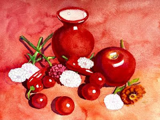
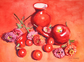
We spent about two hours trying to finish up "Red on Red", but didn't manage. Lol. First, I drew a cherry tomato in graphite to explain the local color, highlight, form shadow, reflected light, and cast shadow. It's easy enough, but once we start painting in color, things can go haywire. I painted around the highlight shape with cadmium red; for the form shadow, I switched to permanent alizarin crimson, but switched back to red for the reflected light. If you use enough paint, you won't need to glaze. When the tomato was dry, we painted the cast shadow with the purple mixture of cobalt blue and crimson.

All the cherry tomatoes and red peppers were painted the same way. As a matter of fact, the vase and apple were painted the same way too, although they may have required a glaze or two; the apple has the belly button and stem area that require some fiddling.

As you put down a wet stroke of one color next to the still wet stroke of another color, make sure you remove the excess water from the brush to avoid runbacks. Don't try to be thrifty by using only one or two sheets of paper towel for the entire painting session. The difficulty of watercolor has everything to do with the control of the ratio between water and paint and the sensitivity to the moisture level in the brush and on the paper. (The other difficulty is the one-way-ticket painting process unique to watercolor, meaning we proceed only in one direction: from light to dark. That's why we have to organize and plan ahead.)

Then we painted the green stems and leaves with the green mixture of Winsor lemon and cobalt blue. Let the first layer dry and do the second layer with a darker green on the shadows along the stem and on the leaves to create form. When the second layer is dry, paint the cast shadows with the purple mixture of crimson and cobalt blue.

For the zinnias, we first drew the overlapping layers of tiny petals with appropriate colors of watercolor pencils and started the first layer of wash in orange (the mixture of red and cadmium yellow pale), permanent rose, red purple (the mixture of rose and a little cobalt blue), etc. When it was dry, we had to redraw the petals because watercolor pencil lines disappeared, giving us one more opportunity to redraw. For the dark crevices, I used the red purple mixture (crimson and cobalt blue).
 
If you wish, you can have fun with the tiny yellow star-like shapes in the center of some zinnias by painting them with the mixture of yellow and white gouache with a rigger brush. Finish the zinnias by painting dark purple cast shadows. Below are the two demo process images and finished painting. 
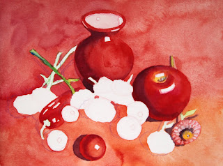
 

"Red on Red in Progress I"

"Red on Red in Progress II"

"Red on Red" (watercolor, 9" x 12")

This week's main lesson was painting rocks. I first drew the design with watercolor pencils (green, brown, blue, and violet). The shading in the rocks is demonstration only; don't do it yourself. Landscapes can be overwhelming to many students. Think the big shapes first. In this exercise there are five big shapes: the sky and trees, the middle ground cluster of rocks and pebbles on the left, the foreground big rock and pebbles, the big water shape, and the small group of rocks in the middle ground on the right. Group the shapes and cluster them in a meaningful manner that allows the viewer's eye to enter the painting and travel and linger.

I started painting from the top (that's how we generally paint landscapes) on dry paper, with cobalt blue for the sky holes, yellow green (lemon and a bit of cobalt blue) for the tree foliage in the sun, dark green (quinacridone gold and ultramarine blue) for the dark foliage in the shadow, and dark brown (burnt sienna and ultramarine blue) for the shadowy area in the right bottom of the big tree shape.

For the water, I used gold, yellow green (lemon and a little bit of cobalt blue), and warmer gold/burnt sienna as it gets closer to the bottom of the paper. Please develop "Holmes Run Rocks" up to this point. We will finish the painting together next week and move on to the triptych exercise!
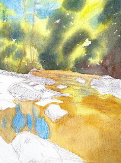
 

"Holmes Run Rocks in Progress"


Friday, October 22, 2021

"Red Hair" (watercolor pencil on paper; 11" x 8.5")


"Red Hair" (watercolor pencil, 11" x 8.5")

I decided to blog about my online Zoom classes with the Art League School in Alexandria, VA. This is what we did in the fifth week of the fall term, 2021 for my "Watercolor Portraits" class. 
 
The lesson was about drawing portraits in watercolor pencils. The process is similar to watercolor in that we layer from light to dark. On an accurate pencil drawing, I began the portrait by hatching colors, starting with a turquoise to indicate reflected light on the shadow side of the head. Then I hatched and cross-hatched with lightest colors (cream and pale pink) and moved onto the mid-tone colors of orange, scarlet, and red purple; then, finally the dark tones (brown, violet, indigo, and black for the upper lash lines, pupils and iris outlines). When you are hatching and cross-hatching, be consistent and mindful. Below is where I stopped before adding water.

"Red Hair" in progress

When you add water to your drawing with a brush, you will notice the colors deepen dramatically as long as you are using the artist-quality watercolor pencils such as Caran d'Ache Museum Aquarelle and Faber Castell Albrecht Durer. What you are doing is activating the pencils. That's right. We don't use watercolor pencils the way we do waxy colored pencils. On their own, watercolor pencils are anemic-looking; it's only when they are activated with water, they begin to sing. 
 
Please avoid the temptation to scrub the hatched texture to obliterate pencil strokes. If you don't like the strokes, why bother with watercolor pencils? It's time-consuming to hatch and cross-hatch and there is no point in erasing them with water. These pencil strokes add charm and the graphic texture to the finished work.

After the paper dries, you can add more tone by using watercolor pencils as if they are watercolors. How? With a clean wet brush, you pick up tone from the long lead of a pencil and apply it to the desired area. (By the way, I don't use a mechanical pencil sharpener to sharpen my pencils because it tends to eat up pencil leads and sometimes break them!) You can dip the pencil into water and draw with the wet lead (upper lash lines, upper lid folds, hair, etc) to strengthen lines.
 
You can also use a nail file to grate pencil leads onto a wet area to create texture like freckles, etc. Keep adding more tone until you are satisfied. You can of course introduce watercolor, but we didn't in this lesson.

By the way, what kind of paper works best with watercolor pencils? My favorite is Fabriano 140 lb hot press paper; I also like Moleskine watercolor sketchbook and Strathmore 500 series drawing paper pad (8" x 10" is a good size). In other words, smoother paper with less pronounced tooth than Arches 140 lb cold press paper seems to work better.

The following are the colors I find useful for skin tones in case you want to purchase a few more watercolor pencils:
Naples ochre (Museum Aquarelle or M/A), Light flesh (M/A), Medium flesh (Albrecht Durer or A/D), Salmon (A/D), Light purple pink (A/D), Burnt ochre (M/A), Pompeian red (A/D), Purplish red (M/A), Caput Mortuum (A/D), Carmine lake (M/A), Dark flesh (M/A), Violet pink (M/A), Periwinkle blue (M/A), Light malachite green (M/A), Light olive (M/A), Olive yellow (M/A).

I've played around with watercolor pencils. Here are some of the results; the last one is my self-portrait!


"Self-portrait" (watercolor pencil, 8.5" x 5")


Thursday, October 21, 2021

"Assateague Island Sunset" (oil on linen panel, 8" x 10")


"Assateague Island Sunset" (oil, 8" x 10")


Assateague Island in the Eastern Shore of Virginia and Maryland is famous for its wild ponies. My family and I went there twice this summer for two short vacations. You can tell we love the place. We usually stay at Chincoteague, a small, less-touristy place than let's say Ocean City or Mytle Beach. 

There are beaches and salt marshes, of course, but Accomack County, Va, where the city is located, itself is a gem which makes you feel like you are thrown back seventy years with quaint towns and tiny islands to explore. We will be going back and I have already painted this lovely area quite a few times and more paintings are coming up.

In this image there were no ponies although they usually graze in this patch. After an overcast and rainy day, the exquisite sunset and its golden hues permeating the marshy landscape took our breath away! 


Sunday, October 17, 2021

"Red on Red" (watercolor on paper, 9" x 12")


"Red on Red" (watercolor, 9" x 12")

I decided to blog about my online Zoom classes with the Art League School. This is what we did in the fourth week of the fall term, 2021 for my "Watercolor from Start to Finish" class. This week's lesson was the color Red. The first order of the day was to talk about our three reds (cadmium red, permanent rose, and permanent alizarin crimson) in term of their temperature, value and intensity. I also discussed the importance of color lightfastness and asked you to avoid fugitive colors, such as rose madder genuine, alizarin crimson, opera rose, etc. 
 

Then we mixed oranges and purples from our reds, yellows and blues. I explained why I chose certain colors (think the closeness to each other on the color wheel to achieve brighter versions of the secondary colors). The color-mixing ability comes from experience, but if you understand a bit of "color theory", it's much easier and less "let's hope for the best" than otherwise!


Then we moved on to the business of drawing a vase, first cylindrical glass, then a pitcher with a handle and spout. Many students get stumped on this, so I tried to help you how to draw a symmetrical form utilizing the central axis line and turning the paper upside down to turn off the analytical side of our brain. Here is a page from Bert Dodson's Keys to Drawing, a drawing manual that will help you overcome your fear of drawing. It's the best there is and I have done many the exercises more than once!
 

Finally, we got to the painting. First we drew the shapes with watercolor pencils (red for the red shapes and green for the green stems and leaves), making sure that they don't float in the middle of the paper with tiny positive shapes and a huge negative space. And please overlap shapes!

Then we painted the negative space with cadmium red on dry paper. Use enough paint and lots of water so that paints don't dry on you. Near the right bottom of the paper, introduce a bit of cadmium yellow pale; when you get to the left top of the paper, add some alizarin crimson. Use a large round brush; for tiny "trapped shapes", use a smaller brush. Painting around the positive shapes is called negative painting, which is not the easiest thing in the world. Do the best you can and don't worry about perfection.

If your first wash is too anemic, do another layer on dry paper. Mine looked fine, so I moved onto painting shapes, after firming up the contour lines of the shapes and also indicating the highlight shapes on the vase, apple, peppers and tomatoes with watercolor pencils.

Starting with the vase, we painted the shapes with the appropriate reds (think temperature and value). I explained the form shadow, cast shadow and reflected light. We did the second layer on the vase, apple, pepper, and tomato, and also painted cast shadows (after drawing them first with a purple pencil).

Creating a form (making a shape appear three-dimensional) by using colors (with the same hue but of different temperatures and values, then glazing with the shadow colors for the form shadow, and even softening edges) is hard! I will go over this next week again.

We didn't get very far, so decided to stop here and finish the painting next week. Please develop the painting up to this point.

"Red on Red" in progress


Friday, October 15, 2021

"Emelia Rigl in Sepia" (watercolor on paper; 12" x 9")

I decided to blog about my online Zoom classes with the Art League School. This is what we did in the second week of the fall term for my "Watercolor Portraits" class. We worked on a sepia value study of "Emelia Rigl," who was a New York stage actress in the 1870's. Below is the reference photo for the project.

The first order of the day was do a demo of a three-quarter female portrait drawing, using "Emelia Rigle" as the reference. My drawing below doesn't quite look like her, but hey, you get the idea. (There is too much information to give you a short summary, so please watch the recording to get to the bottom of the business!) At the bottom is the demo drawing.

Then we started the main lesson of the day. We used only burnt sienna (my favorite is Daniel Smith) and cobalt blue. In the value scales, the value 1 is the white of the paper (highlights). The value 7 is as dark as it gets with the mixture of these two colors. The value 9 is black (for the pupils). The high-key paintings crowd around highlights and mid tones; the low-key paintings lack highlights and crowd around mid tones and darks. We won't be using nine values; you can do a convincing portrait with five or six values.

I first painted the background with the mid-tone wash (slightly bluer on the left side). After drying it thoroughly, I started with the lightest wash, covering the entire area of the subject, except the lightest parts (highlights, including the catchlight of her left eye). Don't make this layer too dark and please make it more brown than blue!

In between layers, dry the paper thoroughly. We are glazing, so paper should be bone dry. At each stage, I mixed a slightly darker batch by adding a little more of each paint; mix more than you think necessary. The skin tones are four layers. By the fifth layer, I got everything done, except the pupils, for which you can use black. The hair and black ribbons are the next darkest.

Below is my sample painting. We did an exit poll on which version you like better: the demo or the sample. We all liked the first one (demo); it's punchier!