
 |
| "Portrait in Limited Palette" |
The following is what we did in the fourth week of the winter term, 2022 in my "Watercolor Portraits" class (my online Zoom classes with the Art League School in Alexandria, VA).
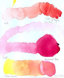
We worked on a portrait in a limited palette using only six colors:
Winsor lemon, permanent rose, cadmium red, cobalt turquoise light by
Winsor Newton (can be substituted with cerulean blue), cobalt blue, and
French ultramarine blue. The exercise was inspired by the artwork by
Stephie Butler in a watercolor magazine ("Beginner's Guide to
Watercolours").
This is not how I normally paint portraits, but it is an great exercise to learn about watercolor (paints go wherever there is moisture on the paper and stop where it's dry) and not deal with the panic one feels when putting down the first layer of skin tones.
We used the mixture of permanent rose and Winsor lemon for skin tones for the most part.
Cadmium red was preserved for accents and to make some deeper brownish
purple for darks. (Personally, I use cadmium red as the basis of all
skin tones and rarely use permanent rose. We'll talk a lot more about warm and cool reds than I did at the beginning of the class; if you are confused about the color temperature business, rest easy.)
 |
| "Mixing Skin Tones" |
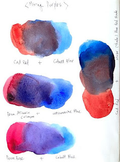 |
| "Mixing Purples" |
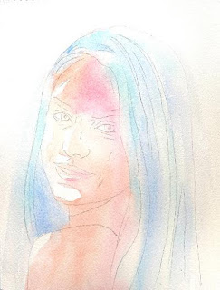
First we wetted the paper with the exception of highlights and white of the eyes,
then floated pale cobalt turquoise light on the highlights of the hair
and pale cobalt blue in the darker areas of the hair and the negative
space (background). We continued to drop the mixture of permanent rose
and lemon on skin tones (sometimes a little cooler with just rose) while
the paper was still wet.
 |
| "Step 1" |
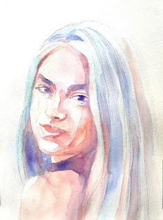
We dried the paper thoroughly, then started layering.
Whenever you are layering, add a little dark accents in the eyes (first
with the purple mixture of rose and ultramarine blue, later with the
brownish, darker mixture of cadmium red and ultramarine blue).
 |
| "Step 2" |
I showed you how to soften the edges of a stroke
(put down a tone, quickly rinse the brush, and with the clean damp
brush pull the tone away). Whenever possible, pull the tones to the
surrounding areas so that the mouth doesn't look like a cutout, the
eyebrows don't look like caterpillars, the hair doesn't look like a
helmet, etc.
 |
| "Step 3" |
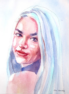
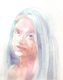
Don't be afraid to go dark in the shadows, but don't jump from light straight to dark. Mid-tones make up the bulk of skin tones! The catchlights of the eyes were done with a white Sakura gellyroll pen 10.
As you can see, the white balance of the finished demo is much cooler
than the three step-by-step photos of the sample painting I have taken
for you. Honestly, I find taking a good picture of an artwork much
harder than creating a good painting!
No comments:
Post a Comment