Thursday, December 15, 2011

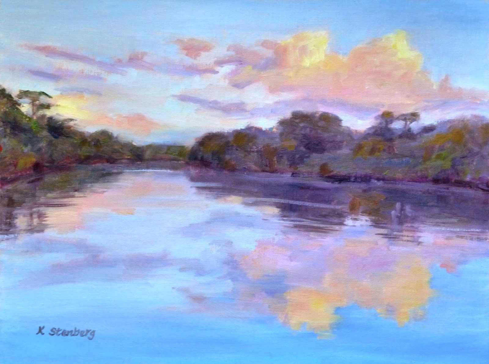
"Walk along Autumn Canal" (oil on linen; 9" x 12") sold


"Walk along Autumn Canal"
sold
"Autumn Bliss" (oil, 9" x 12")
sold
"Autumn Canal" (oil, 12" x 12")

"Autumn Day along the Canal" (oil, 9" x 12")
sold

Canal is not really one of my series, although it surely looks that way.  The reason has to do with the beauty of Wide Water on the C & O Canal along the Potomac. Some places are like a painter's heaven, a gold mine, a jackpot. You can go there over and over and still find things to paint.  The C & O Canal is one of them. I had a good fortune to discover the place, thanks to the Art League Plein Air Painters, who went there several times this fall. It's always a good idea to paint with friends for safety and conviviality. I joined them twice. Each time, the weather obliged. I still have more pictures to work from. Yippee!

"Autumn Bliss" was the third painting from my "mini" series.  Can you tell whether it was done on location or in studio?  Surprisingly, "Autumn Canal," with all those details, was painted en plein air, whereas "Autumn Bliss," with a bolder design, was painted at home.  You can tell, however, that both have the similar feel in terms of the time of the season.

"Walk along Autumn Canal" (I am running out of titles!) is the latest canal painting.  The vantage point is just a short distance from the one in "Autumn Bliss."  It feels more painterly than "Autumn Bliss."  Perhaps I have finally gotten in touch with the painterly arist's zen.

Monday, December 12, 2011

"Silent Night" (oil on linen; 10" x 12") sold


"Silent Night"
sold
"Snow Valley" (oil; 10" x 15")
sold

Snowscape is another favorite subject of mine.  So much so that, I am in danger of running out of my reference material for snow paintings, as I live in an area that doesn't get much snow.  Of the two latest snowscapes, I like "Silent Night" better.  Snow is inherently a cold matter.  Unless much care is taken, a snow painting will be too cold to look at.  I thought that the warm-toned clouds in "Snow Valley" will balance out the cool colors in the rest of the painting.  But, over all, it feels too icy for comfort.

So I am going back to painting snow scenes in early morning or late afternoon light.  Sunset is even better.  Snow reflects everything around it and, of course, the ambient light. The brilliant colors in the sunset sky seem to bring out the best in snow.  If only it would snow!

Sunday, December 11, 2011

"Sunset Clouds" (oil on linen; 9" x 12") sold


"Sunset Clouds"
sold
"Lighthouse at Sunset" (oil; 9" x 12")
sold

It is a great idea to work in a series.  To get to the bottom of things, so to speak.  Sunset sky is one of my such on-going series.  I am perhaps inspired by my mentor, Sara Linda Poly.  She is my first oil painting teacher, whose luminous skyscapes never fail to take my breath away.  As a veteran plein air painter, she paints on location these "golden moments," which don't last very long.  Half an hour, tops, if you are lucky. 

Sara draws the landscape parts--trees and so on--on a toned ground first and waits for the sunset to work its glorious, spectacular magic.  It is, of course, hard to paint looking at the sun in rapidly fading light, and I don't know how she does it so well.  As a newbie to plein air painting, I prefer to paint these sunset scenes in my studio.  "Sunset Clouds" and "Lighthouse at Sunset" are my two latest attempts at sunset sky.  I am pleased with them, for now.

Thursday, December 8, 2011

"At Founders Park" (watercolor with white gouache; 9" x 9")


"At Founders Park" on my sketchbook page

Rick's demo of a "poster" figure study

My attempts at "poster" figure studies

Sunday's schedule was even more rigorous. For three hours, we had a model for our "poster" figure studies. Rick Weaver's main concern was most students' obsession with line drawing. We try to draw as precisely as we are capable of, then "color in." He would rather have us think in terms of color shapes. Color has four properties: hue (red, blue, yellow, etc.), chroma (color intensity), value (light and dark), and temperature (warm and cool). And the same color will appear differently, like a chameleon, depending on what surrounds it.  To paint in color is to play with fire.

Rick's answer was to do a series of "poster" figure studies.  The more, the better.  If you look at Rick's demo carefully, you will find eight color shapes: light and dark shapes for the head, hair, shirt, and background fabric.  We were told to "match" the overall color for each shape, being mindful of hue, chroma, value, and temperature.  Within each shape, there is a myriad of nuanced colors.  Forget those and come up with one color that describes the shape.  One should be able to tell the picture across the room as a woman with brown hair wearing a green shirt against an orange backdrop with a strong yellow light.  We did three of these quick studies.  The model came prepared with changes of clothes.


Rick doing a demo at Founders Park in Alexandria, VA

Rick's unfinished landscape demo

The view of winter bushes I chose to paint

After a quick lunch break, we went outside for a landscape exercise.  This is what I was hoping for, but didn't expect to happen.  How often do you get a perfect weather for outdoor painting in early December?  The fortune, however, favored us.  The warm late afternoon sun cast long cool shadows.  After watching Rick do a quick demo, we were given 45 minutes to do a plein-air landscape sketch.  Yes, really.  I painted the above scene, sitting on a small sketchbook, as the grass was wet and I didn't come prepared with a stool.  It took three minutes to set up the gear.  It would have taken 30 minutes to settle down to paint in oil! 

We returned to the classroom for the final parting words from Rick and goodbyes.  He said: do "poster" studies like a musician practices scales.  I took the workshop to learn to use watercolors like oils.  I learned that, and much more.  Thank you, Rick.

Wednesday, December 7, 2011

"Blue and Green Still Life" (watercolor with white gouache; 13" x 11") sold


"Blue and Green Still Life"
sold

Still Life setup with Rick Weaver

Rick starts blocking in

Rick's compact travel watercolor palette

Rick's demo painting--loose and free!

Last weekend I took a fabulous workshop--"Opaque Watercolors"--with Rick Weaver at the Art League School in Alexandria, VA.  I was excited to see him in person, as he had the reputation of being brutally honest to students in what he says about their artwork.  I have heard of students ending up in the bathroom to cry after his critique!  Another reason for the anxiety was that, because of a low enrollment, there was an imminent danger of the workshop getting cancelled.  Dang!  I really wanted to learn how to use watercolors opaquely like oils for painting during vacations.

I am a dedicated plein-air painter and have dragged my painting gear around in my enthusiasm to all sorts of places, including national parks in the Southwest.  But there is the bulk issue of the art gear necessary for outdoor painting in oil.  An even bigger problem is traveling with oil paints and mediums.  One has to take numerous precautions not to get your stuff thrown out of your luggage.  These days, a traveling oil painter is treated worse than a terrorist with a bomb on the airplane!

I was tired of it all.  I needed an intervention.  I had to find out whether Rick's promise would deliver: the promise of maximizing the watercolor paints' potentials with one additional paint--a white gouache--to make them behave opaquely, but retaining transparency when appropriate.  Fortunately, six additional students signed up for the workshop at the last moment.  Thank goodness!  And Rick did more than deliver.  His reputation turned out to be false as well.  He was a fun, gentle, encouraging, and phenomenal teacher!

On Saturday, we tackled still life to get the hang of the new medium.  Even a veteran watercolorist such as myself found that adding a white gouache to watercolor paints transformed them into a totally different animal.  Traditional transparent watercolors dry a little lighter; but opaque watercolor paints dry darker, just like acrylic paints.  Strange.  I also had to figure out the right water/paint ratio to make the paints flow.  Tricky.


My still life value study (watercolor with white gouache; 9" x 9")

In other words, it was hard!  For a particularly struggling student, Rick did another quick demo of a value study with just one color of burnt umber.  As we had only half an hour left by that time, several of us decided to do the same instead of starting a new still life as Rick made us switch to another setup.  A slave driver!  I didn't have the right color, so, instead, used Daniel Smith's "Moonglow".  The above value study is pretty much a trasparent watercolor, with one exception.  I restored lights with a white gouache here and there. 

You see, that is precisely the point.  In traditional watercolors, lights once lost are lost forever, just like Fitzwilliam Darcy's opinion once lost is lost forever in Pride and Prejudice.  In traditional watercolors, a white paint is death, anathema.  One must preserve white and lights with life.  But, honestly, who gives a darn!  With a white added to your watercolor paints, you can go either way--darker or lighter.  There is freedom.  Hallelujah!

Friday, December 2, 2011

"Cardinal in the Snow" (oil on linen; 8" x 10") sold


After
sold
Original image


Speaking of Photoshop, I learned something very valuable during the workshop with Bobbi Pratte on Monday.  I have lots of paintings with a white background.  For instance, in "Cardinal in the Snow," much of the painting is the snow-covered ground.  Sure, it is about the red cardinal looking for food on a winter day, but if the bird had been standing on a dark ground, the painting's impact would have been completely lost. 

So it is imperative to show in the photographic image what I had captured with paints.  Unfortunately, whenever I take pictures of paintings with a white background, they come out looking drab.  Whites just are not white enough.  They might reflect too much of the blue sky, turning bluish; or they turn out dull, dirty-looking.  Sigh.

Hoping that Bobbi must know what to do, I asked her.  She did indeed know how to correct the problem with Photoshop.  Go to "Enhance," "Adjust Lighting," then "Levels."  In the dialog box, you will see the Input Levels in the top half.  There are three buttons.  The far right button controls the highest values.  Drag it to the left until you find the satisfactory light value.  That's it!

I could have done some more cool stuff even before I started painting "Cardinal in the Snow," too.  I had to use two different photos while painting: one for the pine tree in the background, the other for the bird's pose.  If I had taken the workshop before, I would have combined the two pictures with Photoshop and worked with just one printout.  If I had wished so, I could have flipped the bird's direction, so that it would look the other way.  You get the idea.  I have just entered the wondrous world of Photoshop!

Thursday, December 1, 2011

"Scandinavian House" (oil on stretched linen; 14" x 18") sold


sold

Composition drawing for "Scandinavian House"

I was busy during the Thanksgiving holiday, not visiting with family, but working.  It was my sweet husband who cooked on Thanksgiving!  Why?  I had to finish two commission paintings that need to be shipped by early December.  One of them--"Waterlily Dreams"--I already shared with my readers.  "Scandinavian House" was the second painting I worked on during the holiday.

This  portrait of a house was commissioned by my dear sister-in-law for her husband.  She is probably the only client who didn't negotiate the price; she told me she didn't want a discount.  Bless her heart!  She and husband had raised their four sons in this house.  After their children left, they decided to stay instead of moving somewhere else.  They recently made some additions, and that is why my sister-in-law decided it would be a fun "addition" to their new additions.

I worked with a couple of pictures she took in the afternoon.  She worried about the "artistic" quality of the pictures, but I told her that I liked them just fine.  The late afternoon sun casts long tree shadows on the driveway, lawn, and house itself.  You can tell that the property is surrounded by the tall, slender pine trees.  They are very important in the composition as much as the house itself.  I felt that the two tall trees in front of the house were like the father and mother of the family.  I made sure that they didn't bisect the painting perfectly.

I first did a value drawing on a piece of paper in the same size as the painting itself to work out the composition.  This is something I rarely do as I usually compose in my head and jump right into the painting process.  But, for this important project, I didn't want to waste time and spoil the fresh brushwork by messing around with the elaborate architectural drawing on the canvas itself. 

After my client approved the composition, the rest was a breeze, as I had already decided on the palette: blues for the sky, warm yellow oranges for the house, greeens for the pine trees, and blue violets for the shadows in the driveway.  She wanted the driveway a little less prominent while I was working on the painting, so I obliged by making the lawn a little bigger.  I felt such affection for the family that I think it shows in the final painting.  Doesn't "Scandinavian House" look like a happy house?