Showing posts with label crocus. Show all posts

Sunday, March 27, 2022

"Oregon Coast Sunset" (watercolor on paper; 9" x 12")


"Oregon Coast Sunset"


The following is the description of what we did in the nineth week of the winter term, 2022 for my "Watercolor from Start to Finish" class (my online Zoom class with the Art League School in Alexandria, VA).

The spring registration has begun. Please come back in the next term to continue your watercolor journey with me. You guys, so many of whom are beginners, are doing an amazing job! Here is the link for the "Watercolor from Start to Finish" class; here is the link for the "Watercolor Portraits" class, in case you want to move up a notch and challenge yourself even further!

The image you see above is the class demo of "Oregon Coast Sunset" from yesterday. The theme was "Inspired by Tonalism". Tonalism was an American art movement from the late 19th century. Its most prominent practitioners were George Inness and James Whistler (his nocturnes). They used a narrow value range in low chroma colors to create their serene, romantic landscapes.

Admittedly I am not a tonalist; I am more of an impressionist. It doesn't prevent me from exploring this intriguing movement; perhaps there are things for us to glean from their approach to painting landscapes and cityscapes.

We first wetted the paper and brushed in very pale winsor lemon and permanent rose while not touching the blue/white bands along the horiozon. In the next wet-on-wet layer, we did the same thing, this time, with cobalt blue where you see blues. We decided to deepen the colors slightly by doing the third wet-on-wet layer, repeating the same color patterns.

Then we painted the headland on dry paper with the dark mixture of French ultramarine blue and burnt sienna, pushing it more brown and slightly lighter along the horizon to suggest sea fog. While the wash was drying, we continued to establish the rugged terrain of the headland with diagonal strokes. Try not to lose the initial mid-dark wash. Remember this is a tonalist painting! Don't turn the whole headland shape into a black mess; think 3 and 4 in the value scale, not 1 (black) or 2 (near black).

When the headland was dry, I decided to experiment by laying down a horizontal stroke of white gouache over the horizon and headland to suggest sea fog shrouding the view. I put down the white and quickly softened the top and bottom edges of the long stroke. Some headland serrated edges got smeared, but I like the result. This is an optional step; don't do it if you are unsure of your ability. You can easily ruin the painting that is going well so far.

Let's finish the painting by adding a series of horizontal strokes to suggest the incoming waves. The colors are the same as the headland mixture, except lighter. Sometimes we used it bluer; sometimes added a little alizarin crimson. Some lines are darker. There are two bands of blues; the second band is where the dark reflection of the headland begins. The bottom third of the painting has the big reflections.

The colors are the same as the headland's, except it's bluer than the headland color. Remember that if you don't overmix two colors, you can push it either way depending on your need. Let it me one of the biggest gains from my class.

Make sure the reflections are not too dark (you destroy the serene mood) or too light (you lose the impact). The edges should be uneven and a not solid, straight vertical line. Make curvy strokes toward the bird.

The bird may be tiny, but it's very important in the design. If it had not been there in the reference, I would have invented it to balance the massive mirror-image shapes of the headland and reflections on the right side. It's a some kind of a coastal bird (sandpiper?). Don't forget to paint the shadow. The color is the same as the reflections and headland.
 
 That's it! Once again, I want to thank you for your awesomeness! Here is the past nine weeks in a nutshell. Most of you have come a long way, blossoming from absolute beginners to intermediate watercolorists. I am proud of all of you for your progress!
 
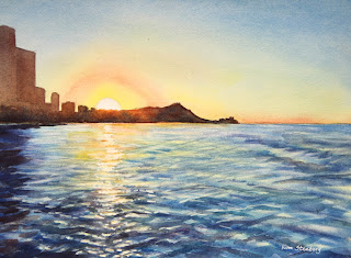
"Waikiki Sunrise"


"Zippy Zebra"

"Mandarin Oranges in Silver Bowl"

"Red Amaryllis"
Winter Shadows"

"Crocuses in Snow"

"Snowman and Red Barn"

"Starry Sky"


Sunday, February 13, 2022

"Crocuses in Snow" (watercolor on paper; 9" x 9")


"Crocuses in Snow"


The following is the description of what we did in the third week of the winter term, 2022 for my "Watercolor from Start to Finish" class (my online Zoom class with the Art League School in Alexandria, VA).

At the beginning of the class, I shared my Hawaii travel journal, which I compiled during the trip for the most part. (I blogged about it) Watercolors are the perfect medium to travel with, either for a short hop to a local park or around the world. It's compact, it dries fast (think the oil medium, which takes weeks to dry!), it can be done half-way (drawing done on location with some color notes or photos) and finished later at your leisure, etc. I highly recommend you start keeping travel journals in the future!

Then I talked about the color yellow: its value range (very narrow), intensity, temperature, and chroma. I also showed you how to mix purples with reds and blues: some mixtures make beautiful purples (cool reds and warm blues that are closer on the color wheel); others make brownish purples (mixtures with cadmium red, a warm red; the red and blue are near complements in this case).

"Yellow Swatches"

"Mixing Purples"

The main business of the day was painting "Crocuses in Snow" to explore the complementary harmony of yellows and purples. On the design drawn on the square format, we started the painting by applying Winsor lemon (the coolest and lightest yellow) on all the flowers.

When the paint was dry, we glazed the flowers with cadmium yellow pale, while preserving the highlights. Finally, we mixed deep yellow/orange with cadmium yellow and a little bit of cadmium red (be careful; otherwise, you end up with scarlet!) for the deeper, warmer bits. With only three layers, we were able to create form for these high-key flowers with a narrow value range.

The rest of the painting went fast. Remember that the white of the paper signifies the brilliant sun-lit snow, hence mustn't be touched! The grass-like leaves, which I extended to the edges of the paper (don't paint a subject floating in the middle of the painting!) were painted in two layers with the mixture of lemon and cobalt blue (the second layer being a little bluer and darker).

The mid-tone shadows on the snow was painted with cobalt blue. Don't make it too light or too dark. Make the shadow shapes as organic as possible, not looking like a starfish; extend the shapes to the edges whenever possible; don't make the shadow shape too small or too big.

In the reference, you don't see much color in the shadow, so I practiced an artistic license because I know from experience that shadows on snow on a sunny day often take on a blue cast thanks to the blue sky being reflected back into them.

You may have noticed that the yellow flowers alone on the stark white paper made them look isolated and not so impactful. After we put down the blue shadows (remember blue and orange are compliments?; and blues are darker than yellows), suddenly the flowers look more beautiful and anchored (with the double contrasts of values and temperatures. If we had used a dull shadows as in the reference, the contrast would have been less and the impact not so great.

Finally, as the icing on the cake, we plonked down a deep purple (mixture of permanent alizarin crimson and French ultramarine blue) for the dark shadows and earth showing through the snow. If I had chosen permanent rose and cobalt blue (which makes a mid-tone purple), the contrast would have been compromised. Don't' make this shape too small or too big.

I said last week that many beginners' paintings suffer from the lack of highlights and darks. Highlights or whites were mindfully preserved in this exercise (or in the last week's) because we were painting snow, but I saw some paintings without the darks during the critique (probably you didn't get that far). You've seen the difference the presence of these darks make in a painting with your own eyes!

"Crocuses in Snow Reference"


Monday, March 14, 2016

"Spring's Arrival" (oil on linen; 8" x 6")

 
click here to buy


This year, thanks to a mild winter, spring has come early.  Crocuses have come and already gone!  Daffodils and hyacinths are now blooming in my garden.  I am glad I took time to paint these lovely purple crocuses that announced the arrival of spring.

Tuesday, March 24, 2015

Friday, January 30, 2015

"Crocuses in Snow" (watercolor on paper; 5" x 7") sol


click here to buy


These early spring babies are not blooming yet; the reference photo was taken a while back. Aren't the yellow crocuses peaking through a cover of light snow a cheerful sight on a wintry day?  Spring will come!

Saturday, January 18, 2014

"Crocuses in Snow" (oil on linen; 6" x 8") sold


sold


A Facebook fan of mine suggested that I should paint crocuses poking through snow.  As we've had snowless winters for the past two years, I thought it could not be done.  Guess what.  I found an old picture of crocuses half buried in a thin layer of snow.

Crocuses will start blooming in a month.  If we are lucky, we will get some snow to coincide with these hardy early spring flowers.  I have them all over my garden and yards. Crocuses are good naturalizers, that is, they multiply on their own.  Deer don't eat them either!

Thursday, March 21, 2013

"Spring Light" (watercolor on paper; 8" x 17") sold


sold


Crocuses are one of the first flowers that bloom in the season, sometimes peeking through a cover of snow.  If you have the bulbs planted in a pot, you can even force them to bloom in winter.

Most artists paint light.  The subject matters are often inconsequential.  In "Spring Light," I was painting the bright spring light as much as the backlit crocuses by the window.


Tuesday, March 13, 2012

"Crocuses and Miniature Daffodils" (oil on linen; 8" x 10") sold


sold

Reference photo

Crocuses are one of the first flowers that bloom in a spring garden.  Their yellow, white, and purple flowers shout, "Wake up!  It's spring!"  In some years, these hardy babies will poke through a snow-covered ground.  Not this year, of course.  They naturalize nicely too, multiplying year after year.   Gardeners love them for one more reason.  Deer don't seem to care for them. 

Another spring bulb deer avoid to the gardeners' delight is the daffodil.  Miniature daffodils, my husband informs me, are the ancestors of modern, big, flashy daffodils.  As you can see in the above picture, they are about the same height as and perfect companions for crocuses.

One thing I have noticed lately while painting spring flowers is that flowers in a natural setting look, well, more natural than those in a still-life setup.  A good reason to get out there and dig.  It is hard to be inside painting when it is a glorious spring day outside.

Sunday, May 8, 2011

Garden Flower Journal (pen and watercolor, 9" x 4" ea)


As some of you may remember, I make my own journal books with good watercolor paper.  With a full sheet (22 x 30"), I come up with six 9 x 9" pages for my journals, plus three 4 x 9" cards.  I didn't know what to do with them until I came up with a brilliant idea of making slender journals for whatever projects I felt like.  Thus was born the "Garden Flower Journal," from which I am sharing some pages today.

The idea was to keep track of the flowers growing in my garden and a nearby park through the spring (2009).  I drew directly with a Micron pen, which is waterproof, then loosely added a watercolor wash.  With the same pen, I also did the lettering and jotted down notations.  The unusual format of the paper made me work hard on the design of each page.

As I was looking through the pages of this journal the other day, an inspiration came to me.  Why not start a "Fruits and Vegetables Journal"?  Many vegetables and fruits are elongated.  Think bananas, cucumbers, green onions, leeks, zucchinis, bokchoy, etc.  As for fruits, I can line up strawberries, cherries, and so on.  For large, globular fruits like watermelons, I can slice them up.  How fun!  I will keep you posted.