 |
"My Parents"
|
The following is what we did in the third week of the winter term,
2022 in my "Watercolor Portraits" class (my online Zoom classes with the Art League School in
Alexandria, VA). By the way, it was my birthday yesterday, and I thought it was quite appropriate to paint my dear parents, who had passed away (my father at the age of 43 and my mother almost 20 years ago). I painted them with gratitude and love. I hope they are pleased. My father, an architect, had wished to be an artist; I am living his dream thanks to the support of my family (including my mother, my mother-in-law and my husband). Thank you.
During the first half of the class, I discussed the properties of color: hue, value, intensity/chroma, and temperature,
while making color swatches. I will keep repeating these important
concepts, so if you are a little confused, don't worry about it! Please make your color swatches to become familiar with your paints.
 |
"Color Swatches I"
|
 |
"Color Swatches II"
|
The
Color Swatches III below show how to neutralize colors to create "mouse
colors", by mixing complimentary or near complimentary colors. We don't always use high chroma colors; if so, the viewer's eyes will get fatigued by over-stimulation. The "mouse colors" is a term used by Jean Dobbie in her classic book, "Making Colors Sing".
They surround and support bright, intense colors and make them look
even more beautiful. Learning to mix these soft, lovely, muted colors at
will, not by accident on the way to creating a "muddy",
"dirty-looking", or "over-worked" painting, will put you in good stead.
Please don't overmix and use plenty of water and paint!
 |
"Color Swatches III"
|
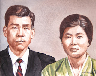
In the second half of the class, I worked on the double portrait of my parents based on an old black-and-white photo.
So, this particular exercise is about working from such a photo and
inventing muted colors so that the painting with some colors will still
look old.
Everybody's painting will be different, so I am not going to explain my process in detail. For the background, I did basically the same thing as in the last week's sepia study (a wet-on-wet variegated wash with cobalt blue and burnt sienna; just one layer and light mid-tone). For the skin tones, I used again the same colors, more brown than blue, layering multiple times until I achieved the right tones.
Someone asked about very pale Caucasian skin tones; the mixture of cadmium red and a little cobalt blue will work well.
Cadmium red is a very intense, high-chroma color; you have to be extra
careful and use a little bit to create a pale blush. For darker tones,
use more red and start adding blue.
For the dark hair, I used the mixture of burnt sienna and French ultramarine blue (it's called Jane's Gray),
which creates a little darker tone because ultramarine blue is darker
than cobalt blue (but similar in temperature; it granulates, so I don't
use it in skin tones much except in dark shadows). I wouldn't use any of the black paints to paint "black" hair;
it results in boring "colors". I use black when I am painting a black
outfit; even then, I will introduce other colors for highlights and
shadows.
I decided to paint my mother's traditional Korean costume top in a muted green
to compliment the brown (which is a dull red) skin tones. I mixed it
with cadmium yellow pale and cobalt blue (if I had used Winsor blue, the
result would have been too bright).
To complement the muted green, I painted my father's striped tie in black and muted maroon (mixture of permanent alizarin crimson and a little permanent sap green). The jacket was painted in neutral tint (Daniel Smith), which is a beautiful, transparent cool black. Ivory black is a sooty, warm black. I have both on my palette.

No comments:
Post a Comment