
 |
| After sold |
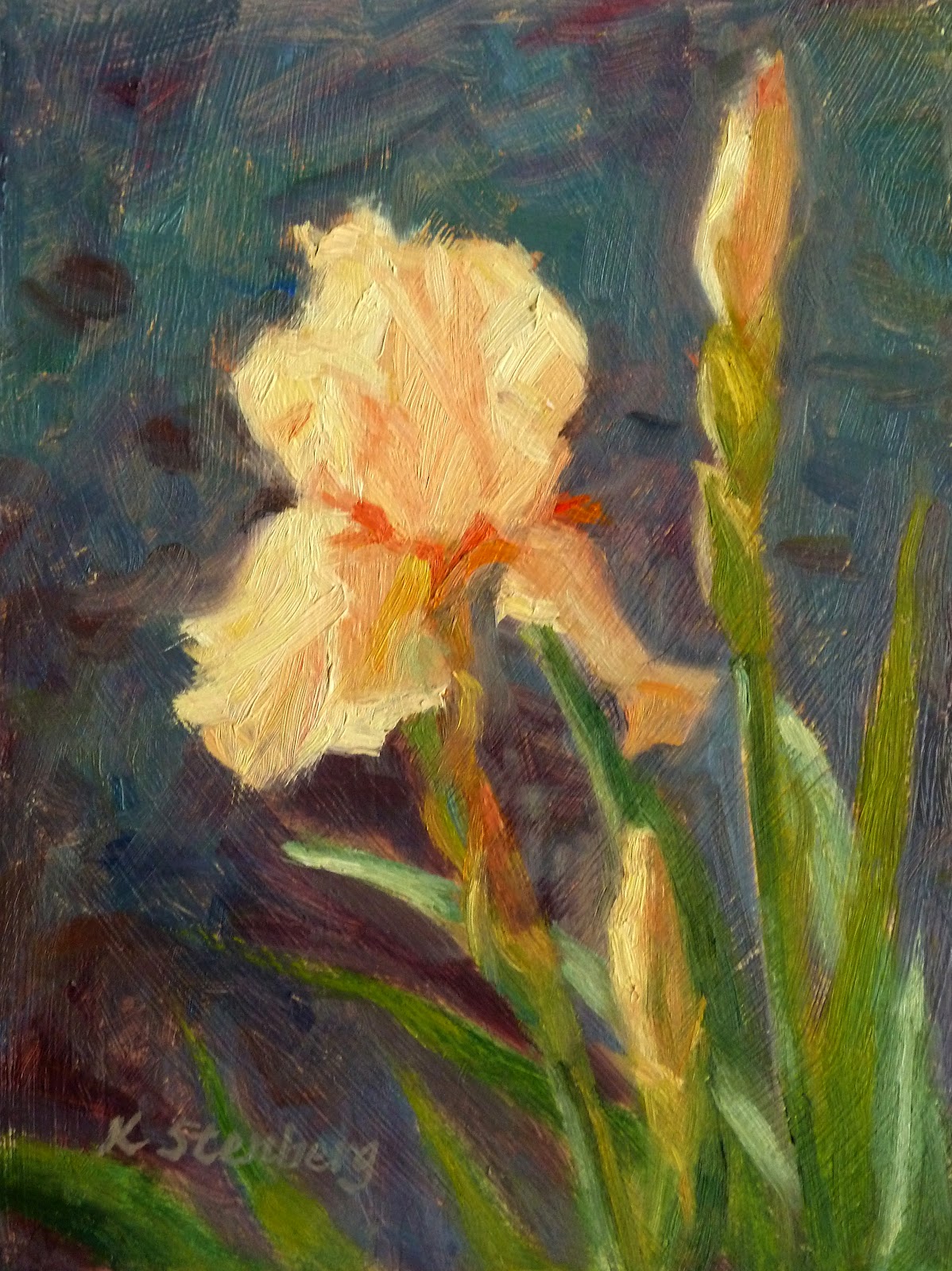 |
| Before |
 |
| Reference photo for "Spring Beauty" |
.jpg) |
| "Yellow Daffodils" sold |
 |
| Before |
One of the trickiest things in painting, I find, is the treatment of the "background." What do I with the environment the subject is sitting in? For instance, if I had painted "Spring Beatuy" exactly as I saw in the reference photo, the result would have been a chaos. When I painted this small gem last spring, I thought I did the right thing by making the "background" blue green--the complementary color of the peach iris. For "Yellow Daffodils," I sublimated the busy, green, spring growth around the daffodils into a soft, grayed green backdrop.
Looking at both paintings with an objective eye, I realized that something had to be done about their backgrounds to make the flowers pop. I changed the overall background colors to purples, then introduced warm colors into the darks, echoing the warmth of the sun and flowers. Yes, I worked on the flowers themselves and spiky leaves of the irises and daffodils too, but they were minor adjustments.
The difference between the original and improved states in both paintings is remarkable. Their message has become clearer--the joy of spring. The flowers look far more vibrant. Despite the small format of the paintings, they carry themselves as if they are much bigger. I learned another lesson in painting: the imporance of the background!
No comments:
Post a Comment