Sunday, May 8, 2022

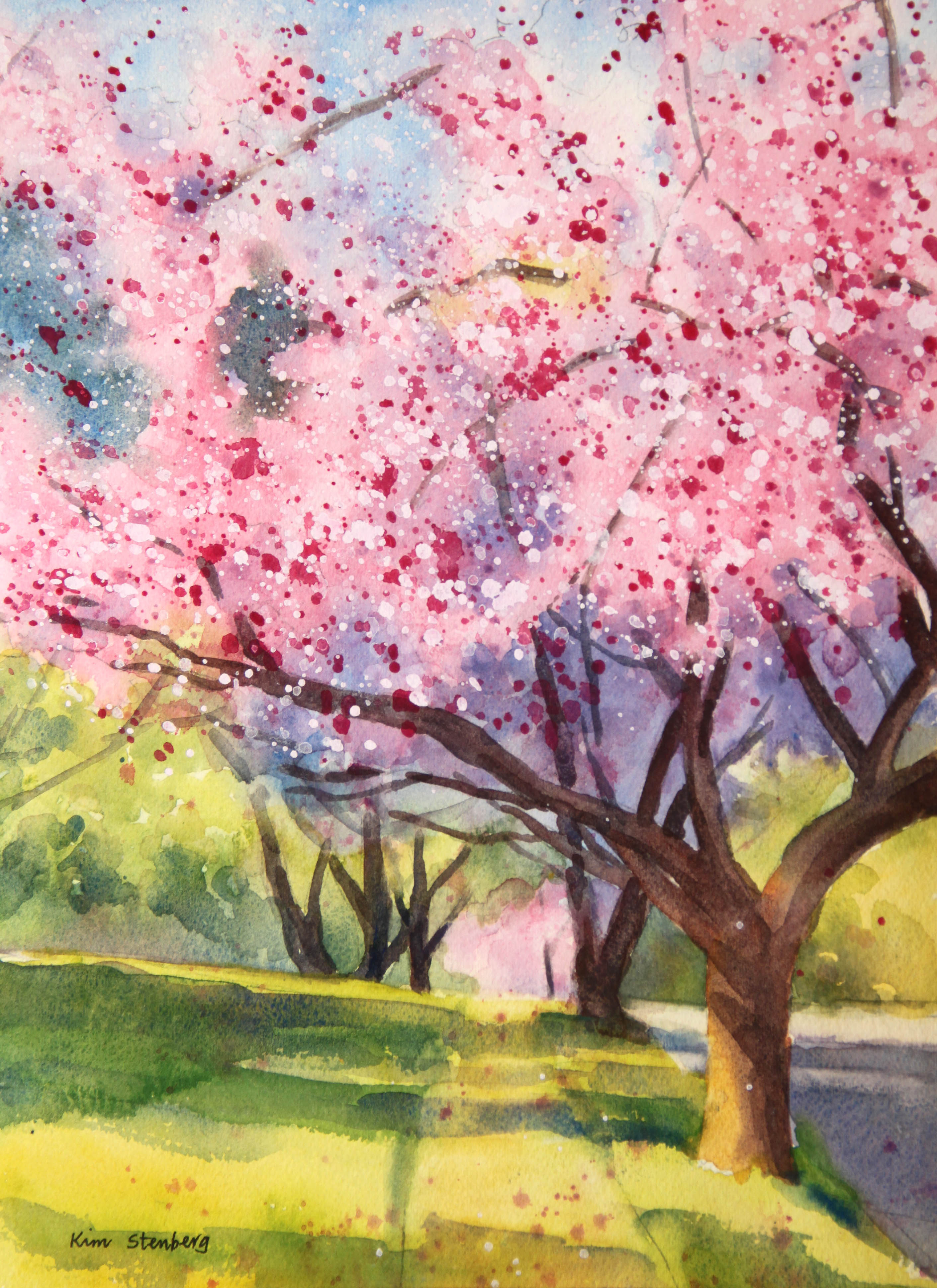
"Double Cherry Blossoms" (watercolor on paper; 12" x 9")


"Double Cherry Blossoms"


The following is the description of what we did in the third week of the spring term, 2022 for my "Watercolor from Start to Finish" class (my online Zoom class with the Art League School in Alexandria, VA).

This week's lesson was about the edges through painting "Double Cherry Blossoms". We drew the design, then we wetted the paper thoroughly and evenly. The success of the variegated wash depends on how you do this step; don't rush it.

We dropped cobalt blue in the sky holes, pale permanent rose in the sun-struck cherry blossoms, yellow green (winsor lemon and a little cobalt blue) in the grass and trees, and quinacridone gold in the trees, side walk and street. We dried paper until it's bone dry. 

The biggest trap in a cherry blossom painting is paint it all pink and saccharine. One must focus on light and dark shapes. Desaturate the picture and print it out black and white as well as a color version to avoid the trap. We wetted a little more than the top half of the paper and dropped the purple mixture (French ultramarine blue and permanent alizarin crimson) to suggest the cherry blsooms in shadow.

We mixed the dark green (ultramarine blue and gold) and dropped it in the two dark green shapes showing through the gaps in the cherry blossoms in the top left.

So far, the painting has no hard edges. We are going to bring the sunshine by introducing the crisp-edged shadows. The shadow colors vary depending on the local colors: the blue greens (cadmium yellow pale and cobalt blue; I glazed the purple mixture over green here and there later) on the grass and the shadow areas in the distant trees and purples (ultramarine blue and crimson; you may add a little gold for the street) on the sidewalk and street.

I've noticed during the critique session, quite a few of you made the edges of these shadows mushy. Don't be afraid of hard edges. What's problematic (at least for me) is that there are only hard edges in a painting. Hard edges come forward and they can also suggest the sunny condition; soft edges tend to recede, create soft textures and can suggest a damp weather condition. The ability to control the hard/soft edges indicates how advanced you are in your watercolor journey and will open the door for you to paint any subject you wish!

By the way, below is your homework. Please practice mixing greens. Many students hate mixing and painting greens, but we cannot avoid greens, especially in landscapes. It's actually not that hard to mix beautiful greens. Again, it's matter of practice and positive attitude!

Mixing Greens

We painted the tree trunks and limbs with the mixture of ultramarine blue and burnt sienna. Make sure the mid-tone branches in the middle of the cherry blossoms tuck behind the clouds of flowers or dark shadows and not stick out out of nowhere.

Finally, it's time to get messy with the splatters. Cover yourself and the working area because these pesty splatters tend to end up everywhere! We first splattered with permanent rose, then white gouache. Use a small round brush, load it up with enough thick paint and splatter carefully in all directions. Avoid big bombs (caused by too much water in the brush). Nothing happening? Use more water. Don't be half-hearted with these splatters. Do enough of them so that they show!

I avoided these splatters (which suggest the highlights on the flowers) in the shadow areas. I splattered a little bit on the sidewalk and grass. At the end, I decided to splatter the mixture of a little permanent rose and white gouache as well.

Below is my class demo. This is only one way of painting cherry blossoms. You may want to try a different approach with more hard-edged flowers. As long as you include the dark shadows of these delicate flowers, you will have success.


"Double Cherry Blossoms Class Demo"


Tuesday, May 3, 2022

"Enchanting Bluebells" (watercolor on paper; 9" x 12") sold


"Enchanting Bluebells" (sold)


Virginia bluebells are blooming in the Riverbend Regional Park in Great Falls, VA. Let's walk down the path in dappled light together. It is so magical and enchanting that all the worldly worries are forgotten here.


Sunday, May 1, 2022

"Acadia Milky Way Reflections" (watercolor on paper; 12" x 9")


"Acadia Milky Way Reflections"


The following is the description of what we did in the second week of the spring term, 2022 for my "Watercolor from Start to Finish" class (my online Zoom class with the Art League School in Alexandria, VA).

This week''s lesson was the wet-on-wet variegated wash through painting "Acadia Milky Way Reflections". The way we did it was a little unusual, but the sky is the limit as far as the variegated wash is concerned, and I cannot emphasize its importance in watercolors. 

We drew the design with a HB pencil very lightly. Then we wetted the paper thoroughly and evenly except the land shape below the horizon. The success of the variegated wash depends on how you do this step; don't rush it. There are no fixes when the paper is wet unevenly.

We dropped very pale Winsor lemon, then a little permanent rose in the sky and water, where you see the glows caused by the gazillion stars. Make these pale shapes interesting and somewhat mirror-image (the glow shape in the water is the reflection of the same in the sky!)

Dry paper until it's bone dry (feels room temperature, not cool, to touch). If you rush this drying stage, you are likely to disturb the underlying layer(s). As long as you bone-dry and then wet the paper gently but thoroughly for the next layer with a soft flat brush, you can do this theoretically up to hundred times, although only a few fanatical watercolorists do it!

The next layer was cobalt blue to suggest the night sky. The night sky is usually very dark, almost pitch black, but when there is a full moon, aurora, or a galaxy full of stars, it will look quite colorful. Don't cover the glows from the first layer. Bone-dry the paper and wet it again for the third layer.

We darkened the periphery of the paper with the blue purple mixture of French ultramarine blue (darker than cobalt blue) and permanent rose. Quite a few of you ended up covering up the cobalt blue layer entirely. Please don't. If you haven't wetted the paper nice and evenly, you will by now have many hard edges around the glows in the sky and water. It's game over because the sky and water take up 90% of the painting. We cannot even say they are the background or negative space; they are the painting, the story (plus the stars). Again, I cannot emphasize enough the importance of the beautifully executed variegated wash at the beginning of many paintings.

Many beginners feel thwarted by the variegated wash or wet-on-wet technique altogether and decide to stick to the wet-on-dry, paint-by-the numbers-without-numbers technique. If you are one of them, you are limiting your potential. Watercolor is capable of achieving the infinite variety of subtle and not-so-subtle images. You master both the wet-on-wet and wet-on-dry techniques, the world truly becomes your oyster!

If your sky and water are not dark enough, you have to repeat the process. Don't be afraid of using enough paints. Don't paint wishy-washy, anorexic paintings. Nobody swoons over the half-hearted washes.

Now, it's time to paint the small sliver of the land shape. Paint the rocks in three layers: quinacridone gold base, burnt sienna mid-tone cracks, and the dark mixture of ultramarine blue and burnt sienna, plus a little gold (for the dark base, some cracks, and reflections of the dark rocks in the water). Using the same dark mixture (don't mix the paints thoroughly ever!), paint also the coniferous tree shape, making sure the farther trees are smaller to have them recede.

Finally, it's time to get messy with the white gouache splatters. Cover yourself and working area because these pesty splatters tend to end up everywhere! And mask the water and trees with two pieces of paper. Use a small round brush, load it up with enough thick paint and splatter carefully in all directions. Avoid big bombs (caused by too much water in the brush). Nothing happening? Use more water. Don't be half-hearted with these splatters. Do enough of them so that they show!
 
We will be using the splatter technique again. So if you don't like the mess, get over it! It's useful for stars, sands, rocks, or to add some visual noise where nothing of interest is happening.


Friday, April 29, 2022

"Victorian Lady in Sepia" (watercolor on paper; 12" x 9")


"Victorian Lady in Sepia"


The following is what we did in the second week of the spring term, 2022 in my "Watercolor Portraits" class (my online Zoom classes with the Art League School in Alexandria, VA).

First we talked about the important business of the value scales (grayscales). I actually made them for you to see (If you just watched, please try them; it's not as easy as it looks!), using the sepia mixture of cobalt blue and burnt sienna (Daniel Smith). You can also try a black (I like neutral tint by Daniel Smith).

Then we started the main lesson of the day, which was painting a sepia value study of "Victorian Lady", based on a sepia picture taken between 1890 and 1900. We used only burnt sienna (my favorite is Daniel Smith) and cobalt blue. In the value scales, the value 10 is the white of the paper (highlights). The value 2 or 3 is as dark as it gets with the mixture of these two colors. The value 1 is black. The high-key paintings crowd around highlights and mid tones; the low-key paintings (such as tonalist) lack highlights and crowd around mid tones and darks. We won't be using ten values; you can do a convincing portrait with six values. Beginners' paintings often lack highlights and darks and remain in the mid-tone fest!

Sepia Grayscales

I first painted the background with the dark mid-tone variegated wash (slightly bluer and darker along the periphery, giving the subject a brownish halo) on thoroughly wet paper. If your first layer was too light, repeat the process. You have to dry the paper thoroughly before rewetting; otherwise you disturb the first layer. Be as gentle as possible when you are wet-glazing. The variegated background wash is something I do in every single portrait painting; you have to master this technique

Then I started painting the subject with the lightest wash on dry paper, covering the entire area of the subject, except the lightest parts (highlights). Don't make this first layer too dark and make it more brown than blue! The value should be the #9 in the grayscale (called tint).

In between layers, dry the paper thoroughly. We are glazing, so paper should be bone dry. At each stage, I mixed a slightly darker batch by adding a little more of each paint; mix more than you think necessary (you don't want to run out of paint in the middle of the wash!). By the fifth layer, I got everything done; for the darkest layer, I used French ultramarine blue rather than cobalt blue as the former is a darker color. The darkest values are found in the hair, dark trim of the brooch, left-side brow and adjoining dark shadow of the nose, pupils, upper lip (left side), canine fossa and a few folds of the blouse.

For the finishing touch, I used the Sakura gelly roll pen 10 to restore the catchlights in the pupils. You can use instead a white gouache. You can also use a white gouache for the white polka dots and highlights in the neck and lace.

The image below is the class demo; the top image is my sample painting, which is warmer than the demo. The color temperature in photography is called white balance. Even the same painting can look different depending on the lighting condition. The day when I took the picture of the sample painting, it may have been an overcast day that caused the general warmness. Today when I took the picture of the demo, it was a bright sunny condition (the blue of the sky causes the cool temperature).

"Victorian Lady in Sepia" Class Demo

Monday, April 25, 2022

""Medici Fountain at Luxembourg Garden" (oil on linen; 10" x 8") sold


sold


The Medici Fountain (la fontaine Médicis) is a monumental fountain in the Luxembourg Garden in the 6th arrondissement in Paris. It was built in about 1630 by Marie de' Medici, the widow of King Henry IV of France and regent of King Louis VIII of France. It was moved to its present location and extensively rebuilt in 1864-66.

I visited the famous fountain in late summer on an overcast day in 2019. In the painting I tried to capture the magical serenity of the place with the pointillist style. Do you think I succeeded?


Sunday, April 24, 2022

"Santa Ana Mountains Wildflowers" (watercolor on paper, 9" x 12")


"Santa Ana Mountains Wildflowers)


The following is the description of what we did in the first week of the spring term, 2022 for my "Watercolor from Start to Finish" class (my online Zoom class with the Art League School in Alexandria, VA).

This week's lesson was about painting by numbers without numbers. This is how the beginners start out; one can do the most amazing things with this approach, so no reason to disdain it.

I discussed the properties of color: hue (yellow, orange, red, purple, blue, green, etc), value (light and dark), intensity/chroma (bright and dull), and temperature (warm and cool). I will keep repeating these important concepts, so if you are a little confused, don't worry about it!

To practice the wet-on-dry, paint-by-numbers-without-numbers method, we painted "Santa Ana Mountains Wildflowers". First, we drew the design with a HB pencil with a light touch. The less you use eraser, the better-off you are. If you must, use a kneaded eraser. The watercolor paper must be handled with kid gloves and with tenderness. I emphasize the importance of using an undamaged, good paper (Arches 140lb cold press paper). It comes through layers of watercolor washes and that's why a good watercolor painting glows.

Then we wetted the sky shape only and did a graded wash in cobalt blue. This is the simplest, yet effective way of painting sky and still gives it a sensation of depth. The sky is usually darker at the top and lighter near the horizon. So use more paint at the top and less near the horizon. Making a smooth transition from deeper to lighter tone is much harder than you think. Hence practice the graded wash!

Tilt the paper pad/board a little to utilize gravity. If you are using a stiff flat brush, your job will be tougher. If the wash turns out too light (watercolor dries a couple of value scales lighter; wet paper requires more paint than dry paper), repeat the process. Dry the paper completely, wet the sky shape (if your flat brush is stiff or your strokes are too vigorous, you will remove a lot of the first layer), then drop the cobalt blue. Theoretically you can repeat the process up to hundred times, but who has the time or patience!

The rest is relatively simple; it's matter of blocking in different color shapes, then glazing (adding layers on dry paper). We started with the orange California poppy shapes (mixture of cadmium yellow pale and a little cadmium red), then painted the purple California bluebell shapes (mixture of cobalt blue and permanent rose), and the green grass shapes (mixture of cadmium yellow and cobalt blue).

I glazed the poppy petals in shadow with the red orange mixture of cadmium red and cadmium yellow.

I glazed the distant hill slopes in shadow with the purple mixture of French ultramarine blue and permanent alizarin crimson. I glazed darker purple flowers and darker grasses with the same purple mixture. Yes, purple is a very useful color as greens and blues turn purple when they become really dark. Even reds become purple when they are dark.
 
In this lesson, you learned to mix paints partially so that two paints can make four colors (for instance, yellow, yellow orange, red orange and red; rose, rose purple, blue purple, blue; yellow, yellow green, blue green, and blue). Never overmix and end up with a homogenized mixture


Monday, April 4, 2022

"Kaena Point Sunset" (watercolor on paper; 9" x 12")


"Kaena Point Sunset"


The following is the wrap-up of the "Painting Sunsets in Watercolor" workshop I taught this weekend at the Art League School in Alexandria, VA.
 
It has been a great pleasure to have you in my sunset workshop. I hope you learned something to help you in your watercolor journey. Some of you were not familiar with the wet-on-wet variegated wash or painting in layers. But it is generally why we take workshops: to broaden the horizon and try something new. You guys were awesome!

Things to take away? Sunsets are all about the yellow and orange glows and we have to preserve that glow to paint a successful sunset.

Blues and purples are present often in sunsets. Since oranges and yellows are complimentary colors of blues and purples, if we paint them at the same time, they will mix on their own on the  wet paper and result in mud. Hence, we must separate them in layers!

Each time when you wet the paper for the wet-on-wet technique, which helps us to apply paint smoothly without leaving hard edges (and sky, water, and many other things are all about softness), you have to wet the paper thoroughly. And you have to use good paper (we used Arches 140 lb cold press paper)!

Each time when we start the next layer, the paper has to be bone dry! Otherwise you risk stirring up the previous layer(s). If you do this right, you can repeat the process until you can't take it anymore. Lol. You can also wet only part of the paper (sky, water, etc.) depending on your purpose.

We don't always repeat the variegated wash in multiple layers. As I have shown some examples, I sometimes get it done in one or two layers.  So don't think what we did is the norm. It depends!

The reason why repeated the yellow, red orange, and blue layers twice is this: it's better to go gentle and layer than go too strong and do oops. In watercolor, removing paints is much much harder than adding more paints in layers. Go easy and go slow! Patience is the most important virtue in watercolor.

So the end result should be vibrant yellow, red orange and blue. Some of you needed to strengthen blues, right?

When you are satisfied, paint the land shape, tree, boats, or whatever. Hard edges are introduced at this stage and we often paint on dry paper. Darks must be dark enough!

Values are the most important thing in a painting in any medium. If you are plagued by the feeling that your project is not going well, take the picture of your work-in-progress and desaturate the picture using your phone picture editor. You will see your problems right away!