Friday, June 10, 2022

"Sabrina at Hanauma Bay, Oahu" (watercolor on paper; 14" x 10")


"Sabrina at Hanauma Bay"


The following is what we did in the seventh and eighth weeks of the spring term, 2022 in my "Watercolor Portraits" class (my online Zoom classes with the Art League School in Alexandria, VA).

The last independent project is the full-length portrait and the focus of the last two weeks of the spring term. The following three images are from Laurel Hart's "Putting People in Your Paintings". She has a YouTube channel with full-length videos. Check them out!

"Figure Proportions I"
"Figure Proportions II"

"Shadow Patterns"

I also introduced two books: Christopher Hart's "Figure it Out!: Human Proportions" and "The Complete Book of Poses for Artists" by Ken Goldman and Stephanie Goldman.

There are a number of ways of handling a full-length portrait but, in my opinion, the easiest way is focusing on the light and shadow pattern in the face and body and paint it in either two (light and dark) or three (light, mid-tone, and dark) values. (Refer to the third image from Laurel Hart's book.) If you are capable, you can soften the edges since face, torso, and limbs are round objects of either egg-like or cylindrical forms.

But keeping the light and shadow patterns distinct is more important in rendering the human form in such a small scale than softening edges. My demo painting, "Sabrina in Hanauma Bay, Oahu", is 14" tall and her head is only 1 1/2" tall, whereas the average human head is 9" tall. (Remember that the average person is 7 to 7 1/2 head long; my daughter, who is 5' 2" tall, is  less than that.) The features are tiny, but if you draw the light/shadow pattern right, the subject will emerge miraculously, as you can see in the work in progress below!

"Sabrina in Hanauma Bay in Progress"

I used the three value method for "Sabrina at Hanauma Bay" and "Artist at 28". You can paint anything, not just skin tones, in three values, be that the hair, clothes, or whatever! For the image below from my whimsical figure journal that I keep for pure fun, I used Schmincke's naples yellow reddish (light), rose dore (mid-tone), and perylene violet (dark). You can use whatever colors of your choice that harmonize well with each other; just designate a different color for each value. 
 
 
"Two Women in Black"

I used watercolor pencil shavings and water spritz to create the sand texture in the beach. I also used watercolor pencils the draw in some patterns in the coverup, then painted dark shadow patterns with indigo blue; to restore light patterns, I used white gouache. For these tiny portraits, if you are having trouble getting features right, you may want to consider using either watercolor pencils or colored pencils in appropriate colors.
 
Below is the finished image of "Artist at 28". The painting is based on an old photo that was taken when I was 28 years old. I look like a girl!
 
"Artist at 28"


Sunday, June 5, 2022

"Red Giraffe" (watercolor on paper; 12" x 9")


"Red Giraffe"


The following is the description of what we did in the seventh week of the spring term, 2022 for my "Watercolor from Start to Finish" class (my online Zoom class with the Art League School in Alexandria, VA).

This week we explored a stylized portrait of an animal through "Red Giraffe". I don't usually paint like this, so it was a lot of fun and a liberating experience. Art should be about creativity and thinking outside the box. This may not be your cup of tea or it could be just what you were looking for. Finding one's own bliss is the goal, not getting the approval of your instructor or family!
 
You will need white gouache, a dip pen and black india ink, and Pentel Arts Portable Pocket Brush Pen. If you cannot get hold of the Pentel brush pen (make sure you get the right one, there are many different Pentel brush pens!), you can use a small round brush or rigger brush with India ink instead.

First draw the design, then wet the paper thoroughly and drop paints (cobalt blue, Winsor lemon, cadmium yellow pale, and cadmium red) randomly without overmixing. Immediately spritz water and let colors drip and mix. Let it dry.

Do the linework with the dip pen with India ink, then with the Pentel pocket brush pen, using my paintings as reference. There is no right or wrong, so do your thing!

Finally, paint markings on the giraffe in cadmium red and restore the lost white with white gouache. Have fun! 


Friday, June 3, 2022

"Mimosa Time" (watercolor on paper; 10" x 8")


"Mimosa Time"


The following is what we did in the sixth week of the spring term, 2022 in my "Watercolor Portraits" class (my online Zoom classes with the Art League School in Alexandria, VA).

This week we are exploring the portrait with prominent hands. When handled well, the hands can contribute hugely to the success of the portrait, so much so that a great portrait painter is usually someone who can paint hands masterfully. Instead of avoiding a subject with hands, let's embrace the hands and try to get better!

Below is the image of my class demo in progress. Just like anything else, painting hands is all about paying attention to plane changes and value shapes, the latter caused by different amounts of light falling on them. Often the quality of light is subtle, but it is still there. In my case, there was the natural light from the window (right side) and the warm artificial light from the interior (left side). The subject's melon-color shirt also strongly influenced the colors in the hands. I had to play with the warm/cool contrast as well as the light/dark one. 


"Mimosa Time in Progress"


The end game here is modeling the hand (with five fingers!) successfully so that it looks three-dimensional. When I realized that I had lost the light shapes, I reintroduced them with white gouache, and there you go, the hand holding the champagne flute appeared in full glory. 

The beard is no different from anything else. Paint light and darks. Of course, hair has soft texture, so the ability to control the hard/soft edges is paramount in the success of painting a beard and mustache. My husband has a salf-and-pepper beard and I had to make sure the darks were dark enough. The hair on the left side, near the orange drink, reflected the warm color and it was important that I didn't use cool darks. Yes, values are the most important things, but color temperature has to be sometimes considered as well.
 
When I was satisfied with the light/dark pattern of the beard and mustache, I went over to add the "salt" part with white gouache using my "lifting"brush. I was mindful not to overdo these finishing touches. Remember that it's not the details, but the overall light and dark pattern and soft texture, that gives the impressions of the facial hair or any hair.


Wednesday, June 1, 2022

"National Cathedral" (oil on stretched canvas; 40" x 40") sold


"National Cathedral"


The painting is a commission for Catherine and her husband Andrew. Andrew went to St. Albans School, right next to the cathedral and practically grew up in and around the magnificent Gothic cathedral. He got married there and had planted a tree in front of the north side (entry area) with his father. It was an important sentimental project for Andrew and he chose this image personally so that his tree would be a part of the finished painting.

It was the largest oil painting project ever for me. It took about two months to draw, block in, paint and add finishing touches. I needed a little stool to reach the highest areas of the big canvas! Thank you for the opportunity, Andrew and Catherine, who were the most gracious clients. 

I must say that my patience and drawing skills have improved much because of this project. The only drawback is that I couldn't take a proper photography of the huge canvas, so I had to make do with a quick shoot with my phone. What a shame!


Work in Progress I

Work in Progress II

Work in Progress III


Sunday, May 29, 2022

"Margaret" (watercolor on paper; 12" x 9") sold


"Margaret"


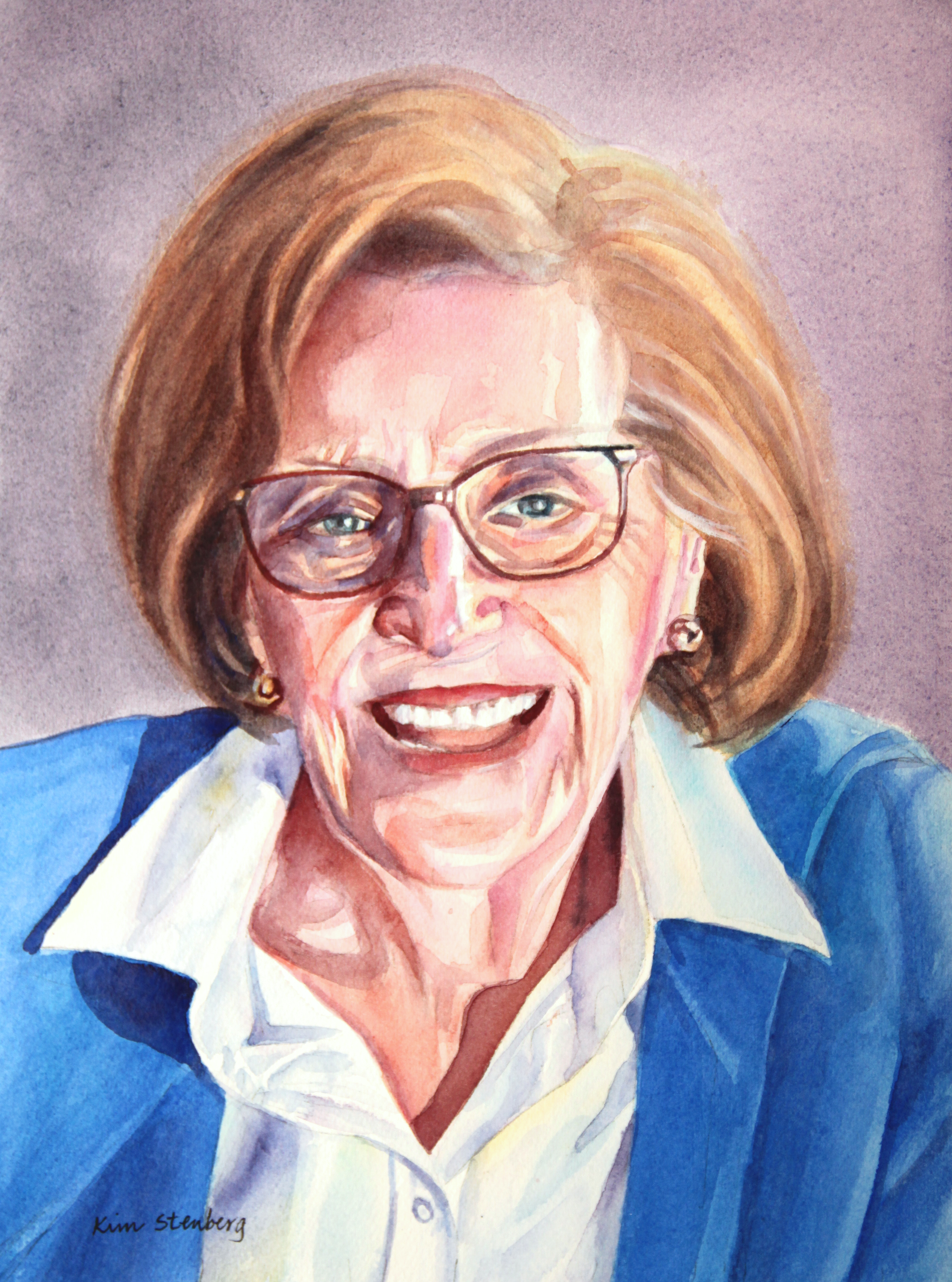
This is a commission portrait for Christa. Her beautiful mother passed away last year at the age of 86 and the portrait is meant for her father. I have known Christa for over 20 years and it was an honor to paint her mother, whom I have never met but heard about when our daughters went to preschool together. It is time like this when I feel particularly good about being a portrait painter, helping my friends and other clients to remember the happy memories of their beloveds.


"Great Falls Rapids" (watercolor on paper; 9" x 12")


"Great Falls Rapids"


The following is the description of what we did in the sixth week of the spring term, 2022 for my "Watercolor from Start to Finish" class (my online Zoom class with the Art League School in Alexandria, VA).

This week we painted rocks and rapids with "Great Falls Rapids". Painting a landscape can be daunting due to the seemingly endless shapes of trees, leaves, rocks, etc. It is essential to break the scene down into big shapes. In this painting, there are three big shapes of the sky, trees, and rocks/water. As you are familiar by now, we generally paint the landscape from what's farthest to the closest from us (from the top to the bottom of the paper).

So, first we wetted the sky thoroughly and evenly and painted it in cobalt blue in graded wash. We dried the paper for the next step of the tree shape. By the way, the rest of the painting was painted on dry paper with mostly hard edges.

Here I decided to do something different from my sample painting above, which I felt too claustrophobic. Upon analysis, I realized I had painted the trees (two stacks of the farther, blue green and the closer yellow green treelines) too dark and too bright. Instead I decided to paint them slightly lighter, duller, purpler and with less details (and soft edges between the two stacks) so that they will recede to the background instead of coming forward.

For the darker tree stack, I used the purple mixture of French ultramarine blue and permanent alizarin crimson and cut its brightness down a little with the complementary yellow (quinacridone gold). We used the largest round brush we can handle for the tree shape.

While the wash was still damp, we quickly brushed in the dull blue green mixture of ultramarine blue and gold, making sure this front stack was lighter (more water and less paint!). If you are quick enough, you will end up with the soft blurring between the two stacks of trees.

While this front stack was still damp, I decided to brighten the wash by charging (dropping) Winsor lemon into the wash (make sure you don't introduce too much extra water). That was enough and we were done with the tree shape That's how I like to roll with the minimum fuss.

Now the fun and excitement of painting rocks and water began. That rocks are hard and water is not is what you have to remember. Forget the details and focus on the big shapes and gradually break down the big shapes without ending up with tiny pebbles or hard-edged, frozen water.

First, we painted the rocks, then water. For the first wash of the rocks, we painted in a light mixture of gold, burnt sienna and cobalt blue, sometimes pushing the color to yellow, sometimes to brown, and sometimes blue. As long as you don't mix the three colors completely, you can paint the same light-value, first wash in subtly changing colors!

For the mid-tone planes and dark crevices and cracks, I used two different dark mixtures: the first mixture of ultramarine blue, alizarine crimson and gold and the second Jane's Gray mixture of ultramarine blue and burnt sienna. Remember that the rocks are not only hard-edged, but also round objects with volume. Think mass/planes, not lines. Otherwise, you will have a bunch of flat-shaped, busy-looking thingies. Also don't paint over all the light-value, first wash shapes. They are the highlights. Think light, mid-tone, and darks to create the rocks with hard outer edges, but with voluminous mass.

Make sure you don't accidentally paint over the white water shapes. Paint slowly, looking for the rock shapes. Get into the flow and enjoy the process. You are not in a rush to finish the painting. If you get tired because this may take a while, take a break or finish the painting another day.

For the water shapes, we switched to Winsor blue as the base blue; it's a transparent, staining, and cool-temperature/greenish blue. For the turquoise water, we added Winsor lemon; for purple areas, we added a little alizarin crimson. Leave plenty of white shapes to suggest white water. If you accidentally lose white water shapes, it's okay to retrieve them with a white gouache, but it's always best to be mindful and utilize the white of the paper to the maximum.

I  didn't get to finish the demo. But I love the way it's heading; it's so much better than the sample painting, don't you think? I may even finish it someday. I think that's the value of doing the same project twice: learn from the first try and do things better and differently the second time. Be one's own constructive critique without the destructive self-talk. Be kind to oneself, but be objective to oneself as well.


"Great Falls Rapids Class Demo in Progress"

Sunday, May 22, 2022

"Queen Anne's Lace Lake" (watercolor and gouache on paper; 12" x 9")


"Queen Anne's Lace Lake"


The following is the description of what we did in the fifth week of the spring term, 2022 for my "Watercolor from Start to Finish" class (my online Zoom class with the Art League School in Alexandria, VA).

This week we explored the mixed media of watercolor and gouache. Whenever you add a little white gouache to watercolor, the latter turns into an opaque medium of gouache. Please check out James Gurney's YouTube video on "Painting Peonies with Watercolor". In this video, you will learn the nuts and bolts about plein-air painting and how to paint tree peonies in watercolor and gouache. He is a world-famous painter of many mediums; he is one of the most creative artists I know of.

"Queen Anne's Lace Lake" involves the hard/soft edge handling as well. After drawing the design, we wetted the paper thoroughly and evenly and first painted along the horizon (both above and below) with a very pale winsor lemon (if you are heavy-handed with lemon, your sky will turn green!), then painted the rest of the sky and water in cobalt blue.

After drying the paper, we wetted this time the sky shape only and dropped the greens (lemon and cobalt blue) and purples (French ultramarine and permanent alizarin crimson) to suggest the distant trees. If your paper is too wet, you will lose control and the distant trees will be as tall as the middle-ground tree. Drop purples generally along the horizon, but don't be automatic. Refer to my painting. At one go, I created the impression of the soft-edged distant tree line with layers of tall and short trees.

After the paper dried, we wetted this time the water and tall middle-ground tree shape. We dropped purples for the reflections of the distant trees along the horizon and the reflections of the tall tree and middle-ground land shape. We also dropped greens and purples for the tall tree. Make sure the tall tree shape looks like a tree, not a mitten! If you haven't wetted the paper thoroughly, you will have hard edged reflections!

While the paper is still damp, make grass strokes in the foreground with various greens and even some purples for dark shadows in between grasses. 

When the paper dried, we pained the middle ground land shape (now hard edges are happening for definitions).

Time for gouache! Whenever we use gouache, we have to use it with much less water. If you use it in the consistency of watercolor (with lots of water), gouache practically disappears. Whenever we mix watercolor with white gouache, the mixture dries about two value scales darker (the opposite of watercolor).

Keeping these two things in mind, stipple dots with the watercolor/gouache mixture of appropriate colors in the tall tree, middle-ground land shape, and middle-ground reflections in the water. These dots suggest the tree foliage, distant Queen Anne's lace and their reflections in the watercolor.

For the foreground, we are also using the watercolor/gouache mixture, but in a more controlled manner, tiny dots for the Queen Anne's lace flower heads, elongated strokes for the cattails, and long grass-like strokes for the tall grasses
 
Make sure that the flowers or cattails don't have the same heights or are not evenly spread out as if they are a marching band. The grasses should have different heights and some should reach all the way to the middle-ground land shape. Grasses should have a variety of greens; stroke in some ocher-colored grasses and dark blue shapes for a variety as well. 

At the end, as the icing on the cake, I painted the tiny water lilies in the water using permanent rose and gouache.

As you can see, introducing a white gouache to watercolor opens a whole new world to the watercolorist. We can go not only from light to dark as the medium dictates, we can also go dark to light. Freedom it allows us may not be for all watercolorists, but I embrace it whole-heartedly!