Friday, February 18, 2022

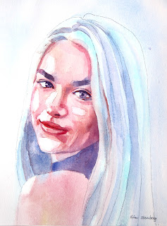
"Portrait in Limited Palette" (watercolor on paper; 12" x 9")


"Portrait in Limited Palette"


The following is what we did in the fourth week of the winter term, 2022 in my "Watercolor Portraits" class (my online Zoom classes with the Art League School in Alexandria, VA).

We worked on a portrait in a limited palette using only six colors: Winsor lemon, permanent rose, cadmium red, cobalt turquoise light by Winsor Newton (can be substituted with cerulean blue), cobalt blue, and French ultramarine blue. The exercise was inspired by the artwork by Stephie Butler in a watercolor magazine ("Beginner's Guide to Watercolours").

This is not how I normally paint portraits, but it is an great exercise to learn about watercolor (paints go wherever there is moisture on the paper and stop where it's dry) and not deal with the panic one feels when putting down the first layer of skin tones.

We used the mixture of permanent rose and Winsor lemon for skin tones for the most part. Cadmium red was preserved for accents and to make some deeper brownish purple for darks. (Personally, I use cadmium red as the basis of all skin tones and rarely use permanent rose. We'll talk a lot more about warm and cool reds than I did at the beginning of the class; if you are confused about the color temperature business, rest easy.)
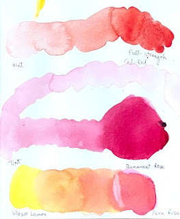
"Mixing Skin Tones"

"Mixing Purples"

First we wetted the paper with the exception of highlights and white of the eyes, then floated pale cobalt turquoise light on the highlights of the hair and pale cobalt blue in the darker areas of the hair and the negative space (background). We continued to drop the mixture of permanent rose and lemon on skin tones (sometimes a little cooler with just rose) while the paper was still wet.
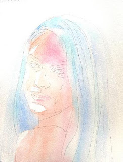
"Step 1"

We dried the paper thoroughly, then started layering. Whenever you are layering, add a little dark accents in the eyes (first with the purple mixture of rose and ultramarine blue, later with the brownish, darker mixture of cadmium red and ultramarine blue).
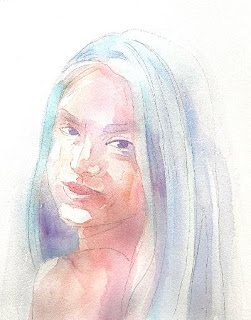
"Step 2"

I showed you how to soften the edges of a stroke (put down a tone, quickly rinse the brush, and with the clean damp brush pull the tone away). Whenever possible, pull the tones to the surrounding areas so that the mouth doesn't look like a cutout, the eyebrows don't look like caterpillars, the hair doesn't look like a helmet, etc.
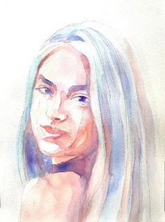
"Step 3"
 
Don't be afraid to go dark in the shadows, but don't jump from light straight to dark. Mid-tones make up the bulk of skin tones! The catchlights of the eyes were done with a white Sakura gellyroll pen 10. As you can see, the white balance of the finished demo is much cooler than the three step-by-step photos of the sample painting I have taken for you. Honestly, I find taking a good picture of an artwork much harder than creating a good painting!


Sunday, February 13, 2022

"Crocuses in Snow" (watercolor on paper; 9" x 9")


"Crocuses in Snow"


The following is the description of what we did in the third week of the winter term, 2022 for my "Watercolor from Start to Finish" class (my online Zoom class with the Art League School in Alexandria, VA).

At the beginning of the class, I shared my Hawaii travel journal, which I compiled during the trip for the most part. (I blogged about it) Watercolors are the perfect medium to travel with, either for a short hop to a local park or around the world. It's compact, it dries fast (think the oil medium, which takes weeks to dry!), it can be done half-way (drawing done on location with some color notes or photos) and finished later at your leisure, etc. I highly recommend you start keeping travel journals in the future!

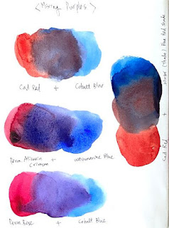
Then I talked about the color yellow: its value range (very narrow), intensity, temperature, and chroma. I also showed you how to mix purples with reds and blues: some mixtures make beautiful purples (cool reds and warm blues that are closer on the color wheel); others make brownish purples (mixtures with cadmium red, a warm red; the red and blue are near complements in this case).

"Yellow Swatches"

"Mixing Purples"

The main business of the day was painting "Crocuses in Snow" to explore the complementary harmony of yellows and purples. On the design drawn on the square format, we started the painting by applying Winsor lemon (the coolest and lightest yellow) on all the flowers.

When the paint was dry, we glazed the flowers with cadmium yellow pale, while preserving the highlights. Finally, we mixed deep yellow/orange with cadmium yellow and a little bit of cadmium red (be careful; otherwise, you end up with scarlet!) for the deeper, warmer bits. With only three layers, we were able to create form for these high-key flowers with a narrow value range.

The rest of the painting went fast. Remember that the white of the paper signifies the brilliant sun-lit snow, hence mustn't be touched! The grass-like leaves, which I extended to the edges of the paper (don't paint a subject floating in the middle of the painting!) were painted in two layers with the mixture of lemon and cobalt blue (the second layer being a little bluer and darker).

The mid-tone shadows on the snow was painted with cobalt blue. Don't make it too light or too dark. Make the shadow shapes as organic as possible, not looking like a starfish; extend the shapes to the edges whenever possible; don't make the shadow shape too small or too big.

In the reference, you don't see much color in the shadow, so I practiced an artistic license because I know from experience that shadows on snow on a sunny day often take on a blue cast thanks to the blue sky being reflected back into them.

You may have noticed that the yellow flowers alone on the stark white paper made them look isolated and not so impactful. After we put down the blue shadows (remember blue and orange are compliments?; and blues are darker than yellows), suddenly the flowers look more beautiful and anchored (with the double contrasts of values and temperatures. If we had used a dull shadows as in the reference, the contrast would have been less and the impact not so great.

Finally, as the icing on the cake, we plonked down a deep purple (mixture of permanent alizarin crimson and French ultramarine blue) for the dark shadows and earth showing through the snow. If I had chosen permanent rose and cobalt blue (which makes a mid-tone purple), the contrast would have been compromised. Don't' make this shape too small or too big.

I said last week that many beginners' paintings suffer from the lack of highlights and darks. Highlights or whites were mindfully preserved in this exercise (or in the last week's) because we were painting snow, but I saw some paintings without the darks during the critique (probably you didn't get that far). You've seen the difference the presence of these darks make in a painting with your own eyes!

"Crocuses in Snow Reference"


Friday, February 11, 2022

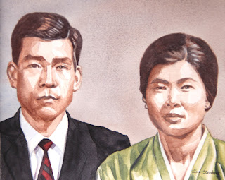
"My Parents" (watercolor on paper; 8" x 10")


"My Parents"

The following is what we did in the third week of the winter term, 2022 in my "Watercolor Portraits" class (my online Zoom classes with the Art League School in Alexandria, VA). By the way, it was my birthday yesterday, and I thought it was quite appropriate to paint my dear parents, who had passed away (my father at the age of 43 and my mother almost 20 years ago). I painted them with gratitude and love. I hope they are pleased. My father, an architect, had wished to be an artist; I am living his dream thanks to the support of my family (including my mother, my mother-in-law and my husband). Thank you.

During the first half of the class, I discussed the properties of color: hue, value, intensity/chroma, and temperature, while making color swatches. I will keep repeating these important concepts, so if you are a little confused, don't worry about it! Please make your color swatches to become familiar with your paints.

"Color Swatches I"

"Color Swatches II"


The Color Swatches III below show how to neutralize colors to create "mouse colors", by mixing complimentary or near complimentary colors. We don't always use high chroma colors; if so, the viewer's eyes will get fatigued by over-stimulation. The "mouse colors" is a term used by Jean Dobbie in her classic book, "Making Colors Sing". They surround and support bright, intense colors and make them look even more beautiful. Learning to mix these soft, lovely, muted colors at will, not by accident on the way to creating a "muddy", "dirty-looking", or "over-worked" painting, will put you in good stead. Please don't overmix and use plenty of water and paint!

"Color Swatches III"


In the second half of the class, I worked on the double portrait of my parents based on an old black-and-white photo. So, this particular exercise is about working from such a photo and inventing muted colors so that the painting with some colors will still look old.

Everybody's painting will be different, so I am not going to explain my process in detail. For the background, I did basically the same thing as in the last week's sepia study (a wet-on-wet variegated wash with cobalt blue and burnt sienna; just one layer and light mid-tone). For the skin tones, I used again the same colors, more brown than blue, layering multiple times until I achieved the right tones.

Someone asked about very pale Caucasian skin tones; the mixture of cadmium red and a little cobalt blue will work well. Cadmium red is a very intense, high-chroma color; you have to be extra careful and use a little bit to create a pale blush. For darker tones, use more red and start adding blue.

For the dark hair, I used the mixture of burnt sienna and French ultramarine blue (it's called Jane's Gray), which creates a little darker tone because ultramarine blue is darker than cobalt blue (but similar in temperature; it granulates, so I don't use it in skin tones much except in dark shadows). I wouldn't use any of the black paints to paint "black" hair; it results in boring "colors". I use black when I am painting a black outfit; even then, I will introduce other colors for highlights and shadows.

I decided to paint my mother's traditional Korean costume top in a muted green to compliment the brown (which is a dull red) skin tones. I mixed it with cadmium yellow pale and cobalt blue (if I had used Winsor blue, the result would have been too bright).

To complement the muted green, I painted my father's striped tie in black and muted maroon (mixture of permanent alizarin crimson and a little permanent sap green). The jacket was painted in neutral tint (Daniel Smith), which is a beautiful, transparent cool black. Ivory black is a sooty, warm black. I have both on my palette.


Sunday, February 6, 2022

"Snowman and Red Barn" (watercolor on paper; 9" x 12")


"Snowman and Red Barn"

 
The following is the description of what we did in the second week of the winter term, 2022 for my "Watercolor from Start to Finish" class (my online Zoom class with the Art League School in Alexandria, VA).

The main business of the day was painting "Snowman and Red Barn" from a black and white photo. We first drew the design lightly with a graphite pencil on the Arches paper. The horizon is above the half way point; the snowman is off the center; the dark anchor tree is behind the snowman (don't put it too close to the edge); the barn is in the center on the horizon. We added a few more secondary elements, then masked the snow-coated tree branches and distant trees with masking fluid.

Landscapes are generally painted from top to bottom, which means from the background (or sky) to the foreground in western art. We first wetted the sky shape above the horizon and painted a graded wash, making the right side slightly darker. The distant trees went in, slightly darker than the sky.

The barn was painted with cadmium red (the sunny side) and permanent alizarin crimson (the shadow side and the gaping interior). We had painted the shadow shapes first with black to darken it (this is something we never do, but for this particular black-and-white exercise).

Then we painted the small tree behind the snowman, slightly darker than the distant trees. The big anchor tree was painted even darker (mid-dark, don't make this tree too light). When you are painting the branches, paint the strokes below the masked lines. I added some grass-like strokes at the foot of the anchor tree; I painted diagonal strokes to suggest the tracks in the middle ground on the left (don't make them too steep, then the barn will look like it's sitting on a hill).

I also added a very pale wash around the front of the snowman so that it will pop out. Some elliptical brush strokes were done around the torso and body of the snowman. On the shadow side of the snowman, I made a bunch of mid-tone strokes to suggest trampled snow. These calligraphic marks take practice, but add so much texture and interest to a painting.

Finally, we painted the snowman itself in three layers (glazing), starting very light and getting increasingly darker, to create form (illusion of three dimension). Then we painted the hat (black) while taking care to leave the strips of white paper to suggest the snow coating. The round chips of the eyes and smiling mouth were done in two layers (light and dark) in black. The carrot nose was painted in two layers (the red-orange mixture of cadmium red and cadmium yellow pale; alizarin crimson stroke at the bottom to suggest shadow). The scarf was painted in three layers (the yellow green mixture of winsor lemon and winsor blue, then add slightly more winsor blue to make the green greener and darker). That's it!

Remember that we used the wet-on-wet technique only at the beginning with the sky. The rest of the painting was done on dry paper!


Friday, February 4, 2022

"Swedish Girl" (watercolor on paper; 12" x 9")


"Swedish Girl"


The following is what we did in the second week of the winter term, 2022 in my "Watercolor Portraits" class (my online Zoom classes with the Art League School in Alexandria, VA).

The main lesson of the day was painting a sepia value study of "Swedish Girl". We used only burnt sienna (my favorite is Daniel Smith) and cobalt blue. In the value scales, the value 10 is the white of the paper (highlights). The value 3 is as dark as it gets with the mixture of these two colors. The value 0 is black. The high-key paintings crowd around highlights and mid tones; the low-key paintings lack highlights and crowd around mid tones and darks. We won't be using ten values; you can do a convincing portrait with five or six values. Beginners' paintings often lack highlights and darks and remain in the mid-tone fest!

"Grayscales"


I first painted the background with the dark mid-tone variegated wash (slightly bluer on the left side) on thoroughly wet paper. After drying the paper, I wetted it again and did the same process. You do this until you are satisfied (in the above painting, I did three layers).

Then I started painting the subject with the lightest wash on dry paper, covering the entire area of the subject, except the lightest parts (highlights: right side of the face, sliver of the neck, top of the right-side hand/arm and the palm pad and top of the left-side arm). Don't make this first layer too dark and make it more brown than blue!

In between layers, dry the paper thoroughly. We are glazing, so paper should be bone dry. At each stage, I mixed a slightly darker batch by adding a little more of each paint; mix more than you think necessary (you don't want to run out of paint in the middle of the wash!). The skin tones are at best three layers; features, four layers. By the fifth layer, I got everything done, except the pupils, for which you can use black (I didn't). The some dark bits in the hair and in the features, itty bitty details around the trims of the blouse, and the triangular shape between the forearms are the darkest.

Below is the reference photo.

"Swedish Girl" Reference


Sunday, January 30, 2022

"Starry Sky" (watercolor on paper; 12" x 9")

 
The following is the description of what we did in the first week of the winter term, 2022 for my "Watercolor from Start to Finish" class (my online Zoom class with the Art League School in Alexandria, VA). 
 
The main business of the class was painting "Starry Sky" to practice the wet on wet variegated wash. We wetted the paper thoroughly and evenly (remove excess water), then painted from the top with ultramarine blue, cobalt blue, narrow strips of permanent alizarin crimson and pale winsor lemon, and finished the wash with pale winsor blue. We dried the paper (bone dry) and repeated the process twice more (if your washes are not dark enough, you can repeat the process as many times as needed). In the second wash, I added the violet mixture (ultramarine blue and alizarin crimson) at the top and continued with the rest of the colors. In the third wash, I added a little bit of winsor lemon to the pale winsor blue to make it a little turquoise.

When the paper was dry, we painted the land shape (about 20% of the painting at the bottom; this is a sky painting) on dry paper with the dark mixture (ultramarine blue, crimson, and winsor blue), the yellow green mixture (winsor lemon and a little winsor blue), and the same mixture as the first strip (with more crimson). Each stroke was put down quickly and decisively with a flat brush, making sure the next stroke went down while the previous stroke was still damp. This way you can create the fuzzy, soft-edged wash.

Finally, we added the stars with the white gouache splatter. You need a heavy cream consistency of gouache (too much water, it dries like a veil; too little water, you cannot splatter). Please practice first on a scrap piece of paper and when you are ready, mask the land shape with a loose sheet of paper and splatter at your pleasure. Avoid big bombs! Splattering takes practice (what doesn't!), and when used skillfully, it adds a beautiful texture (snow, stars, fall foliage, sandy soil, grass, etc.) with white gouache or paints.
  

Saturday, January 22, 2022

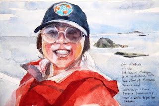
"Sabrina at Makapuu Point Lighthouse, Oahu" (watercolor on paper; 5" x 7.5")

"
"Sabrina at Makapuu Point Lighthouse, Oahu"


Belated Happy New Year! I hope this blog post finds you well. I have been gone for 12 days on a long-awaited vacation to Oahu at the beginning of the year. It was supposed to be a celebration of our 30th wedding anniversary (12/15/90); then the first COVID lockdown and various variants followed. Finally, we and our darling daughter decided to take the risk. Armed with the vaccination card, which was required in all indoor places except in some hole-in-the-wall eateries, off we went. A little nervous, but everything was great in the tropical paradise. We came back safe and sound, except a severe jet lag.

For the last 10 days, I have been meaning to share my travel journal pages with you, but one thing or another intervened. Here you go! All the sketches were done in watercolor with occasional black waterproof fountain pen lines. If necessary, white gouache was used discretely. 

Except a few, they were all painted while in Oahu. I spent hours and hours on my travel journal, foregoing naps and walks on the beach. I am a professional artist who draws and paints. Then, I go on a vacation and what do I do? I draw and paint, exactly the same thing. So, I guess my life is a never-ending vacation!

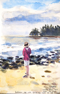
The following images are more or less chronological. I painted a lot of sunsets because they were beautiful and they could be painted quickly. There are some still lifes, flowers and fishes. Only one was done on location, sitting on the side of the crowded Waikiki Beach Boardwalk; the rest, in the comfort of the hotel room using the image of the phone screen as reference.

Although I returned home exhausted from walking (I averaged 10,000 to 15,000 steps per day instead of my usual 5,000 steps!) and non-stop sketching, I am glad that I have done it. These pages bring back happy memories and will be shared with my students in class. Enjoy and if you have any questions or comments, please don't hesitate!


"Me at Haleiwa Beach Park, Oahu"

 
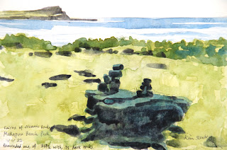
"Cairns of Volcanic Rocks at Makapuu Beach Park"

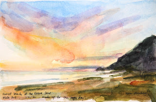
"Sunset at Kaena Point State Park"

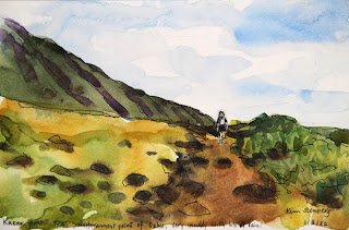
"Me Hiking on Kaena Point Trail: Western-most Point of Oahu"

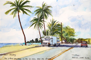
"On the Road to Haleiwa, North Shore"


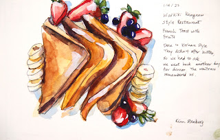
  "French Toast at Waikiki Kangnam Style Restaurant"


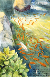
"Koi Pond at Hilton Hawaiian Village, Waikiki"

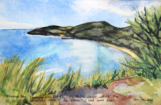
"Hanauma Bay Snorkeling"

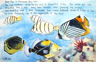
"Reef Fish at Hanauma Bay"

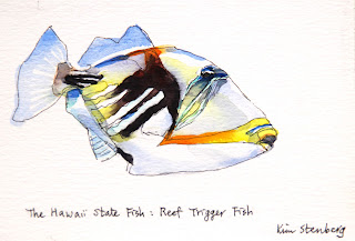
"Reef Trigger Fish: the Hawaii State Fish"

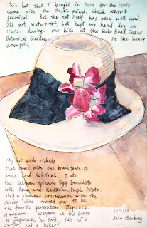
"My Hat with Orchids from Goofy Cafe and Dine"

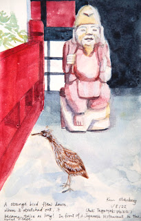
"Strange Bird with Japanese Statue at Hilton Hawaiian Village"

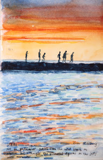
"Sunset Jetty at Waikiki Beach"

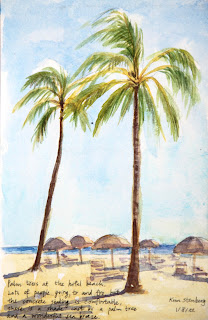
"Palm Trees along Waikiki Beach Boardwalk"

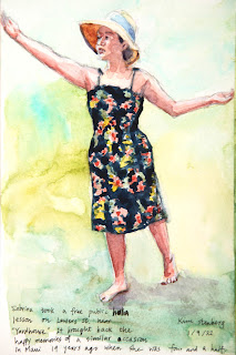
"Sabrina Hula Dancing"

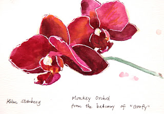
"Monkey Orchid on the balcony of Goofy Cafe and Dine"

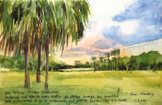
"Fort DeRussy Military Reservation"

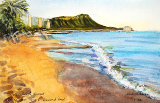
"Waikiki Beach Sunset Looking Toward Diamond Head"

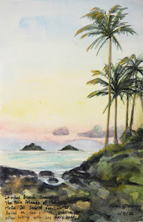
"Lanikai Beach Sunset, Looking toward the Moku Islands"

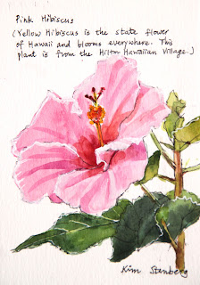
"Pink Hibiscus"