Showing posts with label watercolor portrait. Show all posts

Friday, June 3, 2022

"Mimosa Time" (watercolor on paper; 10" x 8")


"Mimosa Time"


The following is what we did in the sixth week of the spring term, 2022 in my "Watercolor Portraits" class (my online Zoom classes with the Art League School in Alexandria, VA).

This week we are exploring the portrait with prominent hands. When handled well, the hands can contribute hugely to the success of the portrait, so much so that a great portrait painter is usually someone who can paint hands masterfully. Instead of avoiding a subject with hands, let's embrace the hands and try to get better!

Below is the image of my class demo in progress. Just like anything else, painting hands is all about paying attention to plane changes and value shapes, the latter caused by different amounts of light falling on them. Often the quality of light is subtle, but it is still there. In my case, there was the natural light from the window (right side) and the warm artificial light from the interior (left side). The subject's melon-color shirt also strongly influenced the colors in the hands. I had to play with the warm/cool contrast as well as the light/dark one. 


"Mimosa Time in Progress"


The end game here is modeling the hand (with five fingers!) successfully so that it looks three-dimensional. When I realized that I had lost the light shapes, I reintroduced them with white gouache, and there you go, the hand holding the champagne flute appeared in full glory. 

The beard is no different from anything else. Paint light and darks. Of course, hair has soft texture, so the ability to control the hard/soft edges is paramount in the success of painting a beard and mustache. My husband has a salf-and-pepper beard and I had to make sure the darks were dark enough. The hair on the left side, near the orange drink, reflected the warm color and it was important that I didn't use cool darks. Yes, values are the most important things, but color temperature has to be sometimes considered as well.
 
When I was satisfied with the light/dark pattern of the beard and mustache, I went over to add the "salt" part with white gouache using my "lifting"brush. I was mindful not to overdo these finishing touches. Remember that it's not the details, but the overall light and dark pattern and soft texture, that gives the impressions of the facial hair or any hair.


Sunday, May 29, 2022

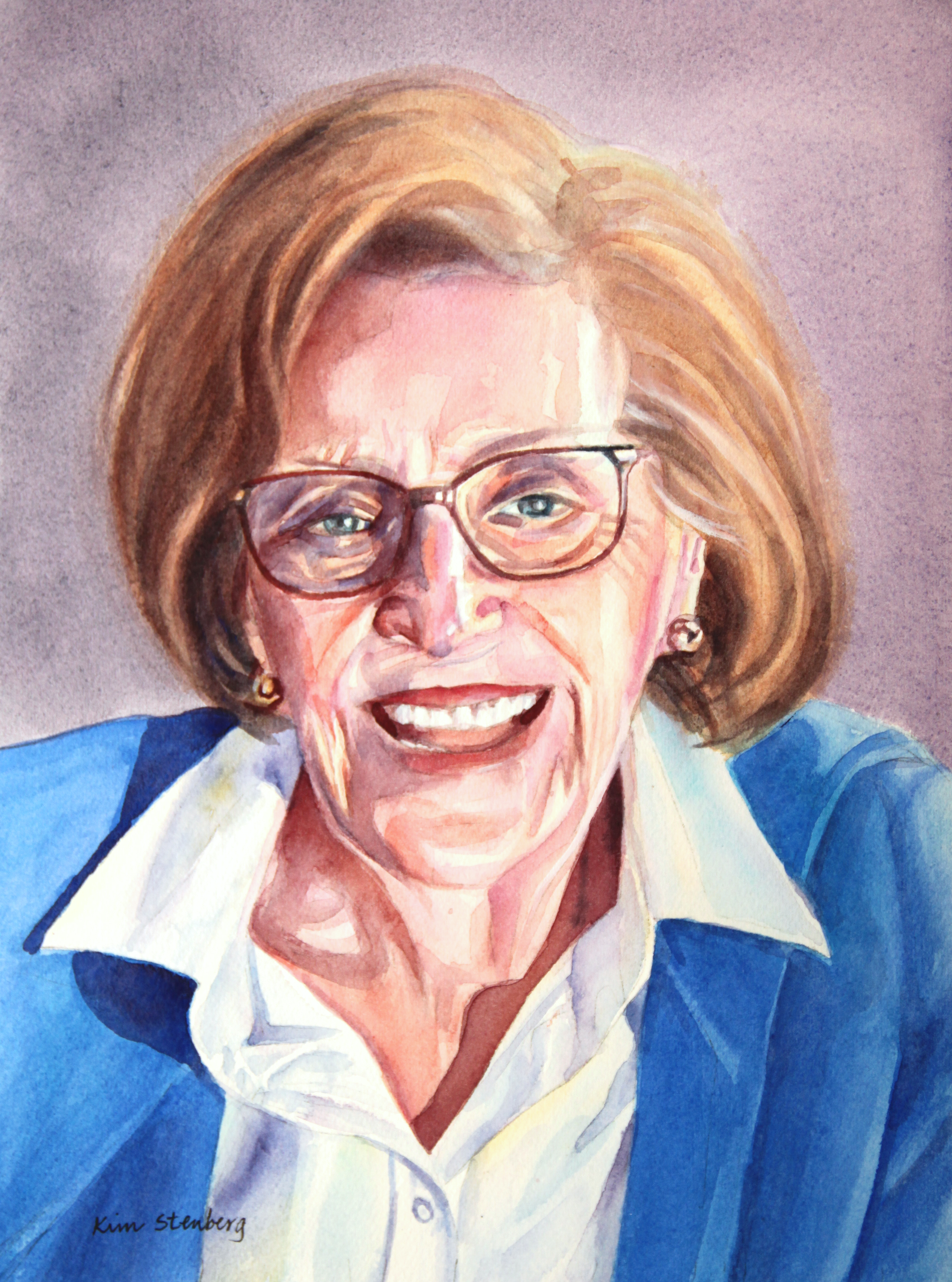
"Margaret" (watercolor on paper; 12" x 9") sold


"Margaret"


This is a commission portrait for Christa. Her beautiful mother passed away last year at the age of 86 and the portrait is meant for her father. I have known Christa for over 20 years and it was an honor to paint her mother, whom I have never met but heard about when our daughters went to preschool together. It is time like this when I feel particularly good about being a portrait painter, helping my friends and other clients to remember the happy memories of their beloveds.


Friday, May 13, 2022

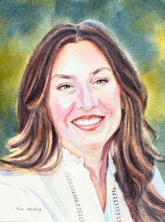
"Female Portrait in Full Palette" (watercolor on pape; 12" x 9")


"Female Portrait in Full Palette"


The following is what we did in the third and fourth weeks of the spring term, 2022 in my "Watercolor Portraits" class (my online Zoom classes with the Art League School in Alexandria, VA).

First we talked about the essential skin colors I use. I highly recommend that you should acquire these paints. I usually start a portrait with a very pale wash over the highlights in the face, neck, and shoulders (if applicable) in Winsor Newton cobalt turquoise light. The mother color of all skin tones is cadmium red; for cool red, I switch to Sennelier Helios Purple (this is a primary color and cannot be mixed successfully). For an area that is getting sun, therefore light and warm, I add a little yellow (cadmium yellow pale works well) to cadmium red.

When I see a little green in the skin tone, I use permanent sap green; when I detect a little blue (either caused by blue sky, clothing, facial hair, or blood veins), I introduce cobalt blue (I don't use French ultramarine blue in the face; I never use Winsor/thalo blue in any skin tones).
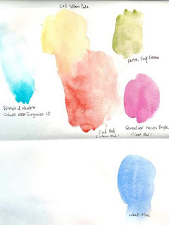
"Essential Skin Colors"

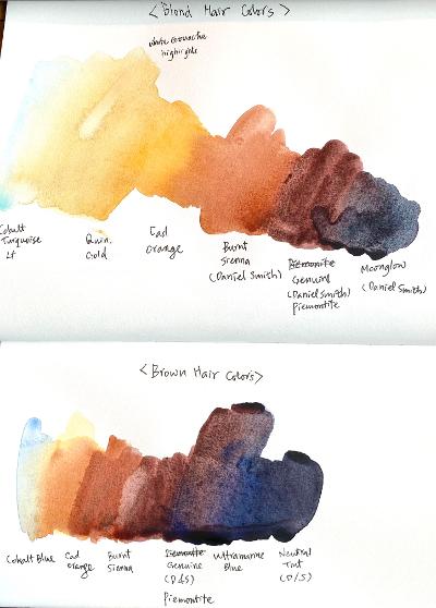
Before I started painting the brunette hair of the subject, I made a couple of color swatches: blonde and brunette. This is only the beginning. There are so many colors of human hair; one must continue to experiment how to render them accurately. Again I stand by the colors I use, but you are welcome to come up with your own concoctions.
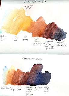
"Hair Colors"

We started the full-on Caucasian female portrait in full color and will finish in in the first half of the next week's class. I successfully took the screen shots during and at the end of the demo and photoshopped them for you.

I always start the portrait with the background with the wet-on-wet variegated wash. In this painting, I aimed at the loose, mid-tone, yellow green/blue green background that suggests foliage. You have to wet the paper thoroughly and evenly, otherwise you are risking a hell of a mess!
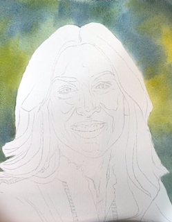
"Screen Shot I"

Then I started painting the brunette hair with very pale cobalt blue highlight, then washed in cadmium orange, thereby created a damp environment to paint burnt sienna, Daniel Smith Piemontite Genuine, and the mixture of Piemontite and Ultramarine blue. (Paint one half at a time).

Hair is all about softness. I had already softened the outer hairline with a small stiff bright oil painter's brush. The reason why I dampened the hair shape with cadmium orange is to paint basically wet-on-wet, because as you know the wet-on-wet technique is all about softness within the shape. Apply the brushstrokes the way the hair grows. If it is straight as this particular subject's hair, use a long, graceful stroke. Think the hair as a series of long light, mid-tone, and dark strands, not individual hair (the same applies to eye brows or any other facial hair).

Many students struggle with hair. (As a matter of fact, many students struggle with everything: background, hair, skin tones, drawing of features, folds of clothes, you name it!) My aim is to make watercolor portraiture accessible to most students and I hope this step-by-step approach helps.

Next, I softened the inner hairline with the lifting brush (there is hardly any painting within which I don't use this brush). Then I started painting the first layer of the skin tones on dry paper, using the pale, watery versions of the above-mentioned essential skin colors (minus cobalt blue, which I used in the second layer).

I didn't mix any colors, except a little cad yellow to cad red in the forehead, etc. Depending on the moisture level of your brush, you may end up with blooms. Don't worry about them. It's sometimes hard to read whether a certain passage is a cool red or a warm red. You can mix the two reds; you can use either red (they are so pale that it doesn't really matter). As we spend more and more time looking at the subject, it becomes clear which area is warm and which area is cool.
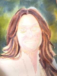
"Screen Shot II"

In a light-skin-toned subject, the painting goes fast. I started the second layer, going bolder. I also started painting the features. There are so many things I covered that I am not going to detail them here. Please rewatch the recording.
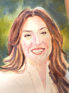
"Screen Shot III"

Next, I finished the female portrait in full palette. I showed you how to deepen the hair without losing the feeling of softness that was established in the first wash last week. I emphasize the importance of soft texture of any hair. Avoid the liney hair with many fussy strokes and instead focus on the light/dark shapes.

How to create the soft, fuzzy texture in watercolor? Paint with water, i.e., as soon as you put down a linear stroke, rinse your brush, remove the excess water on clean paper towel, and stroke it down one or both sides of the previous stroke. Keep repeating the process until you are satisfied with the hair.

I painted the white blouse by painting pale shadow shapes. I used a variety of colors although the shapes are not very big. You can't paint colorful paintings with just few colors. Get into the habit of dipping into a different color each time you reach out to reload your brush. A wet stroke of Color A, then another wet stroke of Color B, and so on. As long as you control the moisture level of your brush, you will still see color variations in your shapes.

But more than anything else, the big picture of the left side of the white blouse being in light and the right side being in shadow has to be emphasized! Do you see the difference of the left and right sides in the finished portrait?

The skin tones needed to be strengthened a bit and the dark shadows of the neck introduced, so that what I did next. The subject with a fair skin tones doesn't require too many layers of glazing, but it doesn't mean you don't have to deny her colors!

After the break, I talked about how to approach painting the subject with glasses/shades. Less is more! Suggest the frames instead of accentuating them. Remember the frames, no matter how thin, have volumes; sometimes it's necessary to paint planes (especially if the subject is in three-quarters view. If you can't see the subject's eyes, don't invent them. If you see the reflections of interesting shapes, paint them. If the glasses/shades cast strong shadows, paint them.
 
This is an independent project, so I won't discuss my demo in details. I am painting "Sabrina at Dean Village, Edinburgh". I finished the sky, the background architecture and stream, and her hair before the class and focused on the skin tones for the demo. 
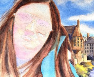
"Sabrina at Dean Village, Edinburgh"

In the image above , you can see the first layer of skin tones. It's very pale, but still gives the impressions of three dimensionality with the adroit use of the highlights (cobalt turquoise light and cadmium yellow pale with a bit of cadmium red) and warm red (cadmium red)/cool red (Helios purple). Something to think about!


Friday, March 25, 2022

"Self-portrait in Suede Jacket" (watercolor on paper; 10" x 8")


"Self-portrait in Suede Jacket"


The following is what we did in the ninth week of the winter term, 2022 in my "Watercolor Portraits" class (my online Zoom classes with the Art League School in Alexandria, VA). 

I talked a great deal about various things, including my favorite watercolor portrait painter, Mary Whyte. Her book, "Painting Portraits and Figures in Watercolor", should be on every watercolor portrait artist's bookshelf. Her greatest strengths, I believe, are her ability to control hard/soft edges and her incredible sense of design. Her handling of details is also breath-taking. Don't just say she has talent. No, it's the prodigious amount of work she has put into her art that got her to her level today!

This week we are working on a self-portrait. I have chosen a rather challenging project of painting various different textures (felt, suede and straight hair), a complicated geometric pattern, and a pair of glasses, which I wear all the time. You don't have to naturally and do whatever you can.

Many past masters have painted themselves. Rembrandt and Vincent van Gogh come to mind as they painted themselves repeatedly, for the lack of money to hire models but, of course, for self-observation and contemplation of their lives. If you have never done it before, you may feel awkward. I myself used to dislike the whole self-portrait business, but as part of this class assignments, I have done it a few times and I am finally getting over my reluctance and actually beginning to enjoy it. One tends to have self-delusions and it's good to be honest with oneself once in a while.

The painting process is the same whether you are painting yourself or someone else. I always start with the "background" in wet-on-wet variegated wash. The goal is to create an ambience for the subject to sit comfortably and breathe the air. If your "background" is a dull gray or not in harmony with the rest of the portrait, you kind of lost the game even before you start painting the subject. Let's work on this issue further in the spring.

I painted the felt hat and suede jacket using mainly granulating paints such as Piemontite genuine, Moonglow, and ultrarine violet to emulate the soft texture.

Painting the complicated pattern, such as my rain jacket, takes patience, but if you do it well, you can create lovely folds and gain the viewer's admiration. Remember that white in shadow is not white!

My hair is, of course, very different from any of yours. I have straight hair and it's probably easier than painting, let's say, curly hair? Either way, the goal is softness and preserving highlights and going dark enough in the dark shapes. I showed you how using the right (warm) temperature in the mid-tones made the hair look real. Again, I like to use granulating paints for hair. You can use whatever colors.

The skin tones are always the hardest thing in a portrait. You ruin the skin tones, you ruin the portrait, no matter how well you have painted the rest. There is no secret. The goal is likeness and even if you have traced the image, you may have traced inaccurately or lost the drawing of features in the process of painting. Then redraw. There are no excuses for the misplaced mouth or missing nostril.

Map out your highlights/mid-tones/darks accurately. I almost always start out with the highlights, giving them a very pale wash of cobalt turquoise light (Winsor Newton). Human skin tones, except the dead, are warm. This initial, barely visible cobalt turquoise layer and blues and violets you will introduce later will counterbalance the relentless ruddiness of the skin tones.

Yes, I use blue (cobalt blue) and violet (ultramarine violet) in the face. The reds vary depending on the subject. For the self-portrait, I used cadmium red and Sennelier helios purple (there is no substitute for this color; I really don't know why you are so reluctant to include this lovely, indispensable color on your palette). For the dark reds, I used madder brown, perylene maroon, perylene violet, and Piemontite genuine (in shadows).

The glasses went in last. One has to be utterly careful in handling the glasses. The portrait is about many things, but never about the glasses. It's there, but it's mostly suggested.

By the way, I don't necessarily tell you what colors to use in your independent projects as we have to learn to see the colors and come up with the right paints to render them through trial and error.


Friday, March 18, 2022

"Raven" (watercolor on paper; 12" x 9")


"Raven"


The following is what we did in the eighth weeks of the winter term, 2022 in my "Watercolor Portraits" class (my online Zoom classes with the Art League School in Alexandria, VA). 

Lots of things were on my mind (in addition to being dead tired), so I may have talked too lengthily. My apologies. All the things I covered, I stand by them. I talked about the importance of accurate measuring and showed you my work-in-progress (a 40" x 40" oil commission painting of the National Cathedral from the north side) to prove that, if you know how to measure with the aid of a proportional divider, you can draw anything.

If your drawing of the subject is wobbly, no matter how hard you work on the project, it will never turn out satisfactory. I once worked on a watercolor portrait commission, which required five drawings and three paintings to satisfy the client and her three teen-age/college age daughters. Why? Watercolor is a relatively unforgiving medium and you can't really correct once you start painting. Please trace if you know your drawing is weak. There is absolutely no dishonor or shame in that! Arches paper is not where you practice drawing; you do that in sketchbooks, if possible, daily.

I also talked about the importance of the variegated background wash that goes down first to set the tone. Wrong color choices and poor executions often lead to poor paintings.

I introduced you to my contemporary watercolor hero, Shirley Trevena and her book, "Artist's Studio: Vibrant Watercolours". (My dead watercolor hero would be John Singer Sargent, LOL.) Her style is not everybody's cup of tea, but her colors and design sense are absolutely divine. My palette is a modified version of hers. She doesn't do portraits per se, but one must get inspirations from all manners of artists, past and present, if you are really serious about your art.

For the hair of "Raven", I used almost exclusively Moonglow and Piemontite genuine (both by Daniel Smith). They both granulate and are effective in achieving that soft Afro look without much ado. Your black subject will, of course, have different colors and require different paints. Always paint the overall lightest color first (in my case, the mixture of French ultramarine blue and burnt sienna), then start carving out dark shapes.

For the skin tones, I started out by toning the highlight shapes (including the whites of the eyes and teeth) with a very pale cobalt turquoise light (Winsor Newton). Then I pondered about the general color palette of the young woman and decided she has a lot of orange and mahogany (reddish brown). I hardly used any burnt sienna.

I do feel strongly about, when painting black subjects, avoiding the earth colors which tend to mud up everything they touch. The only exception may be mixing, let say, an earth color like burnt umber with a transparent color such as Winsor violet, but what does that dark mixture have to do with the human skin tones?

So went in cadmium orange (yes, I have it; I also have cadmium red orange; it beats having to mix them all the time!), cadmium red, and my favorite cool red, Sennelier Helios purple. For darks, I used perylene maroon, perylene violet and ultramarine violet (my favorite is by Schmincke, but it's very expensive!).

The rest is always the same. Make the dental arch and eyes appear rounded by darkening the corners. Don't stain the teeth yellow even if they appear so in the reference; you may have to model each tooth carefully (observation is the key as anywhere else).

The brows are not caterpillars; they have volume and they should arch at the right places. They are not of the same tone or hue as they travel, hugging along the brow ridge.

Be careful with the the nasolabial fold shapes. If you want to ruin the expression of a portrait, this is where you concentrate first, LOL!

Darks should be dark enough. The black skin tones are generally dark in the first place, so you will need more layering to achieve the rich luminousity.


Friday, March 11, 2022

"Dame Maggie Smith" (watercolor on paper; 12" x 9")


"Dame Maggie Smith"


 The following is what we did in the sixth and seventh weeks of the winter term, 2022 in my "Watercolor Portraits" class (my online Zoom classes with the Art League School in Alexandria, VA).  

I worked on "Dame Maggie Smith", picking up where I left it off last week. The left side of the face in generally warmer and lighter; the right side, darker and cooler. I showed you how to paint wrinkles, not as lines but as long shapes, softening them as I went along. These wrinkles must go in when all the planes/structures have been painted to satisfaction. Additional details never make a painting.

At the end, I added the white gouache touches whenever I felt I have lost highlights. We use it with a lot less water, but never straight out of the tube. It dries lighter than you expect, so you may have to go over more than once. If you went too far, with white patches all over the place, you will have to glaze over them with very pale tones (yellow or red depending on the situation).

I also emphasized never to underline the lower lid lines. Don't paint nostrils as dark slits! They often connect with surrounding dark or mid-dark shapes. Be careful with the lips; connect the lips (especially lower lip) with the surrounding tones.

The neck is much darker (although there are some highlights) than the face. I used cad red, madder brown, perylene maroon, perylene violet, cobalt blue, and ultramarine violet.

The eyebrows should be part of larger, mid-tone shapes, not isolated caterpillars. They also change values/hues they arc.

Except the blue (cobalt blue) or violet (I used ultramarine violet), the shadows in the face and neck are all warm.The hair cast shadows, which connect with the form shadows of the face.

I talked about the hair last week. Make it appear soft with extensive lifting/softening along the hairlines (both outer and inner) and inside the hair shape. The hair is a series of long light/mid-tone/dark shapes, never individual strands.


For the last hour, I talked about how to paint portraits of dark-skinned subjects. The dark skins are never to be painted with earth colors (burnt sienna, raw umber, burnt umber, sepia, etc.), which will only result in dull, dirty looking complexions. They vary a great deal: you can find ocher, gold, orange, red, brown, mahogany, magenta, green, blues, and various shades of purples.

"Earth Color Swatches"

You can mix your own browns with cad red/cobalt blue or cad red/permanent sap green, pushing the mixture either way. They are preferable to burnt sienna, which, by itself, never takes my breath away. I am sharing with you the swatches of reds, violets, and some additional colors (including Piemontite genuine by Daniel Smith--my only brown, which I use on its own).
"Mixing Your Own Browns"


"Red Swatches"

"Purple Swatches"

"Additional Color Swatches"

At the very end of the class, I showed you how I would paint the black hair. I decided to wet the hair shape and drop the mixture of ultramarine blue and burnt sienna. I also showed you how to soften the hairlines (both inner and outer) by going around with a clean damp brush before the hair shape dried. What you see is the highlights. I will add darker shapes of the hair (while softening edges at the same time; remember the hair is all about softness) and finish the portrait next week.


"Raven in Progress"


Friday, March 4, 2022

"Baby Angeline" (watercolor on paper; 12" x 9")


"Baby Angeline"

The following is what we did in the fifth and sixth weeks of the winter term, 2022 in my "Watercolor Portraits" class (my online Zoom classes with the Art League School in Alexandria, VA).

First, I showed some pages from Burne Hogarth's Drawing the Human Head to illustrate the developmental stages of the human head.

"Child Head Development I"

"Child Head Development II"

"Child Head Development III"

Next, I talked about my skin tone palette. Cadmium red is the base for all races; I may add a little yellow (it doesn't seem to matter a great deal which yellow); I may shift to a cooler red (usually Sennelier Helios purple); I may add a little cobalt blue or permanent sap green. To suggest the sky reflections on the face, neck and shoulders, I may use very pale cobalt turquoise light (Winsor Newton) at the beginning. I don't use burnt sienna or burnt umber for dark-skinned subjects; they tend to muddy up complexions, which should be luminous no matter what.

Rose dore (Winsor Newton) and Naples yellow reddish (Schimincke) are my cheat colors, which I sometimes use. Some paints are very opaque or highly pigmented; cobalt turquoise light, Naples yellow reddish and, of course, cadmium red are such colors. Use lots of water! Always use lots of water!

Skin Tone Color Swatches.jpg
"Skin Tone Swatches"

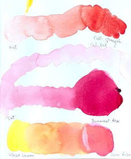
Since skin tones are generally reddish, the color red is the most important hue for painting portraits. I have many; you don't have to buy all of them. The chart below shows the warm red and cool reds. The color temperature is a relative thing, so the same color can look cool or warm depending on what's next to it. I also use lower-chroma colors such as perylene maroon and perylene violet. (I have another chart of violets!) I don't have time to mix all these colors (some can be mixed; others cannot) in the middle of washes because watercolor dries fast leaving blotchty patches.

Color Swatches Reds.jpg
"Warm and Cool Red Swatches"

Finally, I did a little demo of an infant portrait (just the most nerve-wrecking first layer). I will finish it in the next class. 

"Baby Angeline in Progress"

This week I finished "Baby Angeline" and showed you what colors I use for the skin tones. What's important in painting an infant is making sure the structure of the head is apparent and highlights are preserved!

For the face and neck, I painted the highlights with very pale cobalt turquoise light, then continued with pale cadmium red (sometimes with a little cad yellow pale). If the area felt cool, I used instead Sennelier Helios purple (I highly recommend this paint; I don't use permanent rose much). I also used cobalt blue and a little permanent sap green whenever I saw blue or green. Caucasian skin tones have a lot of blues and greens! For the neck, I also used perylene maroon and perylene violet, and madder brown. And of course many layers!

For the blue eyes, I used indigo blue (never use bright blue for blue eyes!)

For the dark lines or shapes in the face (such as nostrils, upper lash lines, the inside or corners of the mouth), use warm darks (perylene maroon, perylene violet, moonglow, the mixture of blues and crimson leaning warm, etc.). The upper lash lines may be cool. Never use paynes gray or indigo blue. And layer and instead of going too dark too fast!

For the hair, I used burnt sienna (Daniel Smith) and cad red (you can't tell where the hair begins and the forehead begins, so I painted accordingly).

As you can see in the finished image above, I used a lot of cool red in this portrait and reserved cad red for warm areas only. The name of the game is layering with pure colors and avoiding lines. Infants are all about softness, so avoid getting the skin tones dirty by overmixing (it applies to all ages and races!) and making too many lines.


Friday, February 18, 2022

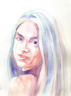
"Portrait in Limited Palette" (watercolor on paper; 12" x 9")


"Portrait in Limited Palette"


The following is what we did in the fourth week of the winter term, 2022 in my "Watercolor Portraits" class (my online Zoom classes with the Art League School in Alexandria, VA).

We worked on a portrait in a limited palette using only six colors: Winsor lemon, permanent rose, cadmium red, cobalt turquoise light by Winsor Newton (can be substituted with cerulean blue), cobalt blue, and French ultramarine blue. The exercise was inspired by the artwork by Stephie Butler in a watercolor magazine ("Beginner's Guide to Watercolours").

This is not how I normally paint portraits, but it is an great exercise to learn about watercolor (paints go wherever there is moisture on the paper and stop where it's dry) and not deal with the panic one feels when putting down the first layer of skin tones.

We used the mixture of permanent rose and Winsor lemon for skin tones for the most part. Cadmium red was preserved for accents and to make some deeper brownish purple for darks. (Personally, I use cadmium red as the basis of all skin tones and rarely use permanent rose. We'll talk a lot more about warm and cool reds than I did at the beginning of the class; if you are confused about the color temperature business, rest easy.)

"Mixing Skin Tones"

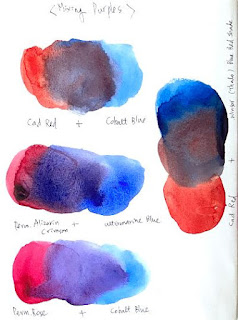
"Mixing Purples"

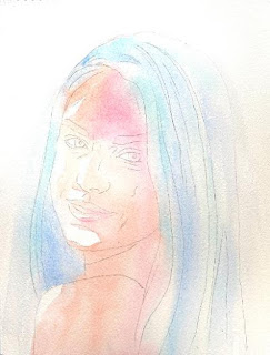
First we wetted the paper with the exception of highlights and white of the eyes, then floated pale cobalt turquoise light on the highlights of the hair and pale cobalt blue in the darker areas of the hair and the negative space (background). We continued to drop the mixture of permanent rose and lemon on skin tones (sometimes a little cooler with just rose) while the paper was still wet.
"Step 1"

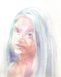
We dried the paper thoroughly, then started layering. Whenever you are layering, add a little dark accents in the eyes (first with the purple mixture of rose and ultramarine blue, later with the brownish, darker mixture of cadmium red and ultramarine blue).

"Step 2"

I showed you how to soften the edges of a stroke (put down a tone, quickly rinse the brush, and with the clean damp brush pull the tone away). Whenever possible, pull the tones to the surrounding areas so that the mouth doesn't look like a cutout, the eyebrows don't look like caterpillars, the hair doesn't look like a helmet, etc.

"Step 3"
 
Don't be afraid to go dark in the shadows, but don't jump from light straight to dark. Mid-tones make up the bulk of skin tones! The catchlights of the eyes were done with a white Sakura gellyroll pen 10. As you can see, the white balance of the finished demo is much cooler than the three step-by-step photos of the sample painting I have taken for you. Honestly, I find taking a good picture of an artwork much harder than creating a good painting!


Friday, February 11, 2022

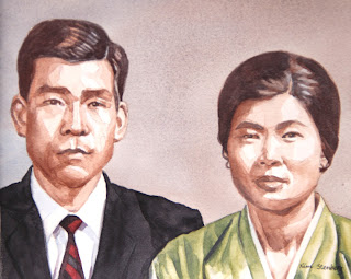
"My Parents" (watercolor on paper; 8" x 10")


"My Parents"

The following is what we did in the third week of the winter term, 2022 in my "Watercolor Portraits" class (my online Zoom classes with the Art League School in Alexandria, VA). By the way, it was my birthday yesterday, and I thought it was quite appropriate to paint my dear parents, who had passed away (my father at the age of 43 and my mother almost 20 years ago). I painted them with gratitude and love. I hope they are pleased. My father, an architect, had wished to be an artist; I am living his dream thanks to the support of my family (including my mother, my mother-in-law and my husband). Thank you.

During the first half of the class, I discussed the properties of color: hue, value, intensity/chroma, and temperature, while making color swatches. I will keep repeating these important concepts, so if you are a little confused, don't worry about it! Please make your color swatches to become familiar with your paints.

"Color Swatches I"

"Color Swatches II"


The Color Swatches III below show how to neutralize colors to create "mouse colors", by mixing complimentary or near complimentary colors. We don't always use high chroma colors; if so, the viewer's eyes will get fatigued by over-stimulation. The "mouse colors" is a term used by Jean Dobbie in her classic book, "Making Colors Sing". They surround and support bright, intense colors and make them look even more beautiful. Learning to mix these soft, lovely, muted colors at will, not by accident on the way to creating a "muddy", "dirty-looking", or "over-worked" painting, will put you in good stead. Please don't overmix and use plenty of water and paint!

"Color Swatches III"


In the second half of the class, I worked on the double portrait of my parents based on an old black-and-white photo. So, this particular exercise is about working from such a photo and inventing muted colors so that the painting with some colors will still look old.

Everybody's painting will be different, so I am not going to explain my process in detail. For the background, I did basically the same thing as in the last week's sepia study (a wet-on-wet variegated wash with cobalt blue and burnt sienna; just one layer and light mid-tone). For the skin tones, I used again the same colors, more brown than blue, layering multiple times until I achieved the right tones.

Someone asked about very pale Caucasian skin tones; the mixture of cadmium red and a little cobalt blue will work well. Cadmium red is a very intense, high-chroma color; you have to be extra careful and use a little bit to create a pale blush. For darker tones, use more red and start adding blue.

For the dark hair, I used the mixture of burnt sienna and French ultramarine blue (it's called Jane's Gray), which creates a little darker tone because ultramarine blue is darker than cobalt blue (but similar in temperature; it granulates, so I don't use it in skin tones much except in dark shadows). I wouldn't use any of the black paints to paint "black" hair; it results in boring "colors". I use black when I am painting a black outfit; even then, I will introduce other colors for highlights and shadows.

I decided to paint my mother's traditional Korean costume top in a muted green to compliment the brown (which is a dull red) skin tones. I mixed it with cadmium yellow pale and cobalt blue (if I had used Winsor blue, the result would have been too bright).

To complement the muted green, I painted my father's striped tie in black and muted maroon (mixture of permanent alizarin crimson and a little permanent sap green). The jacket was painted in neutral tint (Daniel Smith), which is a beautiful, transparent cool black. Ivory black is a sooty, warm black. I have both on my palette.


Friday, February 4, 2022

"Swedish Girl" (watercolor on paper; 12" x 9")


"Swedish Girl"


The following is what we did in the second week of the winter term, 2022 in my "Watercolor Portraits" class (my online Zoom classes with the Art League School in Alexandria, VA).

The main lesson of the day was painting a sepia value study of "Swedish Girl". We used only burnt sienna (my favorite is Daniel Smith) and cobalt blue. In the value scales, the value 10 is the white of the paper (highlights). The value 3 is as dark as it gets with the mixture of these two colors. The value 0 is black. The high-key paintings crowd around highlights and mid tones; the low-key paintings lack highlights and crowd around mid tones and darks. We won't be using ten values; you can do a convincing portrait with five or six values. Beginners' paintings often lack highlights and darks and remain in the mid-tone fest!

"Grayscales"


I first painted the background with the dark mid-tone variegated wash (slightly bluer on the left side) on thoroughly wet paper. After drying the paper, I wetted it again and did the same process. You do this until you are satisfied (in the above painting, I did three layers).

Then I started painting the subject with the lightest wash on dry paper, covering the entire area of the subject, except the lightest parts (highlights: right side of the face, sliver of the neck, top of the right-side hand/arm and the palm pad and top of the left-side arm). Don't make this first layer too dark and make it more brown than blue!

In between layers, dry the paper thoroughly. We are glazing, so paper should be bone dry. At each stage, I mixed a slightly darker batch by adding a little more of each paint; mix more than you think necessary (you don't want to run out of paint in the middle of the wash!). The skin tones are at best three layers; features, four layers. By the fifth layer, I got everything done, except the pupils, for which you can use black (I didn't). The some dark bits in the hair and in the features, itty bitty details around the trims of the blouse, and the triangular shape between the forearms are the darkest.

Below is the reference photo.

"Swedish Girl" Reference