
 |
| "Female Portrait in Full Palette" |
The following is what we did in the third and fourth weeks of the spring term, 2022 in my "Watercolor Portraits" class (my online Zoom classes with the Art League School in Alexandria, VA).
First we talked about the essential skin colors I use. I highly recommend that you should acquire these paints. I usually start a portrait with a very pale wash over the highlights in the face, neck, and shoulders (if applicable) in Winsor Newton cobalt turquoise light. The mother color of all skin tones is cadmium red; for cool red, I switch to Sennelier Helios Purple
(this is a primary color and cannot be mixed successfully). For an area
that is getting sun, therefore light and warm, I add a little yellow
(cadmium yellow pale works well) to cadmium red.
When I see a little green in the skin tone, I use permanent sap green; when I detect a little blue (either caused by blue sky, clothing, facial hair, or blood veins), I introduce cobalt blue (I don't use French ultramarine blue in the face; I never use Winsor/thalo blue in any skin tones).
 |
| "Essential Skin Colors" |
Before I started painting the brunette hair of the subject, I made a couple of color swatches: blonde and brunette.
This is only the beginning. There are so many colors of human hair; one
must continue to experiment how to render them accurately. Again I
stand by the colors I use, but you are welcome to come up with your own
concoctions.
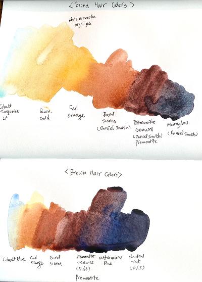 |
| "Hair Colors" |
We started the full-on Caucasian female portrait in full color and will finish in in the first half of the next week's class. I successfully took the screen shots during and at the end of the demo and photoshopped them for you.
I always start the portrait with the background with the wet-on-wet variegated wash.
In this painting, I aimed at the loose, mid-tone, yellow green/blue
green background that suggests foliage. You have to wet the paper
thoroughly and evenly, otherwise you are risking a hell of a mess!
.png) |
| "Screen Shot I" |
Then
I started painting the brunette hair with very pale cobalt blue
highlight, then washed in cadmium orange, thereby created a damp
environment to paint burnt sienna, Daniel Smith Piemontite Genuine, and
the mixture of Piemontite and Ultramarine blue. (Paint one half at a time).
Hair is all about softness. I had already softened the outer hairline with a small stiff bright oil painter's brush.
The reason why I dampened the hair shape with cadmium orange is to
paint basically wet-on-wet, because as you know the wet-on-wet technique
is all about softness within the shape. Apply the brushstrokes the way the hair grows. If it is straight as this particular subject's hair, use a long, graceful stroke. Think the hair as a series of long light, mid-tone, and dark strands, not individual hair (the same applies to eye brows or any other facial hair).
Many
students struggle with hair. (As a matter of fact, many students
struggle with everything: background, hair, skin tones, drawing of
features, folds of clothes, you name it!) My aim is to make watercolor portraiture accessible to most students and I hope this step-by-step approach helps.
Next, I softened the inner hairline with the lifting brush (there is hardly any painting within which I don't use this brush). Then I started painting the first layer of the skin tones on dry paper, using the pale, watery versions of the above-mentioned essential skin colors (minus cobalt blue, which I used in the second layer).
I didn't mix any colors, except a little cad yellow to cad red in the forehead, etc. Depending on the moisture level of your brush, you may end up with blooms. Don't worry about them. It's sometimes hard to read whether a certain passage is a cool red or a warm red.
You can mix the two reds; you can use either red (they are so pale that
it doesn't really matter). As we spend more and more time looking at
the subject, it becomes clear which area is warm and which area is cool.
.png) |
| "Screen Shot II" |
In
a light-skin-toned subject, the painting goes fast. I started the
second layer, going bolder. I also started painting the features. There
are so many things I covered that I am not going to detail them here.
Please rewatch the recording.
.png) |
| "Screen Shot III" |
Next, I finished the female portrait in full palette. I showed you how to deepen the hair without losing the feeling of softness that was established in the first wash last week. I emphasize the importance of soft texture of any hair. Avoid the liney hair with many fussy strokes and instead focus on the light/dark shapes.
How to create the soft, fuzzy texture in watercolor? Paint with water,
i.e., as soon as you put down a linear stroke, rinse your brush, remove
the excess water on clean paper towel, and stroke it down one or both
sides of the previous stroke. Keep repeating the process until you are satisfied with the hair.
I painted the white blouse by painting pale shadow shapes. I used a variety of colors although the shapes are not very big. You can't paint colorful paintings with just few colors. Get into the habit of dipping into a different color each time you reach out to reload your brush.
A wet stroke of Color A, then another wet stroke of Color B, and so on.
As long as you control the moisture level of your brush, you will still
see color variations in your shapes.
But more than anything else, the big picture of the left side of the white blouse being in light and the right side being in shadow has to be emphasized! Do you see the difference of the left and right sides in the finished portrait?
The skin tones needed to be strengthened a bit and the dark shadows of the neck introduced, so that what I did next. The subject with a fair skin tones doesn't require too many layers of glazing, but it doesn't mean you don't have to deny her colors!
After the break, I talked about how to approach painting the subject with glasses/shades.
Less is more! Suggest the frames instead of accentuating them. Remember
the frames, no matter how thin, have volumes; sometimes it's necessary
to paint planes (especially if the subject is in three-quarters view. If
you can't see the subject's eyes, don't invent them. If you see the
reflections of interesting shapes, paint them. If the glasses/shades cast strong shadows, paint them.
This
is an independent project, so I won't discuss my demo in details. I am
painting "Sabrina at Dean Village, Edinburgh". I finished the sky, the
background architecture and stream, and her hair before the class and focused on the skin tones for the demo.

"Sabrina at Dean Village, Edinburgh"
In
the image above , you can see the first layer of skin tones. It's very
pale, but still gives the impressions of three dimensionality
with the adroit use of the highlights (cobalt turquoise light and
cadmium yellow pale with a bit of cadmium red) and warm red (cadmium
red)/cool red (Helios purple). Something to think about!


