Showing posts with label online art class. Show all posts

Sunday, November 21, 2021

"Provence Olive Grove" (watercolor on paper; 9" x 12")


"Provence Olive Grove" (watercolor, 9" x 12")

I decided to blog about my online Zoom classes with the Art League School in Alexandria, VA. This is what we did in the last week of the fall term, 2021 for my "Watercolor from Start to Finish" class.  

The lesson was "Inspired by Vincent van Gogh," the famous post-impressionist painter who doesn't need introduction. We painted the olive grove next to the Abbaye de Montmajour, near Arles, where van Gogh used to live. He drew the medieval monastic ruins many times. He probably painted the same olive grove with the distant Alpilles mountains in the background. We tried to channel van Gogh in watercolor, focusing on mark-making with a high-key, impressionist colors.

First, I drew the design with watercolor pencils. Then I painted the sky on dry paper with very pale Winsor lemon (along the mountains) and cobalt blue (from the top of the paper) and let the two colors merge. If the brush skipped the paper and left some white bits, so much better. There you go an instant cloud or two!

When the sky wash dried, I painted the distant mountains in a mid-tone purple mixture of cobalt blue and permanent alizarin crimson (adding a little quinacridone gold to neutralize the purple). While the mountain wash was drying, I painted the dry grass shape with a light gold wash, leaving some white bits. Then went in the distant plane (between the mountains and the olive grove) in the light green wash of cobalt blue and lemon.

The olive leaves were painted with the same mixture, perhaps slightly bluer (even with the two-color mixture, you can push it to one way or to the other). The gnarly olive tree trunks and branches were painted with the mid-tone mixture of French ultramarine blue and burnt sienna. The foreground bush was painted with light green and some yellow on top. Don't put this shape right in the middle, or make it too big, important and detailed! The purpose of the bush is to introduce some interest in the big foreground grass shape.

Now the painting is blocked in, it was time to break it down, add definitions, details, and brush strokes, and generally add busy marks in the style of Vincent. This was done with an increasingly deeper versions of the first colors, making sure we don't go too dark, maintaining a high-key feeling.

For the grass, I used a rigger brush, which made different marks. The shadows of the trees that indicate the time of the day (late afternoon) and the flat terrain were painted with the purple mixture of ultramarine blue and crimson.

I don't think I painted like van Gogh at all. Busy brush strokes are not my cup of tea! It was a fun project though. Below are the reference and my sample painting (at the bottom of the post). 


"Provence Olive Grove" Reference

Here is a quick look at what we have covered in just nine weeks. I am planning lots of fun projects for the winter term. The winter registration for my online "Watercolor from Start to Finish" is open; here is the link for the class.

Fall Trees Small File.jpg
"Fall Trees" (watercolor, 12" x 9")
Sunflower Love Demo.jpg
"Sunflowers" (watercolor, 9" x 9")

Peggy's Cove Lighthouse Demo Small File.jpg
"Peggy's Cove Lighthouse" (watercolor, 12" x 9")
Red on Red Small File.jpg
"Red on Red" (watercolor, 9" x 12")
Holmes Run Rocks Demo.jpg
"Holmes Run Rocks" (watercolor, 12" x 9")
Storm Moving In Demo.jpg
"Storm Moving In" (watercolor, 9" x 12")
Siberian Tiger Small File.jpg
"Siberian Tiger" (watercolor, 9" x 12")
Annie.jpg
"Annie" (watercolor, 12" x 9")

"Provence Olive Grove" (watercolor, 9" x 12")

Friday, November 19, 2021

"Happy Days" (watercolor on paper; 8" x 10")


"Happy Days" (watercolor, 8" x 10")
  

I decided to blog about my online Zoom classes with the Art League in Alexandria, VA. This is what we did in the ninth week of the fall term, 2021 in my "Watercolor Portraits" class.

The lesson was about painting a double portrait. I chose a reference I took when my daughter was nine. As a matter of fact, it dates from the same day in August, 2007 as the reference for "Sabrina in the Breeze". In Napa, California it was. We were attending a family wedding and decided to make a vacation out of it. We drove around in the area, soaking in the brilliant Californian light. I have created many paintings from the trip, partly thanks to the excellent light and partly because of the happy memories. I even titled the double portrait "Happy Days"

The first decision I made was to make the small background shape mid-tone instead of dark as in the reference. In a photo when something is in direct sunlight, it sometimes gets bleached out to a pure white, which you don't see in person. So I gave my daughter's pink bucket hat a very pale Winsor lemon wash, then even glazed it with pale permanent rose. 

I've noticed how cool the skin tones were in the reference, because the faces were in shadow. So, instead of cadmium red, which is my go-to red for skin tones, I used, for the most part, permanent rose, Sennelier helios purple, Holbein madder brown, permanent alizarin crimson, and quinacridone magenta. I used cadmium red and a little Winsor lemon in the initial wash in the highlight areas. 

 My daughter's right-side cheek, although in shadow, is influenced by the reflected light of her white shirt. So I introduced a little cobalt turquoise light (Winsor Newton), my go-to color to imitate the sky reflected in the skin. There are a lot of blues because of the sunny outdoors lighting. Cobalt blue was used liberally (I made sure not to use French ultramarine blue this time unlike with "Sabrina in the Breeze"). Comparing the skin tones of the two related portraits, I regret using cadmium red and ultramarine blue in my daughter's portrait. You see, we learn through our mistakes!

For my daughter's white shirt, I used cobalt turquoise light, cobalt blue and ultramarine blue to create folds.

Thank you for reading my blog. If you are interested in taking my online watercolor portrait class, the registration for the winter term is now open. Click here for the information.

"Happy Days" Reference

"Sabrina in the Breeze" (watercolor, 10" x 8")


Sunday, November 14, 2021

"Annie" (watercolor on paper; 12" x 9")

"Annie" (watercolor, 12" x 9")


I decided to blog about my online Zoom classes with the Art League School in Alexandria, VA. This is what we did in the eighth week of the fall term, 2021 for my "Watercolor from Start to Finish" class. 

First, I finished "Siberian Tiger" by glazing using the same colors as the last week to make the painting more vibrant and model the form a little bit.
 
"Siberian Tiger" (pen and watercolor, 9" x 12")

 The main business of the day was painting "Annie" in sepia. To make sepia, we used only burnt sienna (my favorite is Daniel Smith) and cobalt blue. The below is the value scales and color swatches I made to test values. The value 1 is the white of the paper (highlights). The value 7 is as dark as it gets with the mixture of the two colors. The value 9 is black.  

"Values Scales and Color Swatches"

Many beginners have trouble reading values and translating them into colors. By using a sepia (or black and white) reference, we can remove the puzzle; by using only one neutral color (sepia in this case), we can remove the difficulty of reading colors in values. This value exercise is invaluable and used by many instructors. We are trying a portrait, which is a whole new ball game with its snares and pitfalls, but here we go. You can do it!

I first painted the background wet on wet with the value 3 wash (slightly bluer than the subject). When the paper dried, I started with the lightest wash, covering the entire area of the subject, except the lightest parts (highlights, including the catch light of her left eye). Don't make this layer too dark!

In between layers, dry the paper thoroughly. We are glazing, so paper should be bone dry. At each stage, we mixed a slightly darker batch; mix more than you think necessary. By the fourth layer, we got everything done, except the pupils. The darkest bits in the face are usually the upper lash lines, nostrils, and the line between lips. The pupils are black (or near black in this case).

The biggest challenge in a value study is to read values correctly, of course. With a soft and round face of a young girl, it is not easy, but I believe the exercise forces you to be decisive in your value reading. Do your best to preserve the white of the paper for the highlights at the beginning and don't forget to put in some darks at the end. As you can see, the majority of the painting was done in mid-tones. Most paintings require five to six values and you rarely need full nine scales. Without the highlights and darks, however, the painting will lose its impact.

Let's revisit "Holmes Run Rocks" of three weeks ago. I turned my class demo into a black and white and it still reads, doesn't it? From now on, if you are having trouble reading the values of your reference or your work in progress, do the same. Things will be much clearer to you! 

"Holmes Run Rocks in Black and White"

"Homes Run Rocks" (watercolor, 12" x 9")


Sunday, November 7, 2021

"Siberian Tiger" (pen and watercolor on paper; 9" x 12")


"Siberian Tiger" (pen and watercolor; 9" x 12")


I decided to blog about my online Zoom classes with the Art League School in Alexandria, VA. This is what we did in the seventh week of the fall term, 2021 for my "Watercolor from Start to Finish" class. 

The first business of the week was finishing up "Storm Moving In". We continued the painting with the top panel on the left. First we wetted the paper and painted the glowing sky shape with the pale mixture of Winsor lemon and cadmium red pale. When the paper was dry, we wetted the paper again and dropped the blues in the clouds with the blue mixture of cobalt blue and burnt sienna. 

When the first layer (which took two separate steps to avoid contaminating the blue and pale peachy yellow shapes) was dry, we glazed the clouds with a little darker mixtures to create some edges and drama. When this layer was dry, we painted the seagull with the dark mixture of ultramarine blue and burnt sienna.

The last panel (the one at the left bottom) was painted with the same colors and same techniques as the first panel, except here it starts with the yellow and alternates with blue, yellow and dark shape. The sea shape is slightly larger than in the first long panel and has layers of waves; make sure you don't paint over the waves in the first wet-on-wet stage to keep it light and foamy-looking.
 
"Storm Moving In Demo"

 
The main business of the week was "Siberian Tiger" done in the pen-and-wash technique. We did the line work with the quill nib pen and the black India ink. If you press the nib a little bit, the lines become thicker. This thin and thick line quality is called the varied line weight, something you will never achieve with the markers such as the Micron or Sharpie pens. If you are brave and you know the fortune favors the brave, you can also try the Pentel Pocket Brush Pen. This sensational pen with waterproof ink makes drawing with the varied line weight portable and fun. It has a steep learning curve, but once you get used to it, you will never go back!

When the line work was done, we switched to a brush to fill in the fabulous patterns on the tiger with the India ink. With the inking finished and totally dry, we went to play! When you introduce line work to your painting, it does most of the work so watercolor takes the second stage. Thus less layering is required. That's why the pen and wash technique is so popular among the travel journal artists. Quickly put down the lines and whip out your watercolor box to add some color notes. Voila, you are ready to enjoy the next site!

I painted the blurry background on dry paper with quinacridone gold, cadmium yellow pale and cobalt blue to suggest the vegetation in the sun. When this was dry, I began to drop paints on the face, making sure I leave some white areas untouched. I used the yellows, cadmium red, permanent rose (on the pink nose), and the purple mixture (cobalt blue and rose) over the shadow areas. I didn't get to finish this fun part, but it won't take long to finish the painting next week! 
 
"Siberian Tiger" demo in progress


Friday, November 5, 2021

"Sabrina in the Breeze" (watercolor on paper; 10" x 8")


"Sabrina in the Breeze" (watercolor; 10" x 8")


I decided to blog about my online Zoom classes with the Art League in Alexandria, VA. This is what we did in the seventh week of the fall term, 2021 in my "Watercolor Portraits" class.
 
This week's lesson was about painting a child's portrait. First, I talked about how a child's head develops from birth until he or she reaches the young adult stage. The following images are from Burne Hogarth's "Drawing the Human Head". The adult ratio of cranial mass and facial mass is 2:1; the newborn ratio is 3 1/2:1! As a child grows the facial mass (from brow to chin) develops faster than the cranial mass (from brow to nape) until the child reaches the mature level by 14-15.

I've also shared my drawings and paintings of children to illustrate the following points:

Everything is crowded in the facial mass at birth; the neck is very short and thin. The first thing we notice is that they have huge eyes, because the eye openings are too small for the adult-sized eyeballs. That's why if you paint the subject's eyes too big, suddenly the subject looks like a child. You paint the child with too long and thick a neck, you have a football player instead of a child! Children's noses are not yet fully developed; very young children have hardly any chins. Overall, their features are soft and round with baby fat. They do have, however, all the bones and muscles, so our job as portrait painters is to look hard for the plane changes while rendering their wrinkle-free faces with as much soft edges as possible.

Child head development I

Child head development II

Child head development II

For the reference of the project, I chose the picture of my daughter taken at the age of nine. Her head is tilted although it's full-on. Her hair is blowing in the breeze creating interesting shadow patterns in the face while obscuring some features. The lighting was the full-sun natural light in northern California, hence a lot of blues bouncing about in the face and white T shirt.

Reference for "Sabrina in the Breeze"

I am not going to narrate the full painting process as you will be working on your own project. I started with the wet-on-wet gradated blue wash for the background, pulling the blues into the hair, then proceeded with painting the hat, face, hair, and the shirt. My skin tones colors were as I have explained last week; however, I didn't use any permanent sap green.

Lots of cadmium red, a little Winsor lemon in the sunny area, some permanent rose (due to the cool sky blue), a lot of cobalt blue (I even used some French ultramarine blue along with permanent alizarin crimson for the shadows; in retrospect, I should have avoided this granulating paint; instead, I could have used cobalt blue with brown madder). Many layers went in to get at the right values. Don't paint your darks as dark as you see in the photo!

As many people have brown hair, I talked about the browns. Please refer to the image below. I don't generally use the usual brown paints shown here, either in the hair or for the African-American skin tones as they tend to get muddy-looking. Browns in the shadow become near black; browns in the light are almost yellow (the bleaching effect of the warm sun) or light blue (the reflection of the sky). Experimentation is the thing!

Brown swatches


Sunday, October 31, 2021

"Storm Moving In" (watercolor on paper; 9" x 12")

"Storm Moving In" (watercolor, 9" x 12)
 

I decided to blog about my online Zoom classes with the Art League School in Alexandria, VA. This is what we did in the sixth week of the fall term, 2021 for my "Watercolor from Start to Finish" class.

The first business this week was finish "Holmes Run Rocks". First, we painted the first layer of the rocks and pebbles with the mixture of quinacridone gold and a little bit of purple (cobalt blue and crimson). Make sure you paint around the sun-struck highlights (if you lose the white of the paper, you lose the game!). If necessary, draw the pebble shapes first, then paint around them.

We started the second stage with the big tree shape using the dotty pointillist method of applying paints. I used three tones: the light tone green (Winsor lemon and cobalt blue), the mid-tone green (cadmium yellow pale and ultramarine blue), and the dark tone (ultramarine blue and permanent alizarine crimson). The tree trunks and branches were painted with the mixture of ultramarine blue and burnt sienna (this is called Jane's Gray).

Then, we moved on to the rocks and pebbles with the dark shadow tone of cobalt blue/ultramarine blue and crimson. We have already established the mid-tone in the first stage. You will see the rocks and pebbles suddenly emerging before your eyes!

The final touch that brought the painting together was the glazing of the big water shape. We wetted the shape first, then dropped the mid-tone mixture of gold and burnt sienna. Quickly we painted in the reflected shadows of the trees and the submerged pebbles with the purple mixture of ultramarine blue and crimson. If your paper is too wet, whatever you put down will fuzz into the water!

"Holmes Run Rocks Demo" (watercolor, 12" x 9")

As you can see my demo painting above looks a little different from my sample painting below. Which one do you like better?

"Holmes Run Rocks" (watercolor, 12" x 9")

The main business of this week was painting a triptych, "Storm Moving In". The first image below is the reference photo I took on Assateague Island. Instead of painting from it as is, I cut it up into three unequal pieces, moved them around until I found a pleasing design, which is the second image. Basically, I placed the tall left panel in the right side and put the two divided right panel pieces in the left for the heck of it!

Anything that moves (in this case, a seagull in flight) becomes the center of interest, which happens to fall in the sweet spot of the picture (one quarter way down from the top and one quarter way in from the left edge; there are four potential sweet spots in a picture, by the way). The tall right panel is now the anchor; the two smaller panels on the left are not of the equal size.

"Storm Moving In Original Reference"

"Storm Moving In Reference Reimagined"

Making sure the horizons are straight and at the same level, and at right angle to the side edges of the paper, we drew them with the help of a ruler/straight edge. Then, we divided the picture with a 1/2"-wide washi tape (not so tacky tape) into three small paintings that cohere.

We started the painting with the right long panel. First we wetted the paper and painted the glowing sky shape and the glowing wet sand shape with the pale mixture of Winsor lemon and cadmium red pale. When the paper was dry, we wetted the paper again and dropped the blues in the clouds and the ocean waves with the blue mixture of cobalt blue and burnt sienna. The dark sand shape was painted in the mid-dark tone of ultramarine blue and burnt sienna.

When the first layer (which took two separate steps to avoid contaminating the alternating shapes) was dry, we glazed each shape with a little darker mixtures to create edges and drama. We will pick up from here next week!

"Storm Moving In Demo in Progress" (watercolor, 9" x 12")


Sunday, October 24, 2021

"Holmes Run Creeks" (watercolor on paper; 12" x 9")


"Holmes Run Rocks" 

 
I decided to blog about my online Zoom classes with the Art League School in Alexandria, VA. This is what we did in the fifth week of the fall term, 2021 for my "Watercolor from Start to Finish" class.

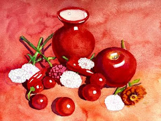
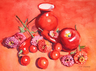
We spent about two hours trying to finish up "Red on Red", but didn't manage. Lol. First, I drew a cherry tomato in graphite to explain the local color, highlight, form shadow, reflected light, and cast shadow. It's easy enough, but once we start painting in color, things can go haywire. I painted around the highlight shape with cadmium red; for the form shadow, I switched to permanent alizarin crimson, but switched back to red for the reflected light. If you use enough paint, you won't need to glaze. When the tomato was dry, we painted the cast shadow with the purple mixture of cobalt blue and crimson.

All the cherry tomatoes and red peppers were painted the same way. As a matter of fact, the vase and apple were painted the same way too, although they may have required a glaze or two; the apple has the belly button and stem area that require some fiddling.

As you put down a wet stroke of one color next to the still wet stroke of another color, make sure you remove the excess water from the brush to avoid runbacks. Don't try to be thrifty by using only one or two sheets of paper towel for the entire painting session. The difficulty of watercolor has everything to do with the control of the ratio between water and paint and the sensitivity to the moisture level in the brush and on the paper. (The other difficulty is the one-way-ticket painting process unique to watercolor, meaning we proceed only in one direction: from light to dark. That's why we have to organize and plan ahead.)

Then we painted the green stems and leaves with the green mixture of Winsor lemon and cobalt blue. Let the first layer dry and do the second layer with a darker green on the shadows along the stem and on the leaves to create form. When the second layer is dry, paint the cast shadows with the purple mixture of crimson and cobalt blue.

For the zinnias, we first drew the overlapping layers of tiny petals with appropriate colors of watercolor pencils and started the first layer of wash in orange (the mixture of red and cadmium yellow pale), permanent rose, red purple (the mixture of rose and a little cobalt blue), etc. When it was dry, we had to redraw the petals because watercolor pencil lines disappeared, giving us one more opportunity to redraw. For the dark crevices, I used the red purple mixture (crimson and cobalt blue).
 
If you wish, you can have fun with the tiny yellow star-like shapes in the center of some zinnias by painting them with the mixture of yellow and white gouache with a rigger brush. Finish the zinnias by painting dark purple cast shadows. Below are the two demo process images and finished painting. 
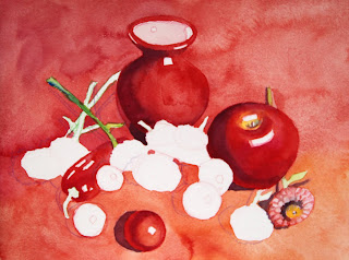
 

"Red on Red in Progress I"

"Red on Red in Progress II"

"Red on Red" (watercolor, 9" x 12")

This week's main lesson was painting rocks. I first drew the design with watercolor pencils (green, brown, blue, and violet). The shading in the rocks is demonstration only; don't do it yourself. Landscapes can be overwhelming to many students. Think the big shapes first. In this exercise there are five big shapes: the sky and trees, the middle ground cluster of rocks and pebbles on the left, the foreground big rock and pebbles, the big water shape, and the small group of rocks in the middle ground on the right. Group the shapes and cluster them in a meaningful manner that allows the viewer's eye to enter the painting and travel and linger.

I started painting from the top (that's how we generally paint landscapes) on dry paper, with cobalt blue for the sky holes, yellow green (lemon and a bit of cobalt blue) for the tree foliage in the sun, dark green (quinacridone gold and ultramarine blue) for the dark foliage in the shadow, and dark brown (burnt sienna and ultramarine blue) for the shadowy area in the right bottom of the big tree shape.

For the water, I used gold, yellow green (lemon and a little bit of cobalt blue), and warmer gold/burnt sienna as it gets closer to the bottom of the paper. Please develop "Holmes Run Rocks" up to this point. We will finish the painting together next week and move on to the triptych exercise!
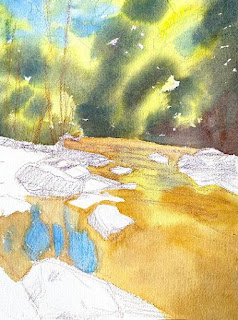
 

"Holmes Run Rocks in Progress"


Friday, October 22, 2021

"Red Hair" (watercolor pencil on paper; 11" x 8.5")


"Red Hair" (watercolor pencil, 11" x 8.5")

I decided to blog about my online Zoom classes with the Art League School in Alexandria, VA. This is what we did in the fifth week of the fall term, 2021 for my "Watercolor Portraits" class. 
 
The lesson was about drawing portraits in watercolor pencils. The process is similar to watercolor in that we layer from light to dark. On an accurate pencil drawing, I began the portrait by hatching colors, starting with a turquoise to indicate reflected light on the shadow side of the head. Then I hatched and cross-hatched with lightest colors (cream and pale pink) and moved onto the mid-tone colors of orange, scarlet, and red purple; then, finally the dark tones (brown, violet, indigo, and black for the upper lash lines, pupils and iris outlines). When you are hatching and cross-hatching, be consistent and mindful. Below is where I stopped before adding water.

"Red Hair" in progress

When you add water to your drawing with a brush, you will notice the colors deepen dramatically as long as you are using the artist-quality watercolor pencils such as Caran d'Ache Museum Aquarelle and Faber Castell Albrecht Durer. What you are doing is activating the pencils. That's right. We don't use watercolor pencils the way we do waxy colored pencils. On their own, watercolor pencils are anemic-looking; it's only when they are activated with water, they begin to sing. 
 
Please avoid the temptation to scrub the hatched texture to obliterate pencil strokes. If you don't like the strokes, why bother with watercolor pencils? It's time-consuming to hatch and cross-hatch and there is no point in erasing them with water. These pencil strokes add charm and the graphic texture to the finished work.

After the paper dries, you can add more tone by using watercolor pencils as if they are watercolors. How? With a clean wet brush, you pick up tone from the long lead of a pencil and apply it to the desired area. (By the way, I don't use a mechanical pencil sharpener to sharpen my pencils because it tends to eat up pencil leads and sometimes break them!) You can dip the pencil into water and draw with the wet lead (upper lash lines, upper lid folds, hair, etc) to strengthen lines.
 
You can also use a nail file to grate pencil leads onto a wet area to create texture like freckles, etc. Keep adding more tone until you are satisfied. You can of course introduce watercolor, but we didn't in this lesson.

By the way, what kind of paper works best with watercolor pencils? My favorite is Fabriano 140 lb hot press paper; I also like Moleskine watercolor sketchbook and Strathmore 500 series drawing paper pad (8" x 10" is a good size). In other words, smoother paper with less pronounced tooth than Arches 140 lb cold press paper seems to work better.

The following are the colors I find useful for skin tones in case you want to purchase a few more watercolor pencils:
Naples ochre (Museum Aquarelle or M/A), Light flesh (M/A), Medium flesh (Albrecht Durer or A/D), Salmon (A/D), Light purple pink (A/D), Burnt ochre (M/A), Pompeian red (A/D), Purplish red (M/A), Caput Mortuum (A/D), Carmine lake (M/A), Dark flesh (M/A), Violet pink (M/A), Periwinkle blue (M/A), Light malachite green (M/A), Light olive (M/A), Olive yellow (M/A).

I've played around with watercolor pencils. Here are some of the results; the last one is my self-portrait!


"Self-portrait" (watercolor pencil, 8.5" x 5")