Showing posts with label watercolor workshop. Show all posts

Monday, April 4, 2022

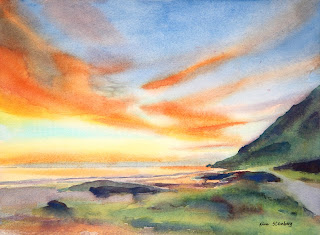
"Kaena Point Sunset" (watercolor on paper; 9" x 12")


"Kaena Point Sunset"


The following is the wrap-up of the "Painting Sunsets in Watercolor" workshop I taught this weekend at the Art League School in Alexandria, VA.
 
It has been a great pleasure to have you in my sunset workshop. I hope you learned something to help you in your watercolor journey. Some of you were not familiar with the wet-on-wet variegated wash or painting in layers. But it is generally why we take workshops: to broaden the horizon and try something new. You guys were awesome!

Things to take away? Sunsets are all about the yellow and orange glows and we have to preserve that glow to paint a successful sunset.

Blues and purples are present often in sunsets. Since oranges and yellows are complimentary colors of blues and purples, if we paint them at the same time, they will mix on their own on the  wet paper and result in mud. Hence, we must separate them in layers!

Each time when you wet the paper for the wet-on-wet technique, which helps us to apply paint smoothly without leaving hard edges (and sky, water, and many other things are all about softness), you have to wet the paper thoroughly. And you have to use good paper (we used Arches 140 lb cold press paper)!

Each time when we start the next layer, the paper has to be bone dry! Otherwise you risk stirring up the previous layer(s). If you do this right, you can repeat the process until you can't take it anymore. Lol. You can also wet only part of the paper (sky, water, etc.) depending on your purpose.

We don't always repeat the variegated wash in multiple layers. As I have shown some examples, I sometimes get it done in one or two layers.  So don't think what we did is the norm. It depends!

The reason why repeated the yellow, red orange, and blue layers twice is this: it's better to go gentle and layer than go too strong and do oops. In watercolor, removing paints is much much harder than adding more paints in layers. Go easy and go slow! Patience is the most important virtue in watercolor.

So the end result should be vibrant yellow, red orange and blue. Some of you needed to strengthen blues, right?

When you are satisfied, paint the land shape, tree, boats, or whatever. Hard edges are introduced at this stage and we often paint on dry paper. Darks must be dark enough!

Values are the most important thing in a painting in any medium. If you are plagued by the feeling that your project is not going well, take the picture of your work-in-progress and desaturate the picture using your phone picture editor. You will see your problems right away!


Monday, December 6, 2021

"Parc de La Tete d'Or in Lyon, France" (watercolor on paper; 12" x 9")


"Parc de La Tete d'Or in Lyon, France"


Dappled light is the spotted light which comes through gaps in a tree canopy and produces the feeling of light and the airy, cheerful mood in a landscape and cityscape. In order for dappled light to occur, we need two conditions: bright sunny weather and the presence of deciduous trees with leaves. On a bright sunny winter day, you may have cast shadows of trees, but no dappled light. On overcast days, you don't get dappled light either.


"Autumn Park" Demo Painting


After drawing the design lightly with watercolor pencils, I painted the first layer of wash, starting with the sky holes with the mixture of cobalt blue and cobalt turquoise light (Winsor Newton). I let it dry first before proceeding to paint the light yellows and oranges of the big tree leaf shape. I continued blocking in the yellow green shape of the grass, the two orange shapes along the path, and the path itself with quinacridone gold. Keep everything light (value) and bright (chroma). We are painting light! 

 Before moving on to the second layer, I talked about how to mix greens (leaves), purples (cast shadows and dappled light on the path), and browns tree trunks and branches). Mixing greens are easy enough; add a blue to a yellow. But which blue and yellow? It depends. By mixing them with one blue at a time, I proved both yellow and blue make a difference, but it's actually yellows that seem to have a bigger impact on the results: a spring green (winsor lemon), foresty green (quinacridone gold and cadmium orange), or in-between green (cadmium yellow pale).

 The bottom line is that if you want a lighter, warmer green, add more yellow and if you want a darker, cooler green, add more blue or go for a darker blue (ultramarine blue or winsor blue). When greens get dark enough, you have to switch to purples! My go-to purple mixture is that of ultramarine blue and permanent alizarin crimson.


For browns, think the complementary colors of blues and oranges/red oranges. The classic mixture is Jane's Gray (ultramarine blue and burnt sienna by Daniel Smith). You can also mix cobalt blue with burnt sienna to make a homemade sepia. Cadmium red and cobalt blue make a beautiful purplish brown. Add winsor violet to cadmium orange with enough water, you get a luminous brown (again think complementary colors)!


I layered and layered with an increasingly darker colors on the leaves, grasses, trees, and painted shadows on the path. I splattered and made leaf-like, organic-looking brushstrokes. In order to create a sunny-looking painting, you need a light, mid-tones, and darks. Many darks are purples. Greens can have many values from light yellow green to dark blue green.


As you can see the group critique on Sunday afternoon, everybody did a fabulous job! You learned a great deal about the importance of value above all else! You learned the various qualities of color: value, temperature and chroma (intensity). You learned the basics of how to control edges to create soft edges. In my experience as a watercolor instructor, students have a lot of trouble grasping the concept of color temperature. The control of edges is very hard indeed. But it's the value that stumps the most.

In terms of paint handling, I emphasized the importance of using enough water! Some of you learned to use enough paint to overcome the anemic look that is common among beginners. But in order to achieve the juicy, watery look of the finish painting, one must use enough water.

And let's not forget not overmixing! I looked at some of your palettes and I see completely mixed batches of greens, browns, purples, etc. Your palette should have batches of half mixed colors that show both colors at each ends so that you can use both warm and cool sides of the same mixture.

I hope to see you in the future either in my online classes or in in-person workshops. I will be teaching the "Watercolor Portraits" class on Thursday 1-4 pm and the Watercolor from Start to Finish class on Saturday 9:30 am - 12:30 am. I am planning to teach the "Painting Sunsets in Watercolor" workshop on April 2 & 3.

If you are on Facebook, please join my private Facebook group that is only open to my past and current students. It's safe and friendly place where you can post your art and follow what's going on in my studio and classes. 


Saturday, November 27, 2021

"Spring Wildflowers" (watercolor on paper; 12" x 9")

"Spring Wildflowers" (12" x 9")


Let's take a walk on a beautiful spring day in the park. This is the Virginia nature trail at the Green Spring Gardens Park in Alexandria, VA. I see blue woodland phlox and golden ragwort blooming. Dappled light on the path is as delightful!

"Spring Wild Flowers" Reference

Dappled light is the spotted light which comes through gaps in a tree canopy and produces the feeling of light and the airy, cheerful mood in a landscape and cityscape. I am teaching a in-studio workshop at the Art League School in Alexandria, VA on December 4 and 5, 2021.  We are going to create these happy paintings together through the mastery of edges, greens, and shadow colors!