 |
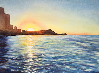
"Waikiki Beach"
|
The
following is the description of what we did in the eighth week of the
winter term, 2022 for my "Watercolor from Start to Finish" class (my online Zoom class with the Art League School
in Alexandria, VA).
So what is this project about?
It's about a controlled variegated wash, with which some of you are
having trouble. It's also about the value control, by which many of you
are haunted (this is the most important and hardest thing to master in
any painting medium, so take heart). It is also about preserving lights
while adding tones and texture (in the water).
It's dawn on Waikiki Beach. The sun is rising just behind Diamond Head in Oahu. There is a hint of a blue sky. Overall, the entire scene is permeated with glorious light.
You destroy light in the water, you lose the painting. We masked the
half sun disk and some horizontal strokes in the water to preserve the
pure light, which is the white of the paper.
We
wetted the entire upper half of the painting and stroked around the sun
disk with winsor lemon, pale cadmium red and spread the lemon and cad
red along the horizon and up. We dried the paper, wetted it again and this time brushed in cobalt blue from the top and pulled it down.
We dried the paper, wetted it again and strengthened the blue wash (the sky has to be blue enough),
stroked in very pale permanent rose above cad red arch (which created a
slight purple "color bridge" to connect red to blue). I also went over
the yellow sky above the horizon in the distance with the blue (which
created a slightly turquoise tone). Everything is done subtly. You go overboard any of the strokes/tones/hues, you ruin the sky.
The
sky is almost half of the painting; so, when the sky is ruined, it's
game over. It's the same with the water, which is the hardest thing to
paint in this project. In a painting, everything has to work; every square inch of the painting has to contribute to the end game, which is beauty (not perfection). An imperfect painting can be beautiful.
We
need the pale golden glow in the highlights of the water, so we wetted
the bottom half of the paper and brushed in pale winsor lemon. We dried the paper. Now it's time to paint the blues of the water (reflection of the blue sky; some are quite dark, such as the reflections of the tall building on the left and some wavelets).
We wetted the paper again and started dropping all three blues:
ultramarine blue along the distant horizon and along the left edge with
the dark reflections and bottom right; winsor blue for much of the
water; and some cobalt blue here and there. Winsor blue may be the
"typical" ocean water color, but if you overdo it, it becomes acidic,
unbearably cold blue, and that why I infused warmer ultramarine blue and
cobalt blue to tone it down. Shadows are the mixture of
ultramarine blue and alizarin crimson or the darker mixture of winsor
blue and crimson.
Make sure you don't lose the pale lemon highlights. Your strokes are not random; They should have a distinct shape of a flat triangular peaks.
Don't make them round. Study the reference carefully. In every project,
study your still life, reference photo, or your view (if painting in
plein air). All the answers are there. If you screw up, it's either your
observation was not careful enough or your painting handling needs
practice.
I kept making these strokes until I ran out of time. You will finish them on your own. I removed the masking fluid and made some horizontal orange strokes on the vertical "column" of brilliant highlight in the water. I also added some dots of white gouache to suggest the sparkles in the water.
Use it thickly (but not straight out of the tube). Then I glazed over
them with very pale lemon. This is the technique the great masters like
Vermeer used extensively to make things glow in their oil paintings.
Finally,
we painted the sliver of the land shape at one go, starting right below
the sun disk with cad red and a little cad yellow pale. White
the glowing red wash was still wet, I dropped the dark mixture of
ultramarine blue and burnt sienna to paint Diamond Head and tiny
buildings on the far horizon. To the left of the sun disk, the tops of the buildings have more burnt sienna
(this "redness" is all caused by the burning glow of the rising sun);
on the other hand, along the horizon (remember the horizon curves
slightly toward the left edge because of trees and such), I dropped more
ultramarine blue to make it darker.
 |
"Waikiki Beach Reference"
|


